In today’s fast-paced digital landscape, efficiency is paramount. Building a high-quality website quickly can be the difference between launching a successful project and falling behind competitors. Elementor, a leading WordPress page builder, offers powerful tools to accelerate this process, and its ready-made sections are a cornerstone of this speed.
Leveraging pre-designed elements allows users to bypass the often time-consuming task of building common website components from scratch. This means more focus can be placed on unique design aspects, content strategy, and overall user experience, rather than reinventing the wheel for every header, footer, or testimonial block.
Accelerate Your Elementor Workflow: The Power of Ready-Made Sections
The allure of custom website design is strong, but the reality of building intricate layouts component by component can quickly become a significant time sink. Elementor provides a flexible framework, but without a strategic approach, even experienced users can find themselves spending hours on repetitive design tasks. This is where the concept of “ready-made sections” emerges as a critical accelerator for any Elementor-powered project.
Understanding these pre-built blocks is key to unlocking faster development cycles. They are not just shortcuts; they are intelligently designed, reusable assets that form the foundation of efficient web creation. By integrating them, you can significantly cut down on development time, allowing you to deliver more projects in less time or dedicate more attention to the finer details that elevate a website from good to exceptional. This strategic adoption of pre-built elements directly impacts your ability to meet deadlines and manage client expectations effectively, making them an indispensable tool in the modern web developer’s arsenal.
The Bottleneck in Custom Elementor Builds
When embarking on a fully custom Elementor build, certain elements naturally present recurring design challenges. Think about constructing a robust call-to-action (CTA) section: you need to meticulously align buttons, craft compelling headlines and descriptions, perhaps integrate an image or icon, and ensure it’s visually appealing across all devices. This process, repeated for every unique section on a website, consumes a disproportionate amount of time. The initial setup and consistent styling of these standard components can become the primary bottleneck, diverting energy away from more strategic design considerations. For instance, a team building 10 client sites might spend weeks just on the foundational elements that are common to most projects. This is where the inherent advantage of pre-built solutions becomes apparent, offering a way to sidestep these repetitive, time-consuming tasks and focus on what truly differentiates a website.
How Pre-Built Sections Transform Design Speed
Ready-made sections fundamentally alter the speed at which websites can be developed within Elementor. Instead of painstakingly dragging and dropping individual widgets to construct a hero banner, for example, you can import a complete, pre-designed hero section in seconds. This includes the layout, typography, color scheme, and even placeholder imagery, all optimized for aesthetic appeal and user engagement. This rapid deployment of complex design elements allows designers and developers to move from concept to a visually complete page much faster. Consider a scenario where a landing page requires a specific testimonial slider and a pricing table; with pre-built sections, these intricate components can be dropped in and configured in minutes, rather than hours. This acceleration translates directly into increased productivity, enabling faster project completion and the ability to manage more simultaneous projects, which is a significant boon for agencies and freelancers. This approach also significantly aids in achieving faster WordPress website development, a core benefit of efficient component usage.
What Constitutes a ‘Ready-Made Section’ in Elementor?
In the context of Elementor, a ‘ready-made section’ is essentially a pre-designed, self-contained block of content and layout that can be easily imported and integrated into your web pages. These sections are typically built using Elementor’s native widgets and features, ensuring full compatibility and editability. They can range from simple headers and footers to complex hero units, service blocks, contact forms, and testimonial carousels. The key characteristic is their reusability and modularity; they are designed to function independently but also integrate seamlessly with other sections. For example, a pre-built FAQ accordion section will come with pre-styled question and answer areas, requiring only content replacement. Unlike full page templates, sections focus on a specific functional or aesthetic purpose, offering a granular approach to website building. Their structure is often designed with responsiveness in mind, providing a solid foundation that can be further refined to meet specific design requirements, embodying the principle of building with optimized website UI/UX design blocks.

Beyond Basic Templates: The Strategic Advantage of Elementor Sections
While full Elementor page templates offer a complete design blueprint, ready-made sections provide a more flexible and targeted approach to website enhancement. They function as sophisticated building blocks, allowing for a higher degree of customization and strategic integration. This distinction is crucial for developers aiming for both speed and unique design outcomes. Instead of adopting an entire pre-set page structure, users can cherry-pick specific components—like a gallery layout or a pricing table design—and weave them into their existing or custom-built pages. This strategic advantage lies in the granularity and adaptability these sections offer, enabling a more nuanced and efficient design process. They empower users to combine pre-built elements with their own unique content and styling, creating websites that are both visually striking and functionally optimized without compromising on brand identity.
Granularity for Customization: Building Blocks vs. Full Pages
The power of Elementor’s ready-made sections truly shines when compared to the rigid structure of full-page templates. Full templates, while offering a complete design, often require substantial modification if they don’t precisely match your vision or functional needs. This can lead to the tedious process of deleting and replacing elements, negating the initial time-saving benefit. Ready-made sections, on the other hand, operate on a block-by-block principle. They are discrete units, such as a contact form block or a team member showcase, that you can insert, rearrange, and style as needed. This granular control allows for a far more agile workflow. Imagine needing a specific type of testimonial display on a page that’s otherwise custom-designed; you can import just that testimonial section and integrate it seamlessly. This modular approach is ideal for making targeted improvements or adding specific functionalities without overhauling the entire page structure, directly contributing to faster WordPress website workflows.
Targeted Design Solutions for Specific Web Elements
Ready-made sections excel at providing optimized solutions for common, yet often complex, website elements. Instead of building a highly effective call-to-action (CTA) button with its accompanying text and background from scratch every time, you can select from a library of pre-designed CTA sections. These are crafted with conversion best practices in mind, often incorporating visual hierarchy and persuasive copy prompts. Similarly, sections for feature lists, image galleries, team member profiles, and pricing tables are available. Each of these is designed to be visually appealing and functionally robust. For example, a testimonial section might include star ratings, client photos, and company logos, all arranged in an engaging carousel. This means you’re not just getting a layout; you’re getting a pre-packaged solution for a specific user interaction or information display, significantly reducing the design and development effort required for these critical components and enhancing Elementor: Elevate UX with Interactive Website Elements.
Integrating Sections into Existing Designs Seamlessly
One of the most significant strategic advantages of using ready-made sections is their inherent ability to integrate smoothly into existing websites or custom-built pages. Unlike full-page templates that dictate an entire site’s aesthetic, sections are designed to be modular and adaptable. This means you can pull a professionally designed pricing table or a modern hero banner and insert it into a page you’ve already built with Elementor, and it will blend harmoniously. The key lies in their consistent design language and flexible styling options. Most high-quality section libraries provide sections that adhere to modern design principles and offer extensive customization settings, allowing you to tweak colors, fonts, and spacing to perfectly match your current brand identity. This capability is invaluable for website updates or redesigns, enabling you to refresh specific sections without rebuilding the entire site. It’s about leveraging proven design patterns while maintaining your unique brand integrity, a core tenet of Elementor: Seamless Elementor Template Integration.
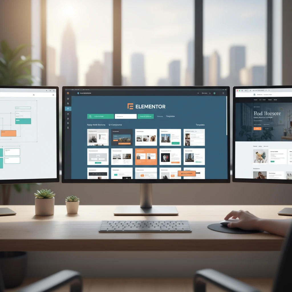
Exploring the CopyElement Library: Your Go-To for Optimized Sections
For those seeking a comprehensive and high-quality repository of pre-built Elementor sections, the CopyElement library stands out. It offers a vast collection designed to cater to a multitude of website needs, from foundational elements like headers and footers to more intricate components for lead generation and customer engagement. The emphasis is on providing professionally designed, conversion-focused blocks that are not only aesthetically pleasing but also engineered for performance and user experience. By exploring this library, users can discover a diverse range of assets that can drastically reduce development time and elevate the overall quality of their WordPress websites. This resource empowers users to build modern, responsive, and effective sites more efficiently, making it an indispensable tool for freelancers, agencies, and small business owners alike.
Discovering Diverse Section Categories (e.g., Headers, Footers, CTAs, Testimonials)
The CopyElement library is meticulously organized into intuitive categories, making it effortless to find the exact pre-built section you need. Visitors can browse through a wide array of options, including visually engaging Header and Footer sections that provide polished navigation and branding opportunities. For driving user action, there are numerous Call-to-Action (CTA) sections designed to capture attention and encourage conversions, often featuring compelling layouts and button placements. Showcase client satisfaction with a variety of Testimonial sections, available in different formats to highlight customer feedback effectively. Beyond these, the library also includes sections for service listings, feature explanations, contact forms, pricing tables, team member profiles, and much more. This rich diversity ensures that whether you’re building a simple blog or a complex e-commerce site, you’ll find purpose-built components to accelerate your design and development process, aligning perfectly with the goal of crafting Elementor landing pages that convert.
Quality Assurance: Design, Responsiveness, and Performance
When selecting ready-made sections, particularly from a curated library like CopyElement, quality assurance is paramount. Each section undergoes rigorous checks to ensure it meets high standards in three critical areas: design, responsiveness, and performance. Design quality means the sections are aesthetically pleasing, follow modern UI/UX principles, and are built with attention to detail. Responsiveness is non-negotiable; every section is designed to adapt flawlessly to various screen sizes – desktops, tablets, and mobile devices – ensuring a consistent user experience regardless of how the site is accessed. Furthermore, performance is a key consideration. Sections are built using efficient coding practices and optimized assets to minimize load times, preventing negative impacts on user experience and SEO. For instance, images are appropriately sized, and code is streamlined. This dedication to quality means you can confidently integrate these sections, knowing they contribute positively to your website’s overall effectiveness and are integral to Elementor: Build High-Speed WordPress Websites.
Finding the Perfect Fit: Section Selection Criteria
Choosing the right ready-made section involves a thoughtful evaluation process to ensure it aligns with your project’s specific goals. First, consider its functional purpose: does it serve the intended role, such as capturing leads, displaying information, or facilitating navigation? Next, assess its design compatibility. While sections are customizable, their core structure and aesthetic should complement your existing or planned brand identity. Look for sections that offer flexibility in color, typography, and layout adjustments. Responsiveness is crucial; ensure the section adapts well to all devices, which is a hallmark of quality components. Finally, consider performance implications. Opt for sections that are built with optimization in mind, avoiding unnecessary bloat that could slow down your site. Libraries like CopyElement often provide previews and detailed descriptions, aiding in making informed decisions that contribute to both a faster workflow and a superior end product. This careful selection is key for leveraging Elementor: SEO-Optimized Websites Made Easy.
Implementing Ready-Made Sections: A Step-by-Step Practical Guide
The process of integrating ready-made sections into your Elementor projects is designed to be straightforward and intuitive, even for users with limited technical expertise. The goal is to empower you to quickly enhance your website’s design and functionality without needing to code. This guide will walk you through the essential steps, from importing the sections into your Elementor editor to customizing their content and styling them to perfectly match your brand. By following these practical instructions, you can harness the full potential of pre-built assets, significantly accelerating your web development workflow and delivering professional-looking results efficiently. This hands-on approach ensures you can immediately start building better websites, faster.
Importing and Inserting Sections into Your Elementor Editor
Once you’ve chosen a ready-made section, the next step is to bring it into your Elementor workspace. The exact method can vary slightly depending on the source of your sections (e.g., a theme add-on, a plugin, or a library like CopyElement). Typically, if you’re using a library plugin, you’ll access the sections directly within the Elementor editor interface. You’ll navigate to the template or block library icon, usually located near the ‘Add New Section’ button. From there, you can browse available sections, often with live previews. When you find the section you want, you’ll click an ‘Insert’ or ‘Add’ button. For libraries that provide downloadable files (like JSON files), you’ll need to go to Elementor > Templates > Saved Templates and click ‘Import Template’, then upload the file. Once imported, the section will appear in your library and can be inserted just like any other element, making Elementor templates streamline your workflow.
Customizing Section Content: Text, Images, and Icons
After inserting a ready-made section, the real customization begins. Your primary task is to replace the placeholder content with your own unique text, images, and icons. Click on any text element within the section, and you’ll see its content appear in Elementor’s left-hand panel, where you can edit it directly. To change an image, click on the image widget, and in the panel, select ‘Choose Image’ to upload your own from your media library or select an existing one. Similarly, for icons, click on the icon widget, and you’ll have access to a vast library of icons to choose from. The goal is to make the section a true reflection of your brand and message. This process is designed to be highly intuitive, allowing you to quickly adapt the pre-built elements to your specific needs without any coding knowledge, contributing to the goal of Elementor: Faster WordPress Websites with Components.
Styling Sections to Match Your Brand Identity
Tailoring the visual aspects of a ready-made section to your brand is crucial for maintaining a cohesive website design. Once you’ve updated the content, focus on the styling options. Each widget within the section (text, image, button, etc.) has its own ‘Style’ tab in the Elementor panel. Here, you can adjust colors, fonts, background types, borders, and spacing. For example, you can change the primary color of buttons and headings to match your brand’s color palette. You can also adjust typography by selecting specific fonts, sizes, and weights that align with your brand’s guidelines. Furthermore, many sections offer background overlay options, shape dividers, and custom CSS capabilities for advanced users. The key is to systematically go through each element of the imported section and apply your brand’s specific styling cues. This meticulous approach ensures the pre-built section becomes an organic part of your unique website, rather than an element that sticks out.
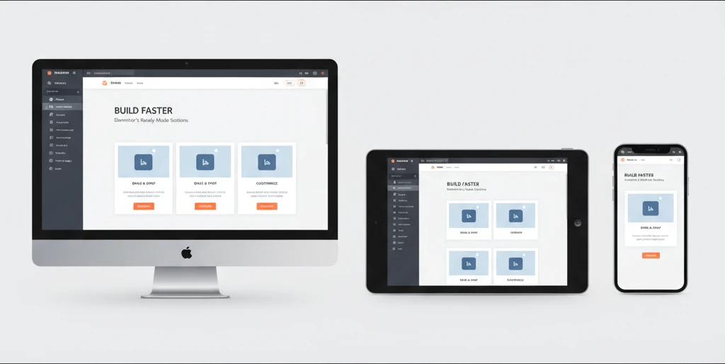
Mastering Responsiveness with Pre-Designed Elementor Sections
In today’s multi-device digital landscape, ensuring your website looks and functions flawlessly across desktops, tablets, and mobile phones is not just a best practice; it’s a necessity. Elementor’s ready-made sections are designed with responsiveness at their core, offering a significant advantage for creators aiming for a unified user experience. These pre-built components have been meticulously crafted by designers who understand the nuances of different screen sizes. Instead of wrestling with individual elements to make them fit, you can leverage sections that are already optimized, saving considerable development time and reducing the likelihood of visual glitches or broken layouts on smaller screens. This allows you to focus on the overall design aesthetic and content strategy, confident that the foundational responsiveness is handled.
The advantage of using pre-designed sections lies in their inherent adaptability. They often employ flexible layouts, fluid grids, and adaptable typography that naturally adjust to varying viewport widths. This means a section that looks stunning on a desktop will gracefully resize for a tablet without requiring manual adjustments. For instance, a multi-column layout might stack into a single column on mobile, or navigation menus could collapse into a mobile-friendly hamburger icon. By starting with these responsive foundations, you dramatically shorten the time spent on the tedious task of tweaking every single element for each device size, allowing for a more efficient and enjoyable website building process. This emphasis on out-of-the-box responsiveness is a key differentiator for modern web design tools.
Understanding Mobile-First Design Principles in Sections
Mobile-first design is a methodology that prioritizes the user experience on smaller screens, recognizing that a significant portion of web traffic originates from mobile devices. Elementor’s ready-made sections often embody this principle, meaning their default configurations are typically optimized for mobile viewing. This translates to elements being well-spaced, typography being legible, and interactive components being easily tappable on a smartphone. When you import a responsive section, you’re not just getting a layout; you’re getting a layout that has likely been considered from the perspective of a mobile user first. This approach ensures that the core functionality and content are accessible and engaging on the smallest screens, with enhancements added for larger devices.
When selecting and implementing pre-designed sections, it’s crucial to understand that the “mobile-first” approach means the mobile view is the baseline. Developers and designers should always preview their work on different device emulators or actual devices. If a section appears perfect on desktop but is unusable on mobile, it’s a sign that the section’s inherent mobile optimization might need further tuning, or that the content within it isn’t best suited for smaller screens. Embracing mobile-first means designing for simplicity and clarity on constrained viewports, ensuring essential information and calls-to-action are prominent and accessible. This leads to a more robust and user-friendly experience overall, as a well-optimized mobile site often translates to a better experience on all devices.
Leveraging Section Settings for Tablet and Mobile Views
While Elementor’s ready-made sections come with impressive default responsiveness, fine-tuning is often necessary to achieve a perfectly tailored user experience. Each section in Elementor offers specific settings that allow you to adjust its appearance and behavior for tablet and mobile devices independently. This granular control is vital for optimizing layouts, typography, spacing, and even the visibility of certain elements. For example, you might want to reduce the padding on a section for mobile to maximize content area, or you might choose to stack columns differently on a tablet than on a desktop. Familiarizing yourself with these device-specific settings is key to unlocking the full potential of responsive design within Elementor.
Within the Elementor editor, you’ll find responsive toggles (often represented by desktop, tablet, and mobile icons) next to most styling and layout options. Clicking these icons allows you to see a preview of how your section will look on that specific device and then make adjustments. For instance, changing the font size for desktop might not affect the mobile view if you haven’t explicitly adjusted it for that device. Similarly, adjusting column widths or margins can be done independently for each breakpoint. A common strategy is to set up your desktop layout first, then switch to tablet and mobile views to make necessary modifications. This iterative process ensures that your website remains functional and aesthetically pleasing across the entire spectrum of devices, making your website development workflow more efficient.
Common Responsiveness Pitfalls to Avoid
Despite the power of Elementor’s responsive features, several common pitfalls can undermine your efforts to create a truly adaptive website. One of the most frequent mistakes is failing to check how sections appear on actual devices or accurate emulators. Relying solely on the desktop preview can lead to unexpected layout breaks or unreadable text on smaller screens. Another common issue is over-reliance on the default settings without considering the specific content and user flow for each device. What looks great on a large screen might be too cluttered or contain too much text for a mobile user. Prioritizing a “one-size-fits-all” approach to responsive design, even with pre-made sections, often leads to a suboptimal experience.
Furthermore, ignoring typography settings for different devices is a frequent oversight. Text that is perfectly sized for a desktop monitor can become too small to read comfortably on a smartphone, or conversely, too large and overwhelming on a tablet. Similarly, excessive use of fixed-width elements or absolute positioning can disrupt responsive layouts. When customizing pre-made sections, pay close attention to the padding, margins, and font sizes, adjusting them specifically for tablet and mobile views. A less obvious, but equally critical, pitfall is not testing interactive elements like buttons and navigation menus on touch devices. Ensure that tappable areas are sufficiently large and well-spaced to prevent accidental clicks. By being mindful of these common errors, you can ensure that your pre-designed sections translate effectively across all devices.
Boosting Conversion Rates with Conversion-Focused Elementor Sections
Ready-made Elementor sections offer a powerful shortcut to designing pages that not only look good but also drive desired actions from your visitors. Conversion-focused sections are specifically engineered to guide users towards a particular goal, whether it’s signing up for a newsletter, making a purchase, filling out a contact form, or downloading a resource. These sections often incorporate proven design principles and psychological triggers that encourage engagement and action. By strategically placing these pre-built elements throughout your website, you can significantly improve your site’s effectiveness in achieving its business objectives without needing extensive custom design or complex development. They provide a solid foundation for persuasive online experiences.
The advantage of using pre-designed conversion-focused sections is that they often come populated with placeholders for compelling copy, clear calls-to-action (CTAs), and optimized form fields. This means you don’t have to start from scratch trying to figure out what makes a CTA button effective or how to structure a lead generation form. CopyElement’s library, for example, provides sections that have been tested and refined to maximize user interaction. Integrating these into your landing pages, service pages, or even blog posts can lead to a noticeable uplift in your key performance indicators. This acceleration in design and implementation allows you to focus more on your marketing message and less on the technicalities of layout and user interface, ultimately leading to faster iteration and better results.
Identifying High-Impact Section Types for Conversions (CTAs, Lead Forms)
When aiming to boost conversions, certain types of Elementor sections stand out for their direct impact on user action. Prominently featured are Call-to-Action (CTA) sections, which are designed to clearly prompt users to take a specific step. These typically include prominent buttons with persuasive text, often accompanied by benefit-driven headlines or short descriptive paragraphs. Equally crucial are lead generation or contact form sections. These are engineered to make it easy for visitors to submit their information, whether for a demo request, a quote, or to subscribe to a mailing list. Their design emphasizes simplicity, clear field labels, and a prominent submit button.
Beyond basic CTAs and forms, other high-impact sections include testimonial blocks and pricing tables. Testimonials build trust and social proof, alleviating user hesitations. Well-designed pricing tables clearly present options and highlight unique selling propositions, making the decision-making process easier. When selecting from a library like CopyElement’s, look for sections that are visually distinct and designed to grab attention. For instance, a CTA section might use contrasting colors for its button, while a form section might employ a clean, minimalist design to avoid overwhelming the user. Integrating these sections strategically on pages where you want users to take specific actions is key to their effectiveness in crafting Elementor landing pages that convert.
Design Elements That Drive User Action
Several design elements, when incorporated into Elementor sections, significantly influence user behavior and drive conversions. Visual hierarchy is paramount; elements like headlines, subheadings, and CTAs should be clearly distinguishable in size and weight, guiding the user’s eye to the most important information and actions. Contrast is another powerful tool – using contrasting colors for buttons against their background can make them stand out, increasing click-through rates. For example, a bright orange CTA button on a white or light grey background is highly effective. Clear and concise copywriting is equally vital; benefit-oriented language that speaks directly to the user’s needs or pain points encourages engagement.
Whitespace, or negative space, plays a crucial role by preventing visual clutter and improving readability, making it easier for users to digest information and focus on CTAs. Interactive elements, such as subtle hover effects on buttons or animated counters for testimonials, can also capture attention and add a layer of professionalism and engagement. For lead forms, reducing the number of fields to only the absolute essentials can drastically improve submission rates. A well-placed testimonial section, featuring quotes and photos of satisfied customers, builds trust and credibility, which is essential for overcoming user hesitation and encouraging them to take the next step. These elements work in concert within a well-designed section to subtly nudge visitors toward conversion.
A/B Testing Section Variations for Optimal Performance
Even with professionally designed, conversion-focused Elementor sections, there’s always room for optimization. A/B testing (also known as split testing) is a critical methodology for determining which variations of a section perform best with your target audience. This involves creating two or more versions of a section, each with a slight difference – perhaps a different CTA button color, a revised headline, a varied form layout, or even a different arrangement of elements. You then present these variations to different segments of your website traffic and measure which version leads to a higher conversion rate.
Implementing A/B tests on Elementor sections can be done through various means, including dedicated A/B testing plugins or built-in features within some marketing platforms. The process involves defining your hypothesis (e.g., “A red CTA button will outperform a blue one”), creating the variations of your chosen section, and then running the test for a statistically significant period or until a sufficient number of visitors have been exposed to each version. Key metrics to track include click-through rates, form submission rates, and ultimately, the overall conversion rate for the page. Analyzing the results will reveal which section variation resonates most effectively with your audience, allowing you to implement the winning design and continuously improve your website’s performance over time. For example, one hypothetical test might show that a button with the text “Get Your Free Quote” converts 15% better than “Request a Quote.”
Optimizing Page Load Speed with Performance-Ready Elementor Sections
Website performance, particularly page load speed, is a critical factor that impacts user experience, SEO rankings, and conversion rates. Elementor’s ready-made sections can significantly contribute to achieving faster load times when chosen and implemented correctly. Unlike custom-built sections that might be laden with inefficient code or unoptimized assets, well-crafted pre-designed sections are often built with performance in mind. Developers who create these components typically adhere to best practices, ensuring that the underlying code is clean, lightweight, and efficient. This focus on performance means that when you integrate these sections, you’re starting with a foundation that is already optimized for speed.
The advantage here is that you bypass the need for extensive code optimization efforts that would be necessary if you were building everything from scratch. A library of performance-ready sections provides a collection of pre-built blocks that have been designed to load quickly, minimizing the burden on your server and the user’s browser. This is especially important for complex websites with many pages or sections. By selecting sections that are known for their speed, you can significantly reduce the overall load time of your pages, leading to a better user experience and potentially higher search engine rankings, as Google and other search engines prioritize fast-loading websites. This is fundamental for building high-speed WordPress websites.
The Impact of Section Design on Website Performance
The design and structure of an Elementor section have a direct and substantial impact on your website’s overall load speed. Sections that are overly complex, containing numerous large images, heavy scripts, or excessive animations, can significantly slow down page rendering. Conversely, sections built with a focus on simplicity and efficiency will contribute positively to performance. For instance, a section that uses a single, optimized background image versus one that loads multiple high-resolution images for different devices or background effects will naturally perform better. The amount of code and the number of HTTP requests generated by a section are key performance indicators.
Elements that require heavy JavaScript execution or CSS rendering can also create bottlenecks. Therefore, choosing pre-designed sections that utilize lightweight frameworks, efficient coding practices, and optimized asset loading strategies is paramount. When evaluating sections, consider how they handle media. Are images compressed and appropriately sized? Are animations subtle and hardware-accelerated where possible? A section that prioritizes a clean structure and minimal resource usage will always outperform one that is visually dense but technically inefficient. This understanding allows you to make informed choices when selecting components that align with your performance goals.
Choosing Sections Built with Lightweight Code and Optimized Assets
When selecting ready-made Elementor sections, it’s crucial to prioritize those built with a commitment to performance. This means looking for sections that utilize lightweight, clean code. Developers who adhere to modern coding standards often produce less bloated HTML, CSS, and JavaScript, which translates to faster loading times. Beyond the code itself, the optimization of assets within the section is equally important. This includes ensuring that any images, videos, or fonts used are properly compressed and sized for the web. A section that includes several large, unoptimized images can drastically increase page weight, negating the benefits of lightweight code.
Reputable template libraries or component providers will often highlight their commitment to performance. For example, they might state that their sections are built using best practices for speed and are regularly audited for performance. When you integrate these sections, you are essentially leveraging the expertise of the developers who built them. A hypothetical example: one section might use a single compressed JPEG for a background image, while another might attempt to use a large GIF and multiple PNGs, leading to significantly longer load times. Opting for sections that demonstrate a clear focus on optimized assets, such as correctly formatted SVGs for icons and responsibly compressed JPEGs or WebP images, is a strategic choice for optimizing your Elementor website’s speed.
Lazy Loading and Image Optimization within Sections
Lazy loading and effective image optimization are two cornerstone techniques for improving website performance, and they are often built into high-quality Elementor sections. Lazy loading is a strategy where images and other media assets are only loaded when they are about to enter the user’s viewport. This means that when a page initially loads, only the content that is immediately visible is processed, significantly reducing the initial page load time. For pages with many images, this can be a game-changer. Many modern, pre-designed sections will have lazy loading implemented by default for their media elements.
Beyond lazy loading, the optimization of images themselves is critical. This involves compressing images to reduce their file size without a noticeable loss in quality, using appropriate file formats (like WebP for modern browsers), and serving images that are correctly sized for their display dimensions. For instance, an image displayed at 300px wide shouldn’t be a 2000px file. High-quality Elementor section libraries often ensure that the images included within their components are already optimized. If you’re replacing placeholder images with your own, always ensure they are optimized before uploading to maintain the performance benefits of the section. This combination of lazy loading and optimized assets is fundamental for ensuring your pages load quickly and provide a seamless user experience, contributing to a better overall site speed.
Ensuring SEO Friendliness: How Sections Contribute to Search Visibility
The way your website is structured and the content it presents directly influence its search engine optimization (SEO) performance. Elementor’s ready-made sections can play a crucial role in making your website more search engine friendly, provided they are chosen and configured with SEO in mind. Search engines like Google analyze various factors to rank web pages, including the semantic structure of the HTML, the quality and relevance of content, and the use of structured data. When you leverage pre-built sections, you gain access to components that often incorporate foundational SEO best practices, such as logical heading structures and well-organized content blocks, which can significantly boost your site’s visibility in search results.
By using sections that are designed with SEO in mind, you can avoid common pitfalls that hinder search engine crawling and indexing. For example, sections that rely heavily on images without alt text or have poorly structured text can be detrimental. However, well-designed sections often provide clear placeholders for headings, paragraphs, and images with descriptive alt attributes, making it easier for search engines to understand and index your content. This allows you to focus on crafting compelling content within these SEO-friendly structures, ensuring that your website not only looks great but is also easily discoverable by potential visitors through organic search. This makes integrating these components a powerful strategy for creating SEO-optimized websites with Elementor.
Semantic HTML Structure within Ready-Made Sections
Search engines rely heavily on the underlying HTML structure to understand the content and hierarchy of a web page. Elementor’s ready-made sections can significantly contribute to robust SEO by providing a foundation of semantic HTML. Semantic HTML uses tags that describe the meaning of the content they enclose, such as `