
In the competitive landscape of 2026, a website’s success hinges on its ability to convert visitors into leads and customers. While Elementor offers a powerful toolkit for website design, its true potential lies in the strategic implementation of conversion-focused Call-to-Actions (CTAs). A well-crafted CTA can be the difference between a passive browser and an engaged client.
This guide delves into the art and science of creating effective CTAs within Elementor, exploring design principles, copywriting techniques, and placement strategies that will transform your website into a lead-generating machine. We’ll move past generic approaches to create CTAs that resonate with user intent and drive tangible results. You might also want to check how to build a complete website in a day using Elementor with components that have great CTAs.
Stop Losing Leads: The Power of Strategic Elementor CTAs in 2026
The Cost of a Weak Call-to-Action (and How to Calculate It)
A weak or poorly designed CTA is more than just an aesthetic issue; it directly impacts your bottom line. The cost of a missed conversion opportunity can be calculated by analyzing your website traffic, conversion rates, and average customer value. For example, if your website receives 1,000 visitors per month and your current CTA converts at a rate of 1%, that’s 10 conversions. If a strong CTA improves the conversion rate to just 2%, you double your conversions to 20. If each customer is worth $500 in revenue, that’s an extra $5,000 per month.
Consider the following when assessing the potential impact of CTA improvements: traffic volume, current conversion rate, average customer lifetime value, and the potential uplift from optimized CTAs. Failing to optimize CTAs is essentially leaving money on the table. Remember to factor in the time investment of designing and testing new CTAs as well, performing an ROI calculation to ensure the investment is worthwhile.
Why Generic CTAs Fail: Addressing User Intent Directly
Generic CTAs like “Submit” or “Click Here” lack specificity and fail to resonate with user intent. They treat all visitors the same, regardless of their stage in the customer journey or the specific content they’re viewing. A user reading a blog post about website security is likely looking for different information and has different intentions than someone browsing your pricing page. Tailoring CTAs to match the context of each page and the user’s likely intent is crucial. Generic CTAs suffer from low engagement because they don’t offer a clear benefit or address a specific need.
Instead of relying on generic prompts, understand what your users are actually looking for. Conduct user research, analyze website analytics, and create user personas to gain a deeper understanding of their motivations. A visitor on a blog post might appreciate a CTA like “Download Our Free Website Security Checklist,” while a visitor on a product page might respond better to “Start Your Free Trial Today”. This level of personalization and relevancy significantly improves conversion rates.
Beyond ‘Learn More’: Matching CTA Copy to Each Web Page’s Purpose
The “Learn More” CTA is a common culprit of vagueness. While it might seem harmless, it doesn’t tell the user what they will learn or why they should click. Each web page serves a unique purpose within your website’s ecosystem, and your CTAs should reflect that purpose. On a landing page designed to generate leads, a CTA might be “Get Your Free Ebook Now!” or “Request a Personalized Demo.” On a product page, a more appropriate CTA could be “Add to Cart” or “See Pricing Details.”
Consider the user’s journey. What action do you want them to take next after consuming the content on the page? The CTA should be a clear and compelling invitation to take that next step. Make sure that the visual design supports the message. Remember, effective CTAs are contextually relevant and action-oriented, guiding users toward specific goals. Reviewing your website’s analytics and user behavior can help to identify opportunities for CTA optimization and improve the user experience.
Defining Conversion Goals: What Do You Want Visitors to Do?
Micro-Conversions vs. Macro-Conversions: A Practical Breakdown
Understanding the difference between micro-conversions and macro-conversions is essential for designing effective CTAs. Macro-conversions are the primary goals of your website, such as a purchase, a subscription, or a qualified lead submission. Micro-conversions, on the other hand, are smaller actions that indicate user engagement and progress towards a macro-conversion. Examples include downloading a lead magnet, watching a video, or adding a product to their wishlist. Micro-conversions are stepping stones to the ultimate goal.
By tracking both types of conversions, you gain valuable insights into user behavior and identify areas for optimization. A high volume of micro-conversions, such as ebook downloads, suggests strong interest. However, a low rate of macro-conversions, such as completed purchases, indicates that there’s a drop-off point in your sales funnel. Elementor’s analytics capabilities can help track both micro and macro conversions. Understanding the funnel helps to make informed decisions about where to place calls to action within the design.
Aligning CTA Goals with Your Sales Funnel Stages
Your sales funnel represents the journey a customer takes from initial awareness to final purchase. Each stage of the funnel requires different types of CTAs to guide users towards the next step. In the awareness stage, the goal is to attract attention and introduce your brand. CTAs here might focus on offering valuable content, such as blog subscriptions or free reports.
In the consideration stage, potential customers are evaluating their options. CTAs should encourage them to learn more about your products or services, such as requesting a demo or comparing pricing plans. Finally, in the decision stage, users are ready to make a purchase. CTAs should be clear, concise, and focused on closing the deal, such as “Buy Now” or “Start Your Free Trial.” By aligning your CTAs with the different stages of your sales funnel, you can provide a more personalized and effective user experience. You might also consider building a high-converting sales funnel directly within Elementor.
Examples: Lead Magnet Download, Product Purchase, Contact Form Submission
Let’s look at some specific CTA examples tailored to different conversion goals. Example: Lead Magnet Download. On a blog post about email marketing, a relevant CTA would be “Download Our Free Email Marketing Template Kit.” The button could lead to a form requesting the user’s email address in exchange for the download. Example: Product Purchase. On a product page for a premium Elementor template, the CTA would be a prominent “Add to Cart” button, ideally with a contrasting color and clear visual hierarchy. Make sure the button is above the fold. Example: Contact Form Submission. On a contact page, the CTA would be a simple “Submit” button below the contact form. However, you could enhance it by adding a benefit-driven phrase like “Get Your Free Consultation” above the button to incentivize submissions. Each example needs a clear, measurable goal.

Crafting Compelling CTA Copy: Psychology Meets Elementor
Using Action Verbs and Benefit-Driven Language
The words you use in your CTAs can significantly impact their effectiveness. Action verbs create a sense of urgency and encourage users to take immediate action. Instead of using passive phrases like “More Information,” opt for action-oriented verbs like “Get Started,” “Download Now,” or “Claim Your Offer.” Benefit-driven language highlights the value that users will receive by clicking the CTA. Instead of saying “Learn More,” try “Discover How to Double Your Website Traffic.” By combining action verbs with benefit-driven language, you create CTAs that are both compelling and informative. For example, “Start Your Free Trial & Boost Conversions Today!” is better than simply “Free Trial.”
Consider your audience’s pain points and desires when crafting your CTA copy. What problems are they trying to solve? What benefits are they seeking? Address these directly in your CTAs to create a stronger connection and increase engagement. Run A/B tests with different versions of your CTA copy to determine what resonates best with your target audience. Track the performance and refine your messaging to maximize conversions.
Creating Urgency and Scarcity (Ethically!)
Creating a sense of urgency and scarcity can be a powerful way to encourage users to take action, but it’s crucial to do so ethically. Avoid using false or misleading claims. For example, don’t say “Limited Time Offer” if the offer is always available. Instead, use genuine scarcity tactics, such as limited-time discounts or limited-stock products. Use language that conveys a sense of urgency, such as “Offer Ends Soon,” “While Supplies Last,” or “Register Now Before It’s Too Late.”
You can also create urgency by highlighting the potential consequences of inaction. For example, “Don’t Miss Out on This Exclusive Opportunity” or “Protect Your Website from Cyber Threats Today.” Remember, transparency is key. Be honest and upfront about any limitations or deadlines. Overusing urgency and scarcity can backfire, so use them sparingly and strategically. For example, a limited-time discount of 20% off on CopyElement templates will make users purchase quickly. Always remember to show the original price and the discounted price clearly on the Elementor layout.
The Power of First-Person Copy (e.g., ‘Start My Free Trial’)
Using first-person copy in your CTAs can create a more personal and engaging experience. Instead of saying “Start Your Free Trial,” try “Start My Free Trial.” This subtle shift in language can make the CTA feel more direct and relatable, increasing the likelihood of users clicking through. First-person copy implies that the user is taking ownership of the action, making them feel more invested in the outcome. Test both first-person and second-person CTA copy to see which performs better for your specific audience. Experiment with phrases like “Get My Free Quote,” “Download My Ebook,” or “Claim My Discount.” A/B testing is essential to measure effectiveness.
Elementor CTA Placement: Prime Real Estate for Conversions
Above the Fold vs. Below the Fold: When to Use Which
The placement of your CTAs is just as important as the copy and design. CTAs placed above the fold are immediately visible to visitors without requiring them to scroll down the page. This is ideal for critical CTAs that you want users to see right away, such as a primary call to action on a landing page. Below the fold CTAs are placed further down the page, after users have had a chance to consume more content. These are often used for secondary CTAs or for users who are further along in the sales funnel.
Consider the user’s intent when deciding where to place your CTAs. If the goal is to capture leads quickly, place a prominent CTA above the fold. If the goal is to educate users and build trust before asking for a commitment, place CTAs strategically throughout the content and below the fold. Analyze your website analytics to see how far users typically scroll down each page and adjust your CTA placement accordingly. Use heatmaps to analyze the areas where users spend more time, and place CTAs in those areas.
Strategic Placement Within Content: Context is Key
Beyond the general above-the-fold vs. below-the-fold placement, consider the specific context of the content surrounding your CTAs. Place CTAs near relevant information or examples to maximize their impact. For example, if you’re writing about the benefits of a particular feature, place a CTA to “Start Your Free Trial” immediately after explaining those benefits. Integrate CTAs naturally into the flow of the content, making them feel like a logical next step rather than an intrusive interruption.
Use Elementor’s flexible layout options to experiment with different CTA placements. Try placing CTAs within text blocks, image galleries, or video embeds. Use visual cues, such as arrows or contrasting colors, to draw attention to your CTAs and guide users towards them. Ensure that your CTAs are responsive and display correctly on all devices. You might even consider leveraging custom fields within Elementor for more dynamic and personalized CTA placement.
Leveraging the ‘Zeigarnik Effect’ with Progress Indicators and Multi-Step Forms
The ‘Zeigarnik Effect’ suggests that people remember uncompleted or interrupted tasks better than completed ones. You can leverage this effect to increase conversions by using progress indicators and multi-step forms. Progress indicators show users how far they’ve progressed in a process, such as filling out a form or completing a purchase. This creates a sense of momentum and encourages them to finish the task. Multi-step forms break down complex forms into smaller, more manageable steps. Each step feels like a micro-conversion, making the overall task less daunting.
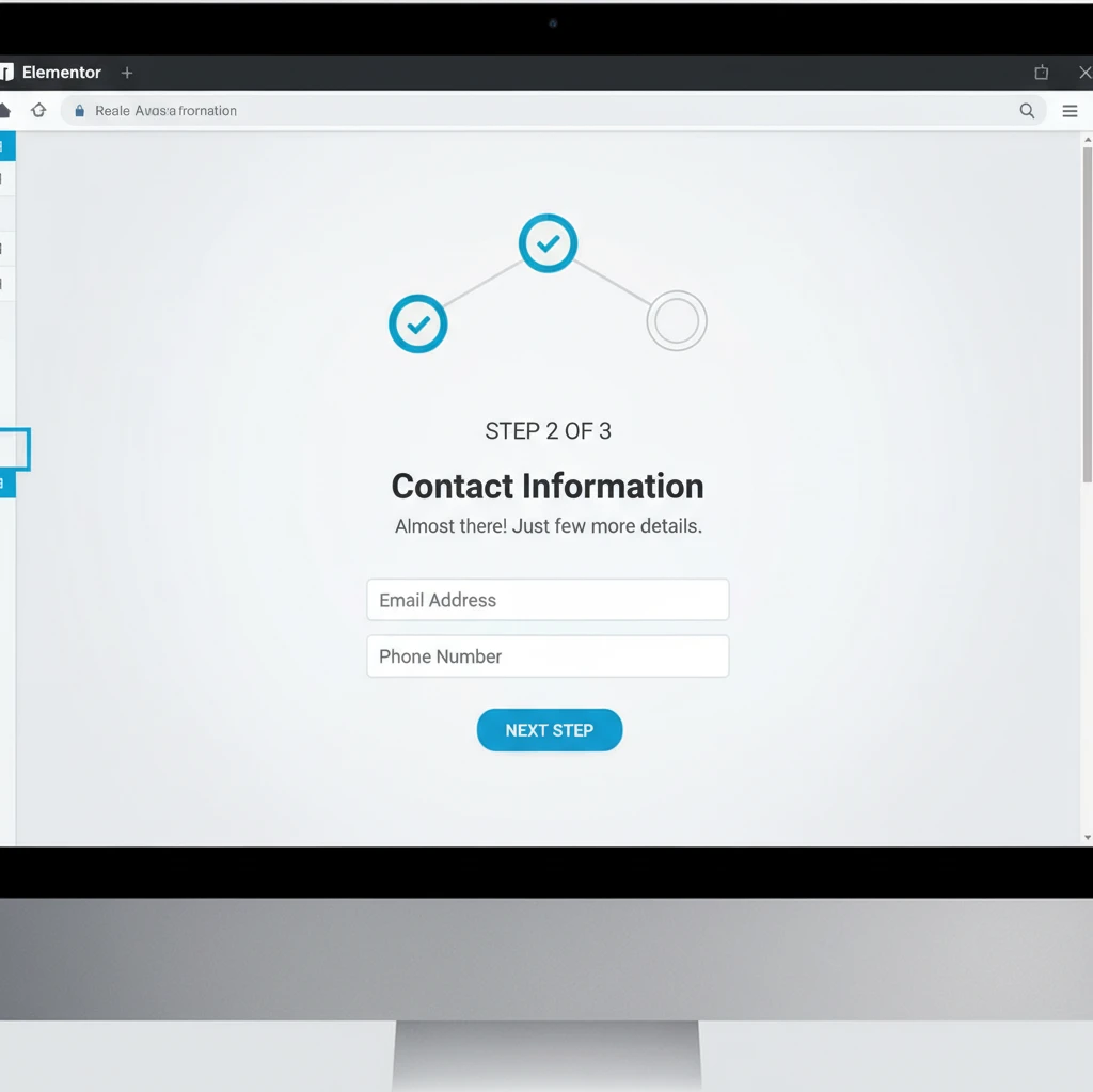
Elementor offers various widgets and plugins that allow you to easily create progress indicators and multi-step forms. Use clear and concise labels for each step to guide users through the process. Provide feedback and confirmation after each step to reassure users that they’re on the right track. By strategically using the Zeigarnik Effect, you can significantly improve conversion rates and create a more engaging user experience. A properly designed multi-step form can reduce abandonment and improve the quality of leads.
Design Matters: Optimizing Elementor CTA Appearance for Maximum Impact
The visual appeal of your Elementor call-to-action (CTA) is paramount. A well-designed CTA not only grabs attention but also influences user behavior, significantly increasing conversion rates. Many website visitors make subconscious judgments about your site’s credibility within seconds, and a poorly designed CTA can negatively impact that perception. In essence, the design should be intuitive, aesthetically pleasing, and aligned with your brand’s overall style guide.
Consider the entire user journey when designing your CTAs. Are users primarily accessing your site on desktop or mobile? Is your target audience more receptive to bold, attention-grabbing designs or subtle, understated ones? Answering these questions will help you tailor your CTA design to maximize its effectiveness. Remember, a compelling CTA is more than just a button; it’s a gateway to a desired action. Neglecting design best practices can lead to missed opportunities and decreased engagement.
Before diving into Elementor, brainstorm the desired emotions and associations. Do you want to convey urgency, excitement, or trustworthiness? The design elements you choose should directly reflect these goals. A/B testing various design iterations is vital to identify the most effective combination of elements that resonates with your target audience.
Color Psychology: Choosing Colors that Convert
Colors evoke different emotions and associations, and understanding color psychology is crucial for CTA design. For example, red often signifies urgency or excitement, while blue conveys trust and security. Green can suggest growth or environmental friendliness. However, the effectiveness of a color also depends on cultural context and the specific industry. What works for a tech startup may not work for a financial institution.
When selecting colors, consider the existing color palette of your website. The CTA should stand out but also complement the overall design. Use a color contrast checker to ensure sufficient contrast between the button’s text and background color, improving readability and accessibility. A high contrast ratio is especially important for users with visual impairments. Monochromatic color schemes can be effective, but they require careful execution to avoid a bland or monotonous appearance.
Avoid using colors solely based on personal preferences. Research what colors are commonly associated with your industry and analyze the color schemes used by successful competitors. Tools like Adobe Color can assist in creating harmonious and effective color palettes. Always test different color combinations with A/B testing to validate your assumptions and identify the most conversion-friendly options.
Font Choice and Readability: Ensuring Clarity and Accessibility
The font you choose for your CTA text significantly impacts readability and user experience. Select fonts that are clear, legible, and appropriate for your brand’s voice. Avoid overly stylized or decorative fonts that may be difficult to read, especially on smaller screens. Font size matters; ensure the text is large enough to be easily read, even by users with impaired vision. Consider the font weight (boldness) as well to make the text stand out.
Pay attention to font pairing if you’re using different fonts for your CTA text and the surrounding content. The fonts should complement each other and create a harmonious visual hierarchy. Google Fonts offers a wide selection of free, high-quality fonts that are compatible with Elementor. Use tools to ensure your font choices meet accessibility standards, such as sufficient contrast between the text and background colors. This will improve the user experience for everyone, including those with visual impairments; and that can also help improve Elementor website accessibility in general.
Line height (leading) and letter spacing (tracking) also play a crucial role in readability. Adjust these settings to optimize the spacing between lines and letters, making the text easier to scan and comprehend. A/B test different font sizes, weights, and styles to determine which combination yields the highest click-through rates. Remember, clarity is key. Your CTA text should immediately convey the desired action and its benefits.
White Space and Visual Hierarchy: Guiding the Eye to the CTA
White space, also known as negative space, is the empty area around your CTA that helps to isolate it from surrounding elements. Adequate white space makes the CTA more visually prominent and prevents it from being lost in the clutter. Use margins and padding within Elementor to create sufficient white space around your CTA button.
Establish a clear visual hierarchy to guide the user’s eye towards the CTA. This can be achieved through a combination of size, color, contrast, and positioning. The CTA should be the most prominent element on the page or section, clearly indicating its importance. Use headlines, subheadings, and supporting text to build a narrative that leads the user towards the CTA. Avoid overwhelming the user with too many competing elements. The goal is to create a smooth and intuitive user experience that encourages them to take action.
Consider using directional cues, such as arrows or lines, to visually guide the user’s eye towards the CTA. However, use these cues sparingly and avoid making them too distracting. A subtle arrow can be effective, while an overly large or flashy one can be counterproductive. Analyze heatmaps and user session recordings to understand how users interact with your page and identify areas where the visual hierarchy can be improved. Refine your design based on data-driven insights to optimize the effectiveness of your CTAs.
Mobile-First CTAs: Ensuring a Seamless Experience on All Devices
In 2026, a significant portion of website traffic originates from mobile devices. Therefore, designing mobile-first CTAs is no longer optional but a necessity. A CTA that looks great on a desktop screen may be unusable on a smartphone due to small size, poor placement, or lack of responsiveness. Prioritizing mobile design ensures a seamless user experience and maximizes conversion rates across all devices.
Use Elementor’s responsive design features to tailor your CTAs specifically for mobile devices. This includes adjusting button sizes, font sizes, spacing, and positioning. Test your CTAs on various mobile devices and screen sizes to ensure they are visually appealing and functional. Don’t assume that your desktop design will automatically translate well to mobile. Often, simplification and optimization are required. For example, using Elementor to optimize website loading speed can indirectly improve mobile CTA performance, as faster loading times lead to a better user experience.
Before launching a new CTA, conduct thorough mobile testing using tools like Google’s Mobile-Friendly Test or BrowserStack to identify and fix any issues. Neglecting mobile optimization can lead to a frustrating user experience and lost conversions.
Optimizing Button Size and Placement for Touchscreens
On touchscreens, button size is critical. Buttons that are too small are difficult to tap accurately, leading to frustration and abandonment. Ensure your CTA buttons are large enough to be easily tapped with a thumb. Aim for a minimum touch target size of 44×44 pixels, as recommended by accessibility guidelines. The ideal size may vary depending on the specific design and target audience, so A/B testing different sizes is recommended. Button placement is equally important.
Position CTAs in locations that are easily accessible on mobile devices, such as at the bottom of the screen or within easy reach of the thumb. Avoid placing CTAs too close to other interactive elements, as this can lead to accidental taps. Consider using a sticky CTA that remains visible as the user scrolls down the page. This ensures that the CTA is always within reach, increasing the chances of conversion.
However, be mindful of the impact of sticky CTAs on the overall user experience. If the CTA is too intrusive or covers too much of the screen, it can be annoying and counterproductive. Test different positions and styles to find the optimal balance between visibility and usability. Remember, the goal is to make it as easy as possible for users to take action on their mobile devices.
Reducing Clutter and Prioritizing Key Information
Mobile screens have limited space, so it’s crucial to reduce clutter and prioritize key information. Avoid displaying unnecessary elements that can distract users from the CTA. Focus on presenting the most important information concisely and clearly. Use short, compelling headlines and subheadings to grab attention and convey the value proposition.
Simplify your CTA design by removing any non-essential elements, such as excessive graphics or animations. A clean and uncluttered design is more likely to capture the user’s attention and encourage them to take action. Use visual cues strategically to guide the user’s eye towards the CTA, such as arrows or contrasting colors. But again, keep it simple and avoid overwhelming the user.
Condense the message of your CTA to its most essential elements. A long, verbose CTA is less likely to be read and understood on a small screen. Use action-oriented language and clearly communicate the benefits of clicking the CTA. For example, instead of “Learn More About Our Product,” try “Get Instant Access” or “Start Your Free Trial.” The goal is to make the value proposition immediately clear and compelling, even on a small screen.
Testing Mobile CTA Performance with A/B Testing
A/B testing is essential for optimizing mobile CTA performance. Test different variations of your CTAs to identify which ones yield the highest conversion rates. This includes testing different button sizes, colors, placements, and text. Use Elementor’s A/B testing capabilities or third-party plugins to conduct your tests. Mobile-specific A/B testing is crucial, as the optimal design for mobile devices may differ from the optimal design for desktops.
When conducting mobile A/B tests, focus on the metrics that are most relevant to your goals, such as click-through rate, conversion rate, and bounce rate. Pay close attention to how users interact with your CTAs on different mobile devices and screen sizes. Use analytics tools to track user behavior and identify areas where you can improve the user experience. Also, remember that by using pre-built components and templates from CopyElement, it’s possible to build websites (including CTAs) quickly, allowing you to iterate on designs and run tests more efficiently.
Continuously monitor and analyze your A/B testing results to identify winning variations and implement them on your website. A/B testing is an ongoing process, and it’s important to continuously refine your designs based on data-driven insights. What works today may not work tomorrow, so it’s essential to stay up-to-date with the latest mobile design trends and best practices.
Advanced Elementor Techniques: Dynamic CTAs and Conditional Logic
Take your Elementor CTAs to the next level by leveraging dynamic content and conditional logic. These advanced techniques allow you to personalize the user experience and display different CTAs based on specific user behaviors, demographics, or referral sources. This can significantly increase conversion rates by presenting users with relevant and targeted offers.
Dynamic content can be used to display personalized messages, offers, or product recommendations within your CTAs. For example, you could display a user’s name or location within the CTA text, making it more engaging and relevant. Conditional logic allows you to display different CTAs based on specific conditions, such as whether the user is logged in, whether they have visited a certain page, or whether they are a new or returning visitor. Mastering conditional logic is also essential to building complete sales funnels in Elementor, as detailed in this comprehensive guide.
These techniques require a more advanced understanding of Elementor and may require the use of plugins or custom code. However, the potential benefits in terms of increased conversion rates and improved user engagement are well worth the effort.
Personalizing CTAs Based on User Behavior (with Elementor Pro)
Elementor Pro offers powerful features for personalizing CTAs based on user behavior. You can use dynamic tags to display personalized information, such as the user’s name, location, or purchase history. This makes the CTA more relevant and engaging, increasing the likelihood of conversion. Furthermore, with Elementor Pro, you can utilize custom fields to display personalized information in your CTAs. This is helpful, for instance, in displaying different promotions or offers to users based on their membership level, a topic more comprehensively described in this guide on building a membership website with Elementor.
For example, if a user has previously purchased a specific product, you could display a CTA promoting a related product or service. If a user has visited a particular page on your website, you could display a CTA offering a discount on a product or service related to that page. Elementor Pro’s conditional display settings allow you to control which CTAs are displayed to which users based on specific conditions.
To fully leverage personalized CTAs, it’s crucial to gather data on user behavior and preferences. Use analytics tools to track user activity on your website and identify patterns that can inform your personalization strategy. The more data you have, the more effectively you can personalize your CTAs and increase conversion rates. Remember to comply with privacy regulations and obtain user consent before collecting and using personal data.
Displaying Different CTAs Based on Referral Source
Understanding where your website traffic originates from is crucial for optimizing your marketing efforts. Displaying different CTAs based on the referral source can significantly improve conversion rates by presenting users with offers that are tailored to their interests and expectations. For example, users who arrive from a social media campaign may be more receptive to a CTA promoting a free trial or a discount. Users who arrive from a search engine may be more interested in a CTA providing valuable information or resources.
You can use Elementor’s conditional logic features, combined with URL parameters or cookies, to identify the referral source and display the appropriate CTA. For example, if a user arrives with a specific UTM parameter in the URL, you can display a CTA that is relevant to that campaign. Alternatively, you can use a plugin or custom code to detect the referral source and set a cookie, which can then be used to control the display of different CTAs. Additionally, it helps to integrate your website with AI marketing automation tools; as discussed here: Unlock SMB Growth: AI Automation & WordPress by 610 Digital
Before implementing referral-based CTAs, carefully analyze your website traffic data to identify the most important referral sources and their associated conversion rates. Focus on tailoring your CTAs to the referral sources that drive the most traffic and have the highest potential for conversion. A/B test different CTA variations for each referral source to optimize their effectiveness. Remember, the goal is to provide a seamless and relevant experience for users, regardless of how they arrive at your website.
Using Conditional Logic to Guide Users Through a Conversion Path
Conditional logic is a powerful tool for guiding users through a conversion path, leading them step-by-step towards a desired action. By displaying different CTAs based on the user’s previous actions or current stage in the funnel, you can create a more personalized and effective experience. For example, a new visitor might be presented with a CTA to sign up for a free email course. Once they have signed up, they could be presented with a CTA to download a free ebook. After downloading the ebook, they could be presented with a CTA to purchase a premium product or service.
Use Elementor’s conditional display settings to create a sequence of CTAs that gradually move users towards the ultimate conversion goal. Each CTA should be designed to address the user’s current needs and concerns, providing them with the information and resources they need to take the next step. Consider using progress indicators to visually represent the user’s progress through the conversion path. This can help to motivate them to continue moving forward.
Before implementing a conditional conversion path, carefully map out the user journey and identify the key touchpoints where CTAs can be used to guide the user towards the desired action. A/B test different CTA sequences to optimize their effectiveness and identify any bottlenecks in the conversion path. Remember, the goal is to create a smooth and intuitive experience that encourages users to complete the desired action.
A/B Testing Your Elementor CTAs: Data-Driven Optimization
A/B testing is the cornerstone of data-driven optimization for your Elementor CTAs. It allows you to systematically test different variations of your CTAs and identify which ones perform best in terms of key metrics like click-through rate and conversion rate. By continuously A/B testing your CTAs, you can ensure that they are always optimized for maximum impact.
The A/B testing process involves creating two or more variations of a CTA (e.g., different colors, text, or placements) and then showing these variations to different segments of your website traffic. By tracking the performance of each variation, you can determine which one is most effective and implement it on your website. A/B testing is not a one-time event but rather an ongoing process. As your website and audience evolve, you should continuously test new ideas and optimize your CTAs to maintain their effectiveness. Furthermore, if you’re using CopyElement to build your website, remember that you may need to implement advanced CSS styling tricks to ensure that the A/B test variations look and function as intended.
Before launching an A/B test, it’s crucial to define clear goals and hypotheses. What are you trying to achieve with the test? What changes do you expect to see? By clearly defining your goals and hypotheses, you can ensure that your A/B tests are focused and effective.
Key Metrics to Track: Click-Through Rate, Conversion Rate, Bounce Rate
When A/B testing your Elementor CTAs, there are several key metrics that you should track to measure their performance. Click-through rate (CTR) is the percentage of users who click on the CTA. A higher CTR indicates that the CTA is effective at capturing attention and encouraging users to take action. Conversion rate is the percentage of users who complete the desired action after clicking on the CTA. A higher conversion rate indicates that the CTA is effective at persuading users to complete the desired action. Bounce rate is the percentage of users who leave your website after viewing only one page. A high bounce rate may indicate that the CTA is not relevant to the user’s needs or that the page is not providing a good user experience.
In addition to these primary metrics, you may also want to track other metrics, such as time on page, scroll depth, and engagement rate. These metrics can provide valuable insights into how users are interacting with your CTAs and your website as a whole. Use analytics tools like Google Analytics or Matomo to track these metrics and analyze your A/B testing results. Remember to set up conversion tracking to accurately measure the number of users who complete the desired action after clicking on the CTA.
Analyze the data to determine statistical significance. A small difference in results might be due to chance and not indicate a real winner. Statistical significance ensures your findings are reliable.
Elementor A/B Testing Plugins and Tools
While Elementor Pro offers built-in A/B testing capabilities, there are also several third-party plugins and tools that can enhance your A/B testing efforts. These plugins and tools often provide more advanced features, such as multivariate testing, advanced targeting options, and detailed reporting. Some popular Elementor A/B testing plugins include Nelio A/B Testing, AB Press Optimizer, and Google Optimize (requires some coding knowledge). Each plugin has its own strengths and weaknesses, so it’s important to choose the one that best suits your needs and budget.
Consider factors such as ease of use, features, pricing, and customer support when making your decision. Some plugins offer free trials or free versions, allowing you to test them out before committing to a purchase. In addition to plugins, there are also several standalone A/B testing tools that can be used in conjunction with Elementor. These tools often offer more advanced features and integrations, but they may also be more expensive and require more technical expertise.
Regardless of which plugin or tool you choose, it’s important to ensure that it is compatible with Elementor and that it integrates seamlessly with your website. Conduct thorough testing to ensure that the plugin or tool is functioning correctly and that it is accurately tracking your A/B testing results.
Common A/B Testing Mistakes to Avoid
Even with the right tools and techniques, it’s easy to make mistakes when A/B testing your Elementor CTAs. Avoiding these common mistakes can help you ensure that your A/B tests are accurate and effective. One common mistake is testing too many elements at once. When you test multiple elements simultaneously, it’s difficult to determine which element is responsible for the observed changes in performance. It’s better to test one element at a time, allowing you to isolate its impact and accurately measure its effectiveness.
Another common mistake is not running your A/B tests for long enough. A/B tests need to run for a sufficient amount of time to gather enough data to reach statistical significance. A short A/B test may produce misleading results due to random fluctuations in traffic. A good rule of thumb is to run your A/B tests for at least one or two weeks, or until you have reached statistical significance. Also, ensure a large enough sample size. Small traffic volumes can lead to inconclusive results.
Failing to properly segment your audience is another frequent error. Different segments of your audience may respond differently to different CTA variations. Segment your audience based on factors such as demographics, behavior, or referral source to ensure that your A/B tests are relevant and accurate. Finally, neglecting to document your A/B testing process can make it difficult to learn from your mistakes and improve your future A/B tests. Keep detailed records of your goals, hypotheses, variations, and results. Use this information to continuously refine your A/B testing strategy and optimize your Elementor CTAs for maximum impact.
Examples: Conversion-Focused Elementor CTA Design in Action
Landing Page CTAs for SaaS Products
For SaaS products, the landing page CTA is crucial for driving sign-ups and free trial activations. A successful CTA clearly communicates the value proposition and minimizes friction. Consider using contrasting colors to make the CTA button visually distinct. A/B testing different copy variations, such as “Start Your Free Trial,” “Get Started,” or “See a Demo,” can reveal which resonates best with your audience. Implement clear microcopy around the button to address potential concerns and reinforce the benefits. For example, next to a “Start Free Trial” button, you could add “No credit card required” to ease anxieties. Pay close attention to placement; above-the-fold placement is often optimal, but experiment with strategic placement further down the page to re-engage users who are scrolling. A great design is crucial, but equally important is technical SEO. Slow pages kill conversions, so be sure to optimize those landing pages.
Example: A project management SaaS company, “TaskMaster,” redesigned their landing page CTA, moving it above the fold and changing the copy from “Learn More” to “Try TaskMaster Free for 14 Days.” They saw a 35% increase in free trial sign-ups within the first month. A key element was also the addition of a short, benefit-driven explainer video near the CTA. Ensuring the site is mobile-friendly is also an important factor. Remember to offer alternatives such as “Watch Demo” so that the users get a chance to learn a bit more before commiting to the trial.
E-commerce CTAs: Product Pages and Checkout Flows
In e-commerce, effective CTAs guide users seamlessly through the purchase process. On product pages, “Add to Cart” or “Buy Now” buttons should be prominent and use contrasting colors that align with the brand. Including trust signals, such as security badges or money-back guarantees, near the CTA can boost confidence and reduce cart abandonment. Optimize the checkout flow by minimizing the number of steps and providing clear progress indicators. Use strong action verbs and keep the language concise and benefit-oriented. For example, instead of a generic “Submit” button, use “Place Your Order Now.” Consider implementing urgency triggers like limited-time offers or low stock indicators to encourage immediate action. You can greatly enhance the experience by building a custom WooCommerce product page with Elementor.
Example: An online clothing retailer, “StyleHub,” optimized their product page CTAs by A/B testing different button colors and copy. They found that a bright orange “Add to Bag” button with a small “Free Shipping on Orders Over $50” badge nearby resulted in a 22% increase in conversion rates. The most crucial element was reducing the steps to checkout. Users often get tired of seeing too many hurdles. Adding a payment gateway like Paypal and Stripe can also significantly improve sales.
Lead Generation CTAs for Service-Based Businesses
Service-based businesses rely on lead generation to fuel growth. Effective CTAs encourage visitors to request a quote, schedule a consultation, or download a valuable resource. Use lead magnets, such as free ebooks, checklists, or templates, to incentivize sign-ups. Your CTA copy should emphasize the benefit of taking action and address the prospect’s pain points. For example, a financial advisor might use a CTA like “Download Our Free Retirement Planning Guide” or “Schedule a Free Consultation to Discuss Your Financial Goals.” Consider using multi-step forms to qualify leads and gather more information before offering a consultation. Place CTAs strategically throughout your website, including the homepage, blog posts, and service pages. Be sure your value proposition is clear, concise, and easy to understand.
Example: A local marketing agency, “WebBoost,” implemented a lead magnet offering a free website SEO audit. Their CTA, “Get Your Free SEO Audit Now,” was placed prominently on their homepage and blog posts. This resulted in a 40% increase in qualified leads within two months. It’s important to note that many sites don’t have enough CTAs. Don’t be afraid to place several in different sections of your website.
Performance Optimization: Ensuring Your CTAs Load Quickly and Efficiently
Image Optimization for CTA Buttons
Large, unoptimized images can significantly slow down your website’s loading speed, negatively impacting user experience and conversion rates. When using images for CTA buttons or graphical elements within CTAs, always optimize them for the web. This includes compressing images to reduce file size without sacrificing quality. Use appropriate image formats, such as WebP, which offers superior compression compared to JPEG and PNG. Consider using image optimization plugins for WordPress that automatically compress and resize images upon upload. Tools like TinyPNG or ImageOptim can also be used for manual optimization before uploading to Elementor. Furthermore, always specify the width and height attributes in the tag to prevent layout shifts during page load. Aim for image sizes that are appropriate for the display area; there’s no need to use a 2000px wide image for a button that’s only 200px wide. A fast website is essential for a great user experience.
Leveraging Browser Caching and CDN for Faster Loading
Browser caching allows visitors’ browsers to store static assets, such as images and CSS files, locally. This means that subsequent page loads will be much faster, as the browser doesn’t need to re-download these assets. Enable browser caching in your web server configuration or using a caching plugin for WordPress. A Content Delivery Network (CDN) further enhances performance by distributing your website’s content across multiple servers located around the world. This ensures that visitors are served content from the server closest to their location, reducing latency and improving loading speed. Popular CDN providers include Cloudflare and KeyCDN. Combining browser caching with a CDN can dramatically improve your website’s performance, particularly for geographically diverse audiences.
Minimizing HTTP Requests for Improved Page Speed
Each element on your website, including images, CSS files, and JavaScript files, requires an HTTP request to download from the server. Minimizing the number of HTTP requests can significantly improve page loading speed. Combine CSS and JavaScript files into fewer files to reduce the number of requests. Use CSS sprites to combine multiple small images into a single image file, reducing the number of image requests. Remove any unnecessary plugins or scripts that are adding to the HTTP request count. Lazy loading images is another effective technique; this delays the loading of images until they are visible in the viewport, reducing the initial page load time. You can explore more techniques on how to optimize your Elementor website loading speed for enhanced user experience. A well-optimized website is essential in 2026.
Maintaining Momentum: Regularly Reviewing and Updating Your Elementor CTAs
Analyzing Performance Data and Identifying Areas for Improvement
Once your CTAs are live, it’s crucial to monitor their performance using analytics tools like Google Analytics or dedicated heatmapping software. Track metrics such as click-through rates (CTR), conversion rates, and bounce rates to understand how users are interacting with your CTAs. Identify underperforming CTAs and investigate potential reasons for their lack of success. Are they poorly placed? Is the copy unclear or uncompelling? Are they visually unappealing? Conduct A/B tests to experiment with different variations of your CTAs, such as button colors, copy, placement, and surrounding design elements. Regularly analyze your data to identify trends and patterns, and use these insights to optimize your CTAs for maximum effectiveness. Pay close attention to mobile vs. desktop performance, as user behavior can vary significantly across devices.
Keeping Up with the Latest Design Trends and Best Practices
Website design trends are constantly evolving, and it’s important to stay up-to-date with the latest best practices for CTA design. Follow industry blogs, attend webinars, and experiment with new design techniques to keep your CTAs fresh and engaging. Consider incorporating modern design elements, such as neumorphism, glassmorphism, or minimalist design, to create visually appealing CTAs that capture users’ attention. Pay attention to accessibility guidelines to ensure that your CTAs are usable by people with disabilities. Furthermore, learn about top new Elementor features and website design trends to ensure your designs stay current. Remember that design is not static; it’s a continuous process of learning and adaptation. Keeping a close eye on your competitors is a great strategy.
Adapting CTAs to Changing User Behavior and Business Goals
User behavior and business goals are not static; they evolve over time. Your CTAs should be adaptable to these changes. As your business expands and your target audience shifts, your CTAs may need to be updated to reflect these changes. For example, if you’re launching a new product or service, you’ll need to create new CTAs to promote it. If you’re targeting a new demographic, you may need to adjust your CTA copy and design to resonate with their specific needs and preferences. Regularly review your business goals and ensure that your CTAs are aligned with these goals. Be prepared to experiment with new approaches and adapt your CTAs as needed to maximize their effectiveness. Successful adaptation is the key to long-term success.
Checklist: Creating High-Converting Call-to-Actions with Elementor
Use this checklist as a guide when creating or optimizing your CTAs with Elementor:
- Define Your Goal: What specific action do you want users to take?
- Craft Compelling Copy: Use strong action verbs and highlight the benefits.
- Choose the Right Placement: Experiment with different locations on the page.
- Optimize Visual Design: Use contrasting colors, clear typography, and engaging imagery.
- Ensure Mobile Responsiveness: Make sure your CTAs look good and function well on all devices.
- Optimize Loading Speed: Compress images, leverage browser caching, and minimize HTTP requests.
- Add Trust Signals: Include security badges, guarantees, or testimonials to build confidence.
- A/B Test Regularly: Experiment with different variations to identify what works best.
- Track Performance: Monitor key metrics like CTR and conversion rates.
- Adapt and Improve: Continuously refine your CTAs based on data and feedback.
By consistently applying these steps, you can create high-converting CTAs that drive results for your Elementor website. Creating effective CTAs isn’t a one-time task. It’s an ongoing process of testing, refining, and adapting to your audience and their evolving needs.