The key lies in understanding how these dynamic components contribute to a superior user experience. Interactive elements aren’t just about visual flair; they are functional tools that simplify complex information, provide feedback, and make navigation intuitive. Elementor’s robust feature set provides a wealth of options to achieve this, allowing for sophisticated designs without the need for custom coding.
Beyond Static: Breathing Life into Your Elementor Designs
Why dynamic elements are crucial for modern web engagement
Dynamic elements are no longer a luxury; they are a necessity for capturing and retaining user attention. In an era of information overload, websites that offer interactive features stand out, providing a more memorable and enjoyable experience. These elements break the monotony of scrolling through blocks of text and static images, encouraging users to explore further. For instance, an animated counter highlighting the number of satisfied clients can instill trust, while an interactive timeline can make historical data more digestible. By making your website a two-way conversation rather than a one-way broadcast, you foster a deeper connection with your audience. This increased engagement directly translates into longer dwell times, lower bounce rates, and a higher likelihood of conversion, as users are more invested in the content. Implementing these elements can be a significant factor in how users perceive your brand’s professionalism and innovation.
Understanding user expectations in 2026 for interactive experiences
By 2026, user expectations for website interactivity have evolved considerably. Visitors now anticipate seamless, intuitive, and responsive interfaces that feel tailored to their needs. This includes features like subtle animations that provide visual feedback upon interaction, expandable content sections that declutter pages, and personalized forms that adapt based on user input. Users appreciate websites that offer clear calls to action and guide them effortlessly towards their goals. A professional website in 2026 is expected to be visually appealing, performant, and, critically, highly interactive. This means going beyond basic click-and-hover effects to incorporate elements that genuinely improve usability and delight the user. For example, a user searching for information expects to find it quickly and easily, and interactive elements like well-organized accordions or tabbed interfaces significantly contribute to this efficiency. To truly succeed, a focus on accessible web design should also be a priority, ensuring these interactive experiences are available to all users.
Mastering Elementor’s Built-in Interactive Widgets
Accordion & Tabs: Organizing Content for Clarity
Accordions and tabs are indispensable tools within Elementor for managing and presenting information in a structured, user-friendly manner. They are particularly effective for pages with extensive content that could overwhelm visitors if displayed all at once. By using accordions, you can create collapsible sections that reveal detailed information only when a user clicks on the header, thereby reducing initial page clutter and improving scanability. Tabs serve a similar purpose, allowing you to group related content into distinct categories, each accessible through a clickable tab. This segmentation helps users quickly find the specific information they are looking for. When implementing these widgets, consider the logical flow of your content. For instance, an FAQ section benefits greatly from an accordion structure, while product features might be best organized using tabs. A common pitfall is over-nesting or poor labeling, which can confuse users. Ensure your tab titles and accordion headers are clear, concise, and accurately reflect the content within.
Toggles & Flip Boxes: Adding Visual Delight and Information
Elementor’s Toggle and Flip Box widgets offer creative ways to present information while adding a touch of visual flair and interactivity. Toggles, similar to accordions but often used for simpler on/off states or brief content reveals, are excellent for displaying settings, features, or short explanatory blurbs. They provide a clean way to switch between two states or reveal hidden content with a simple click. Flip Boxes take interactivity a step further by providing two distinct sides, often with different content or calls to action. A common and effective use case is displaying a service with a brief overview on the front and detailed benefits or a CTA on the back, revealed upon hovering or clicking. These elements can significantly enhance user engagement by adding an element of surprise and discovery. When using Flip Boxes, ensure the front and back content are complementary and the visual transition is smooth, not jarring. Poorly designed flip boxes can sometimes feel gimmicky, so it’s important to use them where they genuinely add value to the user experience rather than just for decoration.
Progress Bars & Skill Bars: Showcasing Achievements and Progress
Progress bars and skill bars in Elementor are powerful visual tools for communicating achievements, expertise, or project progression. Progress bars are ideal for illustrating the completion status of a task, a goal, or even the stages of a service offering, giving users a clear visual cue of how far along something is. Skill bars, on the other hand, are commonly used to represent proficiency levels in various skills, whether it’s for an individual’s portfolio or for showcasing the capabilities of a team or company. For example, a web design agency might use skill bars to highlight their expertise in areas like UX design, SEO, or responsive development. The effectiveness of these widgets lies in their visual impact; they simplify complex data into easily understandable graphical representations. When using them, ensure the percentages or levels displayed are accurate and meaningful. Misleading skill bars can damage credibility. Consider using animation to make them more engaging as they load or update, drawing the user’s eye to this valuable information.
Countdown Timers & Animated Counters: Creating Urgency and Impact
Countdown timers and animated counters are dynamic widgets that can significantly boost engagement by creating a sense of urgency or highlighting key metrics. Countdown timers are invaluable for limited-time offers, event registrations, or product launches, compelling users to act before time runs out. The visual representation of dwindling time can be a powerful psychological trigger for conversion. Animated counters, conversely, are excellent for showcasing impressive statistics, such as the number of projects completed, customers served, or downloads achieved. The animation of numbers ticking up from zero to their final value draws attention and makes these figures more compelling and memorable. When implementing a countdown timer, ensure the offer or event it relates to is clearly communicated and genuinely time-sensitive. For animated counters, use them to highlight genuinely impressive achievements that build trust and authority. Overuse or misapplication of these widgets can detract from their impact and potentially appear disingenuous.
Leveraging Advanced Effects for Enhanced User Journeys
Parallax Scrolling: Adding Depth and Professionalism
Parallax scrolling is an advanced visual technique where background content moves at a different speed than foreground content as the user scrolls. In Elementor, this effect can be achieved with relative ease, adding a sophisticated, multi-dimensional feel to your website. It creates a sense of depth, making your design appear more professional and immersive. This effect is particularly effective for hero sections, breaking up long pages, or highlighting specific content areas. For example, a travel website might use parallax to show distant scenery moving slower than foreground text describing a destination. The key to successful parallax implementation is subtlety. Overdoing it can lead to a disorienting user experience and potential performance issues. Ensure the scrolling speed is well-balanced and doesn’t hinder readability or navigation. It’s also crucial to test this effect across various devices and screen sizes, as it can sometimes behave unpredictably on smaller screens or less powerful hardware. Properly implemented, parallax scrolling can dramatically elevate the visual appeal of your Elementor-built site.
Mouse Effects: Drawing User Attention and Interactivity
Elementor offers a variety of mouse effects that can dynamically engage users by responding to their cursor movements. These effects range from subtle background animations that follow the mouse cursor to interactive elements that change appearance or animate when hovered over. For example, you could implement a “particle” effect where small dots trail the mouse, or have a button subtly glow or expand as the cursor approaches. Such interactions make the user feel more connected to the website, transforming passive browsing into an active exploration. They can also be strategically used to draw attention to important call-to-action buttons or key content areas. When designing with mouse effects, prioritize user experience over novelty. Effects that are too distracting, laggy, or obscure content can be detrimental. Ensure the effects are subtle, provide clear visual feedback, and do not impede navigation or readability. Testing these effects across different browsers and devices is essential to guarantee a consistent and positive user experience.
Sticky Elements: Keeping Key Content Visible
Sticky elements in Elementor allow you to fix certain sections or widgets to the screen as the user scrolls, ensuring crucial content remains in view. This is incredibly useful for navigation menus, call-to-action buttons, or important contact information that you want to remain accessible at all times. For instance, a sticky header with a prominent “Book Now” button can significantly increase conversion rates by providing an immediate pathway for interested users. Similarly, a sticky sidebar could display related content or social media links. The advantage of sticky elements is their ability to improve user flow and reduce the effort required to access important features. However, it’s vital to use them judiciously. An overly large or poorly positioned sticky element can obstruct content and lead to a frustrating user experience. Always ensure the sticky element is compact, well-designed, and doesn’t cover critical parts of the page. It’s also good practice to have a clear way for users to dismiss or hide the sticky element if it becomes intrusive.
Interactive Forms That Convert: Beyond Basic Input
Conditional Logic for Personalized User Experiences
Conditional logic transforms standard forms into intelligent tools that adapt to user input, offering a highly personalized experience. In Elementor, this means showing or hiding specific fields, changing options, or even displaying different messages based on previous answers. For example, if a user selects “Yes” to owning a pet, a field for “Pet Type” might appear. Conversely, if they select “No,” this field is bypassed. This not only makes the form-filling process more efficient and less intimidating for the user by only presenting relevant questions, but it also allows you to gather more targeted and accurate data. Implementing conditional logic effectively requires careful planning of the user journey and the data you aim to collect. A common pitfall is creating overly complex logic that becomes difficult to manage or leads to confusing user paths. Ensure your conditional rules are clear, logical, and contribute to a smooth, intuitive interaction, ultimately improving your conversion rates.
Multi-step Forms for Better Data Collection and User Flow
Elementor’s capability to create multi-step forms is a game-changer for collecting detailed information without overwhelming users. By breaking down a lengthy form into several smaller, manageable steps, you significantly improve completion rates and reduce user drop-off. Each step can focus on a specific category of information, making the process feel less daunting. For instance, a job application form could have steps for personal details, work experience, education, and skills. Visual progress indicators within the form (e.g., “Step 2 of 5”) further guide the user and manage expectations. This approach is particularly beneficial for complex applications, service requests, or detailed surveys. When designing multi-step forms, ensure each step is logically ordered and clearly delineated. Provide clear “Next” and “Previous” buttons, and allow users to review their answers before final submission. This structured approach not only enhances user experience but also leads to higher quality data collection.
Integrating Forms with Popups and Modals
Integrating Elementor forms into popups and modals is a highly effective strategy for lead generation and user engagement without disrupting the primary website flow. Popups and modals allow you to present forms in a temporary, overlay window that appears at specific times or in response to user actions. This can include exit-intent popups, time-delayed popups, or those triggered by a button click. For example, a modal popup could offer a discount code in exchange for an email address, or an exit-intent popup might present a lead magnet to capture a visitor before they leave. The key to successful integration is thoughtful design and precise timing. Popups that are too aggressive, too frequent, or difficult to close can annoy users and negatively impact their experience. Ensure your popups are visually appealing, clearly state the value proposition, and offer an easy way to dismiss them. This strategic use of forms within overlays can significantly boost your lead capture efforts and drive conversions.
Elevating Navigation with Interactive Menus and Headers
Effective website navigation is paramount for user experience (UX) and search engine optimization (SEO). Elementor empowers creators to build sophisticated, interactive menus and headers that not only guide visitors but also enhance engagement. Moving beyond static links, these elements can incorporate visual cues, dynamic behaviors, and responsive designs. When choosing navigation elements, consider site structure clarity, visual appeal, and accessibility. Pitfalls to avoid include overcrowding menus, using overly complex animations that hinder usability, and failing to ensure responsiveness across all devices. For instance, a financial services website might benefit from a mega menu showcasing clear service categories, while a creative agency could use a visually rich header with a subtle animation.
Mega Menus with Visual Elements
Mega menus are ideal for websites with extensive content or numerous product categories, offering a more structured and visually appealing alternative to traditional dropdowns. Elementor allows for the creation of these expansive menus by incorporating widgets like image carousels, icon lists, and even shortcodes directly within the menu structure. The key decision criterion here is information architecture – can the mega menu be organized logically and intuitively? Avoid the pitfall of creating a visually overwhelming or slow-loading mega menu; optimize images and limit the number of interactive elements. An effective example is an e-commerce site that uses a mega menu to display product images and highlight promotions within specific categories, significantly improving product discovery.
Sticky Headers with Dynamic Backgrounds
A sticky header, which remains visible as the user scrolls down a page, is an excellent tool for maintaining consistent access to navigation and branding. Elementor makes it simple to implement this feature and add dynamic flair. Decision criteria should focus on brand consistency and user comfort; the header should be prominent but not intrusive. A common pitfall is making the sticky header too tall, consuming excessive screen real estate. Consider a dynamic background that subtly changes color or opacity as the user scrolls, providing visual feedback and a more engaging experience. A travel blog could use a sticky header where the background image subtly animates upon scrolling, reinforcing the destination’s theme.
Hamburger Menus with Smooth Transitions
For mobile-first design or minimalist websites, the hamburger menu is a standard yet effective navigation solution. Elementor facilitates the creation of aesthetically pleasing hamburger menus with smooth, modern transitions. The primary decision criterion is space optimization without sacrificing usability. A pitfall is using jarring or overly complex animations for the menu reveal, which can disorient users. Instead, opt for subtle, fluid transitions that provide a polished feel. For example, a restaurant website could implement a hamburger menu where the icon smoothly transforms into an ‘X’ upon opening, and the menu slides in from the side with a gentle fade-in effect, making it easy to access the restaurant’s menu or booking options.
Showcasing Visuals Dynamically: Galleries and Carousels Reimagined
Presenting visual content is crucial for many websites, and Elementor offers powerful tools to create engaging image galleries and carousels that go beyond static displays. These dynamic elements can significantly enhance user interaction and keep visitors on your site longer. When implementing visual showcases, prioritize visual storytelling, performance, and responsiveness. Common pitfalls include using unoptimized images that slow down page load times, creating carousels with too many slides that overwhelm users, or designing galleries that are difficult to navigate on mobile devices. An effective example would be a photographer’s portfolio using a carousel that smoothly transitions between high-resolution images, with clear call-to-action buttons overlayed.
Image Carousels with Overlays and Captions
Image carousels are a versatile way to display multiple images in a compact space. Elementor allows for rich customization, including the addition of text overlays, captions, and call-to-action buttons. The key decision criterion is clarity of message; captions and overlays should enhance understanding, not clutter the visual. A pitfall to avoid is using lengthy captions that break the layout or making the carousel auto-play too quickly, preventing users from reading the information. For instance, a real estate website could use a carousel to showcase property listings, with each slide featuring a brief description, price, and a prominent “View Details” button overlayed on the image.
Interactive Portfolio Grids with Filtering
For designers, artists, and agencies, an interactive portfolio grid is essential for showcasing work. Elementor’s portfolio widgets enable the creation of dynamic grids with filtering capabilities, allowing users to sort projects by category, skill, or type. The primary decision criterion is user-driven exploration; the filtering system should be intuitive and efficient. A pitfall is creating too many filter categories or having a slow response time when applying filters, which can frustrate users. An effective example is a web design agency’s portfolio using a filterable grid that allows potential clients to view projects by industry (e.g., e-commerce, SaaS, non-profit) or service (e.g., UX/UI design, development, branding).
Lightbox Integrations for an Immersive Viewing Experience
A lightbox is a pop-up window that dims the background and displays a selected image or video in full size, offering an immersive viewing experience without leaving the current page. Elementor integrates seamlessly with lightbox functionality, enhancing the impact of your visuals. The decision criterion is enhancement of detail; lightboxes are best used for showcasing high-quality images or detailed graphics. A pitfall is implementing lightboxes for every single image, which can become tedious. Instead, use them strategically for featured artwork, product close-ups, or detailed infographics. A travel photographer might use a lightbox to display stunning landscape shots from their gallery, allowing viewers to appreciate the intricate details of each photograph.
Animation and Micro-interactions: The Subtle Art of Engagement
Animations and micro-interactions are the small, often subtle visual cues that make a website feel alive and responsive. Elementor provides a robust set of tools to implement these elements, transforming a static page into a dynamic user experience. The goal is to enhance engagement and guide user attention without being distracting. Key decision criteria include purposeful animation and performance optimization. Avoid the pitfall of excessive or gratuitous animation that slows down the site or detracts from the content. For example, subtle animations can indicate a successful form submission or highlight an active menu item, providing instant feedback.
Entrance Animations for Impactful Content Reveal
Entrance animations draw attention to content as it appears on the screen, creating a more engaging unveiling experience. Elementor allows for a variety of entrance effects that can be applied to widgets and sections. When choosing these animations, prioritize content hierarchy and user flow. A pitfall is using overly dramatic animations that take too long to load or cause disorientation. Opt for animations that are smooth and enhance the readability of the content. A blog post could use a subtle fade-in or slide-up animation for its main headings and paragraphs, making the content appear progressively and pleasantly as the user scrolls.
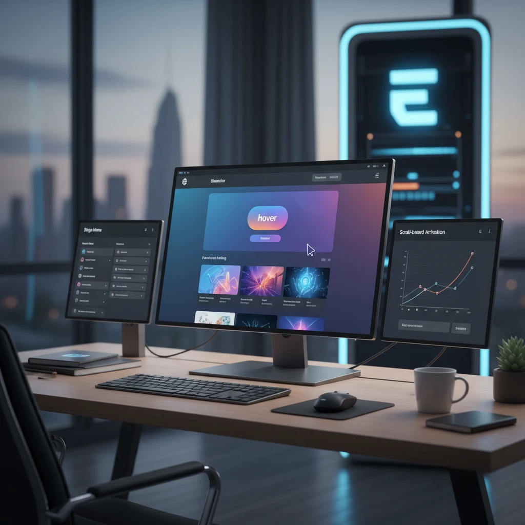
Hover Effects on Buttons and Cards
Hover effects are micro-interactions triggered when a user’s mouse pointer moves over an element, such as a button or a card. These effects provide visual feedback and can encourage interaction. Elementor offers intuitive controls for customizing hover states. The primary decision criterion is clear affordance; the hover effect should signal that an element is interactive and clickable. Avoid making hover effects too subtle to notice or too drastic that they disrupt the design. For instance, a product card in an online store might change its border color, subtly enlarge, or display an “Add to Cart” button on hover, clearly indicating it’s an actionable item.
Subtle Animations to Guide User Attention
Beyond entrance animations and hover effects, subtle animations can be strategically employed to guide user attention towards important elements or provide visual cues for interaction. These might include pulsating icons, animating progress bars, or subtle parallax scrolling effects. The decision criterion here is intentful guidance; animations should serve a clear purpose in directing the user. A common pitfall is using animations that are distracting or compete with the main content. For example, a blinking notification icon or a subtle animation on a required form field can effectively draw the user’s eye to where action is needed, improving form completion rates.
Building Interactive Landing Pages with CopyElement Templates
Crafting high-converting landing pages often requires dynamic elements that capture and retain visitor interest. CopyElement provides a rich library of Elementor templates and components specifically designed for this purpose, streamlining the creation of interactive and effective landing pages. The core decision criterion is conversion optimization; every interactive element should contribute to the page’s primary goal. A significant pitfall is overusing interactivity to the point of distraction, which can detract from the main call to action. Instead, focus on elements that guide the user journey and build trust. For example, a landing page for a new SaaS product could feature an interactive demo carousel or animated feature highlights.
Utilizing Pre-built Interactive Sections for Faster Workflows
CopyElement’s pre-built sections offer ready-made interactive components that can be dropped into any Elementor page, dramatically accelerating development. These sections often include elements like animated counters, testimonial sliders, or dynamic icon boxes, all designed with user engagement in mind. The primary decision criterion is template suitability; select sections that align with your landing page’s objective and brand aesthetic. A pitfall is blindly accepting default designs without customization, which can lead to a generic look. Instead, use these pre-built assets as a foundation and tailor them to your specific needs. This approach aligns with the goal of faster website development workflows facilitated by tools like CopyElement, as detailed in Master”>https://blog.copyelement.com/master-elementor-faster-website-workflows/”>Master Elementor: Faster Website Workflows.
Customizing Dynamic Elements within CopyElement Templates
While CopyElement templates provide a robust starting point, true customization of their dynamic elements is key to creating unique and effective landing pages. Elementor’s interface allows users to tweak animations, colors, typography, and interactive behaviors within these templates. The decision criterion is brand alignment and user experience; ensure customizations enhance, rather than detract from, the overall message and usability. A common pitfall is making complex code modifications without understanding the implications, which can break functionality. Instead, leverage Elementor’s intuitive controls to adjust timing, easing, and trigger conditions for animations, as well as interactive states for buttons and forms, to perfectly match your campaign’s requirements. For advanced customization, explore resources on Elementor:”>https://blog.copyelement.com/elementor-advanced-css-for-unique-designs/”>Elementor: Advanced CSS for Unique Designs.
Examples of High-Converting Interactive Landing Pages
Successful landing pages often integrate interactive elements that guide visitors towards a conversion goal. For instance, a webinar registration page might feature a countdown timer that dynamically updates, creating urgency. An e-book download page could use an animated infographic that visually explains the benefits of the content. A software trial sign-up page might employ interactive feature tours that allow users to explore the product’s capabilities before committing. The decision criterion for implementing such elements is their direct contribution to the conversion funnel. Avoid elements that don’t serve a clear purpose in persuading the user to take the desired action. These examples highlight how Elementor”>https://blog.copyelement.com/elementor-templates-streamline-your-workflow/”>Elementor Templates: Streamline Your Workflow can be leveraged to build visually appealing and functional pages.
Performance Considerations for Interactive Elementor Sites
While interactive elements significantly enhance user experience, they can also introduce performance bottlenecks if not managed carefully. The key is to optimize the delivery and rendering of these dynamic components. Before implementing complex animations or interactive features, it’s crucial to consider how they impact page load times and overall site speed. Poorly optimized interactions can lead to frustration, higher bounce rates, and a negative impact on search engine rankings, which is counterproductive to building effective websites. Understanding the underlying mechanisms of these elements, such as JavaScript execution and asset loading, allows for informed decisions about their usage and optimization strategies. For instance, excessively large animation files or inefficiently coded scripts can overwhelm a browser’s rendering engine, resulting in laggy animations and a sluggish user interface.
Optimizing animation assets for fast loading
The visual appeal of interactive elements often relies on various assets like images, videos, and animated graphics. To ensure these don’t cripple your website’s loading speed, asset optimization is paramount. For images, this means using appropriate file formats (like WebP for modern browsers), compressing them without significant quality loss, and ensuring they are appropriately sized for their display context. Videos should ideally be hosted on external platforms like YouTube or Vimeo and embedded efficiently, rather than directly uploaded to your WordPress server. For animated graphics, consider formats like Lottie animations, which are vector-based and highly scalable, offering excellent performance compared to GIF files. Tools exist within Elementor or as dedicated WordPress plugins that can automate much of this optimization, but a manual review of the largest assets is often beneficial. Aim to reduce the file size of each interactive asset as much as possible while maintaining visual fidelity. This proactive approach prevents excessive data transfer, which is a primary driver of slow load times.
Lazy loading for interactive elements
Lazy loading is a technique where non-critical assets are only loaded when they are about to enter the user’s viewport. This is particularly effective for interactive elements that might not be visible on the initial page load. By default, many Elementor elements will load their associated scripts and assets immediately, regardless of whether they are seen. Implementing lazy loading, often through Elementor’s built-in settings or dedicated performance plugins, ensures that only necessary elements are loaded upfront. This dramatically improves the initial page load time, providing users with a faster perceived experience. For instance, a carousel of interactive product showcases further down the page won’t load its complex JavaScript until the user scrolls to that section. This strategy is a cornerstone of building high-speed WordPress websites, ensuring that interactive features contribute to a smooth user journey rather than hindering it. This is especially relevant for pages with numerous interactive components, where the cumulative effect of immediate loading can be significant.
Balancing interactivity with website speed
The decision to incorporate interactive elements should always be a calculated one, weighing the UX benefits against potential performance costs. The goal is to achieve a harmonious balance between engaging features and rapid loading times. Not every element needs to be animated or interactive; strategically placed, high-impact interactions are far more effective than overwhelming the user with constant motion and dynamic changes. Consider the primary purpose of the page and the user’s expected journey. For example, a portfolio page might benefit from interactive image galleries, while a blog post should prioritize readable content and minimal distractions. Before deploying a new interactive feature, run performance tests using tools like Google PageSpeed Insights or GTmetrix to understand its specific impact. If an element causes a significant drop in performance, explore alternative, lighter-weight solutions or optimize its assets as described previously. This iterative process ensures that interactivity serves, rather than detracts from, the overall user experience and website goals.
Testing and Refining Interactive UX for Maximum Impact
Once interactive elements are implemented, rigorous testing is essential to ensure they function as intended and provide a positive user experience. This phase goes beyond simple functionality checks; it involves understanding how real users interact with these features, identifying pain points, and iteratively refining the design. The goal is to maximize the effectiveness and engagement of your interactive components. This process helps uncover usability issues that might not be apparent during the development stage, such as confusing navigation within an interactive module or animations that are distracting rather than informative. Gathering objective data and user feedback allows for data-driven decisions, ensuring that your interactive elements are not just visually appealing but also functional, intuitive, and aligned with user expectations. This leads to a more polished and impactful website design.
User testing interactive elements across devices
Interactive elements can behave differently across various devices, screen sizes, and browsers, making cross-device user testing a non-negotiable step. What looks and feels great on a desktop might be clunky or unusable on a mobile phone. It’s vital to test how your interactive components respond to touch gestures on smartphones and tablets, how they scale on different screen resolutions, and whether they remain accessible and functional for users with varying needs. For example, a complex hover-activated menu that works well on a desktop might be impossible to trigger on a touch screen. Tools like Elementor’s responsive design modes are helpful during development, but real-world testing with actual devices or reliable emulators is crucial. Recruit a diverse group of testers representing your target audience and instruct them to perform specific tasks involving the interactive elements. Observe their behaviour, note any difficulties, and collect their qualitative feedback. This ensures that your interactive features are universally accessible and user-friendly, fulfilling the promise of responsive web design.
A/B testing different interactive approaches
To truly gauge the impact of your interactive elements, A/B testing (also known as split testing) is an invaluable technique. This method involves presenting two variations of a single element or page to different segments of your audience to see which performs better. For instance, you could test two different animation styles for a call-to-action button, or a carousel versus a static grid display for product showcases. The key is to isolate one variable at a time and measure specific metrics like click-through rates, conversion rates, or time spent on page. By analyzing the data, you can determine which interactive approach leads to more desirable user actions. Many analytics platforms and specialized A/B testing tools can facilitate this process. This data-driven approach helps you move beyond guesswork and implement interactive features that demonstrably contribute to your website’s goals, ensuring you’re not just adding flair but driving tangible results.
Gathering feedback on user flow and engagement
Beyond functional testing and A/B experiments, it’s essential to gather qualitative feedback on how users perceive and interact with your website’s flow and engagement points. This often involves methods like user interviews, session recordings, and heatmaps. User interviews can provide deep insights into a user’s thought process as they navigate your site and encounter interactive elements. Session recordings allow you to watch anonymized user journeys, observing where they click, scroll, hesitate, or get stuck. Heatmaps visually represent areas of a page where users click or move their mouse the most, highlighting what captures their attention. This feedback loop is crucial for understanding the overall user experience and engagement levels. Are users easily finding what they need? Are the interactive elements guiding them effectively towards their goals, or are they creating confusion? Addressing these questions through direct user feedback allows for fine-tuning the user journey and ensuring that interactivity enhances, rather than complicates, the overall website experience.