In the fast-paced digital landscape of 2026, user experience (UX) reigns supreme. Websites are no longer static brochures; they’re dynamic environments where every interaction matters. To truly captivate and retain visitors, designers are increasingly turning to micro-interactions – those subtle, yet powerful, moments of animation and feedback that elevate the overall user journey. This article explores how you can leverage Elementor, combined with the power of micro-interactions, to create websites that are not only visually appealing but also incredibly engaging and user-friendly.
Discover how to strategically plan and implement these subtle cues within your Elementor projects, ensuring they contribute to a smoother, more intuitive, and ultimately more satisfying user experience. Let’s dive into the world of micro-interactions and transform your website from ordinary to extraordinary. We’ll also cover accessibility considerations to ensure your designs are inclusive and usable by everyone.
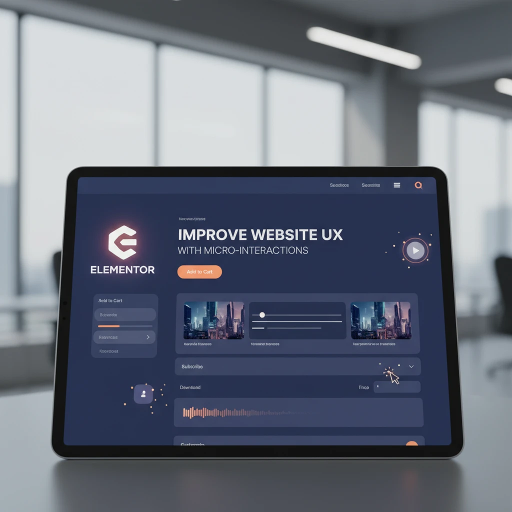
Elevate Your Elementor Website: The Power of Subtle Motion
Why micro-interactions matter in 2026 and beyond
In 2026, web users are more discerning than ever. They expect websites to be intuitive, responsive, and even delightful. Micro-interactions provide that extra layer of polish, transforming mundane tasks into engaging experiences. Think of a button that subtly changes color on hover, or a loading animation that keeps users entertained while waiting for content. These small details can have a significant impact on user satisfaction and brand perception. As explored in Elementor 2026: Top New Features & Website Design Trends, subtle animation and enhanced user feedback are key areas of focus for website design.
Furthermore, micro-interactions play a crucial role in providing real-time feedback to users. Whether it’s confirming a successful form submission or indicating that an item has been added to a shopping cart, these visual cues reassure users that their actions have been registered and processed correctly. This instant feedback builds trust and reduces user frustration. Additionally, by adding subtle motion, you create a more dynamic and engaging experience. This can increase the time users spend on your site, leading to improved SEO rankings and higher conversion rates.
The psychology behind successful micro-interactions: delight and engagement
Successful micro-interactions tap into the psychology of user behavior. They leverage principles like anticipation, feedback, and reward to create a positive and memorable experience. By providing visual confirmation and subtle animations, you signal to the user that their actions are recognized and appreciated. This, in turn, fosters a sense of delight and encourages further engagement. The element of surprise, even in small doses, can also be highly effective. For example, a unique animation that appears after a successful registration can leave a lasting impression.
Consider the power of a well-designed loading animation. Instead of a static progress bar, imagine a playful animation that entertains users while they wait. This simple change can transform a frustrating experience into a delightful one. Similarly, providing helpful guidance and gentle nudges through micro-interactions can significantly improve usability. Highlighting the correct field in a form as the user types, or offering subtle hints when they make a mistake, can make the process smoother and less error-prone. Remember that the goal is to create a positive emotional connection with the user, making them feel valued and understood.
Understanding Micro-Interactions: A UX Primer
Defining micro-interactions: The key elements
Micro-interactions are self-contained, functional animations or visual cues that respond to user actions or system events. They typically consist of four key elements: the trigger, the rules, the feedback, and the modes. The trigger initiates the interaction, which can be either user-initiated (e.g., clicking a button) or system-initiated (e.g., a notification). The rules determine what happens once the trigger is activated. The feedback provides visual, auditory, or haptic confirmation to the user. Finally, the modes define the overall style and aesthetics of the interaction.
A well-designed micro-interaction should be seamless, intuitive, and unobtrusive. It should enhance the user experience without being distracting or overwhelming. The interaction should also be context-aware, meaning that it adapts to the specific task or situation. For example, the micro-interaction for submitting a form should be different from the one for adding an item to a shopping cart. By carefully considering these elements, you can create micro-interactions that are both functional and aesthetically pleasing, contributing to a more cohesive and engaging website experience. You might want to review CopyElement: Unlock Advanced Form Styling in Elementor for form-specific design techniques.
Examples of effective micro-interactions in modern web design
Effective micro-interactions are everywhere in modern web design. Consider the “like” button on social media platforms, which often features a satisfying animation when clicked. E-commerce sites often use micro-interactions to confirm that an item has been added to the cart, typically through a visual cue like a temporary overlay or a change in the cart icon. Another common example is the password strength indicator, which provides real-time feedback to the user as they type. These interactions provide immediate feedback and guide the user through the process.
Example: Imagine a user is browsing a CopyElement template library. When they hover over a specific template, a subtle animation reveals more details about the template, such as its key features and target audience. A small heart icon appears on hover, inviting them to “favorite” the template. Clicking this heart triggers a small animation – perhaps the heart fills with color and briefly pulses – confirming that the template has been added to their favorites list. This entire process is achieved with simple CSS transitions and transformations within Elementor. Another great example could be found in WordPress Web Design: Converting Clicks into Clients, where they discuss using interactions to guide users. Another great one is on the pricing page: as the user adjusts the slider to increase the number of websites they need a license for, the total updates in real-time with a subtle animation.
Micro-interactions vs. animations: Knowing the difference
While both micro-interactions and animations involve movement, they serve different purposes. Animations are primarily visual and designed to enhance the aesthetic appeal of a website. They might include background animations, scrolling effects, or page transitions. Micro-interactions, on the other hand, are functional and directly related to user actions. They provide feedback, guidance, or confirmation. While an animation might simply look pretty, a micro-interaction always has a specific purpose and contributes to the overall usability of the website.
Think of it this way: an animation might be a decorative element, like a parallax scrolling effect, while a micro-interaction is a functional element, like a button that changes color when clicked. Micro-interactions are typically smaller and more focused than animations, and they often involve a response to user input. It’s possible to use animations within micro-interactions to enhance the visual feedback, but the core purpose of a micro-interaction is always to improve the user experience, whereas animation is primarily about visual appeal. Therefore, when planning your website, consider Elementor: Optimize Website Loading Speed in 5 Steps as performance remains critical with animation.
Planning Your Elementor Micro-Interactions: Strategy First
Identify key user actions: Where can micro-interactions enhance the experience?
The first step in planning your Elementor micro-interactions is to identify the key user actions on your website. Consider the tasks that users perform most frequently, such as filling out forms, browsing products, or navigating menus. These are the areas where micro-interactions can have the biggest impact. Look for opportunities to provide feedback, offer guidance, or add a touch of delight to these interactions. For example, you might add a micro-interaction to a button that confirms a successful submission, or a loading animation to keep users entertained while waiting for a page to load.
Consider analyzing user behavior data to identify pain points or areas where users struggle. Micro-interactions can be used to address these issues and improve the overall usability of your website. For instance, if users frequently abandon a form halfway through, you might add micro-interactions to provide real-time feedback and guidance, making the form-filling process easier and more intuitive. By carefully analyzing user actions, you can identify the most impactful areas for micro-interaction implementation.
Define clear goals for each micro-interaction: Engagement, feedback, or guidance?
Each micro-interaction should have a clear and specific goal. Are you trying to increase user engagement, provide feedback, or offer guidance? Defining the goal will help you design a micro-interaction that is both effective and purposeful. For example, if your goal is to increase engagement, you might use a playful animation or a surprising visual cue. If your goal is to provide feedback, you might use a subtle animation or a clear visual confirmation. And if your goal is to offer guidance, you might use a tooltip or a highlighted field.
Example: On a CopyElement landing page, the goal of a micro-interaction on a “Download Now” button might be to provide immediate feedback that the download has started. The button could briefly change color and display a loading animation, reassuring the user that their action has been registered. Alternatively, the goal could be to increase engagement by using a more elaborate animation that emphasizes the value of the downloaded resource. By clearly defining the goal, you can ensure that the micro-interaction serves a specific purpose and contributes to the overall user experience. Don’t forget to think about conversion; review Elementor: Conversion-Focused Call-to-Action Design when appropriate.
Consider accessibility: Ensuring inclusivity in your designs
Accessibility is a crucial consideration when designing micro-interactions. Ensure that your interactions are usable by people with disabilities, including those who are visually impaired, hearing impaired, or have motor impairments. Avoid relying solely on visual cues, and provide alternative methods for users to access the same information or functionality. For example, use descriptive alt text for images, provide captions for videos, and ensure that all interactive elements are keyboard accessible. Additionally, be mindful of color contrast and font sizes to ensure readability for users with visual impairments.
Consider providing options to disable animations or reduce motion for users who are sensitive to visual stimuli. Some users may find animations distracting or even nauseating, so it’s important to offer a way to turn them off. Follow the Web Content Accessibility Guidelines (WCAG) to ensure that your website is accessible to all users. By prioritizing accessibility, you can create a more inclusive and user-friendly website that benefits everyone. Remember also, keyboard focus states need to be highly visible and predictable to allow screen reader users to navigate your designs.
Implementing Hover Effects with Elementor’s Built-In Features
Step-by-step guide: Adding basic hover animations to buttons and images
Elementor provides a user-friendly interface for adding hover animations to various elements, including buttons and images. To add a basic hover animation, first, select the element you want to animate. Then, navigate to the “Style” tab in the Elementor editor. Under the “Hover” sub-tab, you’ll find various options for customizing the element’s appearance on hover. You can change the background color, text color, border color, and even add a box shadow or text shadow. To add a more advanced animation, such as a scaling or rotation effect, use the “Transform” options. Choose “Hover” from the top dropdown, and then select the desired transform effect.
For example, to make a button slightly larger on hover, select “Scale” and increase the X and Y values slightly. To rotate an image on hover, select “Rotate” and enter a degree value. You can also adjust the transition duration to control the speed of the animation. Experiment with different settings to achieve the desired effect. Remember to preview your changes to ensure that the animation looks smooth and natural. These same steps can be adapted to add more advanced interactions. Elementor is constantly evolving, so keep an eye on Elementor’s new features to take full advantage.
Customizing hover effects: Colors, transitions, and transformations
Elementor offers a wide range of customization options for hover effects, allowing you to create unique and engaging interactions. In addition to changing colors and adding shadows, you can use transitions to control the smoothness of the animation. Transitions allow you to specify the duration and timing function of the animation, creating a more polished and professional look. Transformations, such as scaling, rotating, and skewing, can be used to add more dynamic and eye-catching effects. Experiment with different combinations of these options to create custom hover effects that match your brand’s style and personality.
For example, you might use a combination of color changes, box shadows, and scaling to create a button that appears to “pop out” on hover. Or, you might use a subtle rotation effect to add a touch of dynamism to an image. Remember to keep the animation subtle and avoid overwhelming the user. The goal is to enhance the user experience, not to distract from it. You can also use custom CSS to create even more advanced hover effects, but this requires a basic understanding of CSS code. If you need assistance building more advanced interactions, explore Elementor: Leverage Custom Fields for Dynamic Websites to see how custom fields can drive conditional interactions.
Best practices for using hover effects: Avoiding common pitfalls
While hover effects can enhance the user experience, they can also be misused. One common pitfall is overusing hover effects, which can create a distracting and overwhelming experience for users. Stick to subtle and purposeful hover effects that enhance usability, rather than detract from it. Another pitfall is using hover effects that are too slow or too fast. A slow hover effect can feel sluggish and unresponsive, while a fast hover effect can be jarring and distracting.
Ensure your hover effects are consistent across your website. Inconsistent hover effects can confuse users and make your website feel unprofessional. Also, make sure that your hover effects are accessible to all users, including those who use touch devices or keyboard navigation. Since touch devices don’t have a “hover” state, make sure the primary action is still accessible on tap. For keyboard navigation, ensure that the focus state is clearly visible and distinct from the default state. Consider using color contrast tools to ensure that your hover effects meet accessibility guidelines. By following these best practices, you can avoid common pitfalls and create hover effects that enhance the user experience and contribute to a more engaging and accessible website.
Scroll-Based Animations for Engaging Storytelling
Using Elementor Motion Effects for scroll-triggered animations
Elementor’s built-in motion effects offer a straightforward way to implement scroll-triggered animations. These effects can be applied to almost any element, allowing for a wide range of creative possibilities. When deciding which motion effect to use, consider the element’s role in the overall design and how the animation will contribute to the user’s understanding of the content. For example, a subtle fade-in can draw attention to a key headline, while a more dramatic slide-in can emphasize a call-to-action. A common pitfall is overusing motion effects, leading to a distracting and overwhelming user experience. Aim for subtlety and consistency, ensuring that animations enhance rather than detract from the content.
Creating parallax effects: Adding depth and visual interest
Parallax scrolling adds a sense of depth to your website by making background images move slower than foreground content. This effect can create a more immersive and engaging experience for the user. Implementing parallax in Elementor is relatively simple using the motion effects panel. A key decision is selecting appropriate images that lend themselves well to this effect – large, high-resolution images with distinct layers work best. A potential issue is performance: parallax effects can be resource-intensive, especially on mobile devices. Optimize your images and use CSS acceleration where possible to maintain a smooth scrolling experience. Another thing to consider is ensuring that the parallax effect does not interfere with the readability of your content; choose background images that complement the text and avoid overly busy patterns.
Example: Animating elements as users scroll down a landing page
Imagine a landing page for a new software product. As the user scrolls down, different sections are revealed with subtle animations. The product’s headline fades in with a slight upward motion, drawing the user’s eye. Further down, key features are displayed in boxes that slide in from the left and right, creating a dynamic and engaging presentation. As the user reaches the pricing section, the different pricing tiers smoothly scale up, highlighting the recommended option. The final section, a call-to-action button, pulses gently, encouraging the user to click. This sequence of micro-interactions guides the user through the landing page, emphasizing key information and creating a more memorable experience. A page built using conversion-focused call-to-action designs, paired with such animations, will improve the overall engagement. By using subtle and strategic animations, you can enhance the user’s understanding of the product and increase the likelihood of conversion.
Enhancing Form Submissions with Interactive Feedback
Visual cues for successful form completion: Checkmarks, loading animations
Providing clear visual feedback after a form submission is crucial for reassuring users that their information has been received. A simple checkmark animation or a loading spinner can significantly improve the user experience. Consider using Lottie animations for more complex and engaging feedback. The decision to use a particular type of visual cue should be based on the overall style of your website and the level of feedback required. For example, a simple contact form might only need a checkmark, while a more complex application form could benefit from a progress bar. A common mistake is not providing any feedback at all, leaving users wondering whether their submission was successful. The form styling options available in Elementor, or with plugins, can enhance these feedback elements.
Real-time validation with dynamic text: Guiding users during input
Real-time validation helps users correct errors before submitting a form, reducing frustration and improving the completion rate. Displaying dynamic text that provides immediate feedback on input fields, such as password strength indicators or email format validation, can guide users through the form. Think about the clarity and conciseness of your validation messages. They should be easy to understand and provide actionable guidance. For instance, instead of simply saying “Invalid email,” provide a more specific message like “Please enter a valid email address (e.g., example@domain.com)”. One thing to keep in mind is that excessive validation can be intrusive and annoying. Only validate fields that are essential and provide feedback only when necessary. This can also be paired with the dynamic content capabilities outlined in Elementor’s custom fields feature, to personalize the form even further.
Micro-animations for error messages: Making feedback clear and concise
Micro-animations can be used to draw attention to error messages and make them more noticeable. A subtle shake or a color change can effectively communicate that an error has occurred. A key decision is choosing an animation that is both noticeable and unobtrusive. An overly aggressive animation can be jarring and frustrating. A good practice is to use color-coding in conjunction with micro-animations, such as highlighting the erroneous field in red. This provides a visual cue that is both informative and visually appealing. Ensure that the animation is accessible to all users, including those with visual impairments. Providing alternative text descriptions or using ARIA attributes can improve the accessibility of your error messages. This approach, combined with improved validation as above, enhances the form filling process.
Loading Animations: Improving Perceived Performance
Creating custom loading spinners with Elementor and Lottie files
Instead of using the default browser loading indicator, custom loading spinners can add a touch of personality to your website and improve the perceived loading speed. Lottie files provide a simple and efficient way to create animated loading spinners in Elementor. When designing your loading spinner, consider its aesthetic appeal and how it complements your brand. A well-designed loading spinner can make the wait feel shorter and less frustrating. Remember to optimize your Lottie files to minimize their file size and ensure smooth performance. A common mistake is using overly complex or resource-intensive animations that actually slow down the loading process. Prioritize simplicity and efficiency. Using Elementor alongside tools covered in articles like “Elementor: Optimize Website Loading Speed in 5 Steps” can improve performance overall.
Using placeholder content (skeleton loaders): A modern alternative
Skeleton loaders, also known as placeholder content, provide a visual representation of the page structure while the actual content is loading. This technique can significantly improve the perceived loading speed by giving users something to look at while they wait. A key design decision is choosing the right type of skeleton loader for your content. For example, you might use a series of gray boxes to represent text paragraphs or circular placeholders for images. A potential pitfall is creating skeleton loaders that are too detailed or distracting. The goal is to provide a general sense of the page layout without drawing too much attention to the loading process. Skeleton loaders are particularly effective for websites with dynamic content or slow loading times.
Optimizing loading speeds to minimize the need for animations
While loading animations can improve the user experience, the best approach is to optimize your website’s loading speed to minimize the need for them. Implementing techniques such as image optimization, code minification, and browser caching can significantly reduce loading times. Analyze your website’s performance using tools like Google PageSpeed Insights to identify areas for improvement. Reducing the number of HTTP requests and leveraging a content delivery network (CDN) can also improve loading speeds. The decision of how aggressively to optimize should be weighed against development time, but it is worthwhile. Remember that a fast-loading website provides the best user experience, regardless of the presence of loading animations. Loading animations are simply a fallback for when content takes longer than expected to load.
Advanced Techniques: Lottie Animations & Custom CSS
Integrating Lottie animations for complex and expressive micro-interactions
Lottie animations offer a powerful way to create complex and expressive micro-interactions on your website. Unlike traditional GIFs or videos, Lottie files are vector-based and can be scaled without losing quality. They are also significantly smaller in file size, resulting in faster loading times. Integrating Lottie animations into Elementor is relatively simple using the Lottie widget. When designing your animations, consider the overall aesthetic of your website and how the animation will contribute to the user experience. For example, a subtle animation can be used to highlight a button on hover, while a more complex animation can be used to illustrate a concept. A key benefit is that these can be animated by user action, bringing them to life.
Using custom CSS for fine-grained control over animations and transitions
While Elementor’s built-in animation tools offer a wide range of options, custom CSS provides even more fine-grained control over animations and transitions. Using custom CSS, you can create unique and personalized animations that are not possible with Elementor’s visual interface. Consider using CSS keyframes to define complex animation sequences. When writing custom CSS, pay attention to performance. Overly complex or poorly optimized CSS can slow down your website. Use CSS transitions for simple animations and CSS animations for more complex sequences. It’s also important to ensure that your CSS is compatible with different browsers. This can be especially helpful to control animations and transitions on mobile devices. Additionally, by leveraging resources like WordPress Web Design: Converting Clicks into Clients, you can ensure your site is not only functional but also optimized for conversions.
Resources for finding free and premium Lottie animations
Numerous online resources offer free and premium Lottie animations that you can use on your website. Websites like LottieFiles and IconScout offer a wide variety of animations to choose from. When selecting animations, consider the license terms and whether they are suitable for your intended use. Free animations may have restrictions on commercial use. Before adding the animations, review articles like “Elementor 2026: Top New Features & Website Design Trends” for inspiration about integrating cutting-edge design elements. When searching for animations, use specific keywords to narrow down your results. For example, instead of searching for “animation,” try searching for “loading spinner animation” or “hover effect animation.” Always optimize your Lottie files before uploading them to your website to minimize their file size.
Performance Optimization: Preventing Lag and Jitter
Poorly implemented micro-interactions can negatively impact website performance, leading to lag and jitter, which detract from the user experience. Optimizing your Elementor design requires careful consideration of animation code and thorough testing across various devices and browsers. Before implementing these effects, it’s crucial to understand how animations interact with other page elements and potentially strain resources.
Optimizing animation code: Avoiding resource-intensive effects
Optimizing your animation code is essential to minimize resource usage and prevent performance issues. One key aspect is avoiding complex CSS properties that trigger layout recalculations or repaints. For instance, using properties like `top`, `left`, `width`, or `height` for animations can be resource-intensive. Instead, opt for using `transform` and `opacity`, which are handled more efficiently by the browser. These properties can be adjusted using CSS transitions or animations. Additionally, strive to use the `will-change` property to inform the browser of upcoming changes, allowing it to optimize rendering in advance. Furthermore, try to avoid excessive keyframes or overly complex animations, which can lead to performance bottlenecks. Consider simplifying the animations to achieve the desired effect with fewer resources. For example, you can use easing functions to create smooth transitions without complex code.
Testing on different devices and browsers: Ensuring cross-compatibility
Ensuring cross-compatibility is vital for a consistent user experience across all platforms. Thorough testing on various devices and browsers helps identify and resolve potential performance issues and rendering inconsistencies. Different browsers may interpret CSS and JavaScript animations differently, leading to unexpected behavior. Test your micro-interactions on popular browsers like Chrome, Firefox, Safari, and Edge, as well as on mobile devices with varying screen sizes and operating systems. Tools like BrowserStack can help you test your site across a wide range of environments. Pay attention to frame rates and smoothness of the animations on different devices. If you notice lag or jitter on certain devices, consider optimizing the animations specifically for those platforms, potentially by simplifying them or using alternative techniques. Testing also includes checking for any JavaScript errors or CSS conflicts that may arise due to browser-specific quirks. It may also be wise to consider the differences between touch and mouse interactions when triggering the animations.
Using browser developer tools to identify and fix performance bottlenecks
Browser developer tools are invaluable for identifying and fixing performance bottlenecks in your micro-interactions. Chrome DevTools, Firefox Developer Tools, and similar tools offer a range of features for analyzing website performance, including performance profiling, network analysis, and memory usage monitoring. Use the Performance tab to record and analyze the timeline of your website’s activity. This will show you which animations are causing the most significant performance impact. Look for long tasks, excessive repaints, and layout thrashing. The Network tab helps you identify slow-loading resources that may be contributing to performance issues. Optimize images and other assets to reduce their file size and load times. Additionally, the Memory tab allows you to monitor memory usage and identify potential memory leaks. Addressing these bottlenecks ensures your website runs smoothly, improving the overall user experience and engagement. Understanding the correlation between animations and resource consumption is key to optimization.
Testing and Iterating: Refining Your Micro-Interactions
Testing and iteration are essential to refining your micro-interactions and ensuring they meet user needs. Gathering feedback through user testing and A/B testing different designs provides valuable insights into the usability and effectiveness of your animations. This iterative process allows you to continuously improve the user experience and optimize your micro-interactions for maximum impact. You can leverage the advanced form styling available via tools like CopyElement to enhance feedback forms used during user testing, making data collection smoother.
User testing: Gathering feedback on the usability and effectiveness of your animations
User testing is a crucial step in refining your micro-interactions. It involves observing real users as they interact with your website and gathering feedback on the usability and effectiveness of your animations. Conduct user testing sessions with a representative sample of your target audience. Ask them to perform specific tasks that involve the micro-interactions you want to evaluate. Observe their reactions and gather their feedback through questionnaires and interviews. Pay attention to whether the animations are intuitive, engaging, and helpful. Do they understand the purpose of the animations? Do they find them distracting or annoying? Are the animations too fast or too slow? User testing can reveal unexpected issues and provide valuable insights that you may not have considered. Ensure your test environment is similar to real-world conditions. This can be achieved using a website staging environment. User testing allows you to gather qualitative data, providing a deeper understanding of user perceptions and preferences.
A/B testing different micro-interaction designs: Finding the optimal solution
A/B testing involves comparing two or more variations of a micro-interaction design to determine which performs better. Create different versions of your animations, each with slight variations in timing, easing, or visual style. Use A/B testing tools like Google Optimize or Optimizely to split your website traffic between the different versions. Measure key metrics such as engagement, conversion rates, and bounce rates to determine which version is most effective. Analyze the results and use the data to inform your design decisions. A/B testing allows you to make data-driven decisions and optimize your micro-interactions for maximum impact. For example, you might A/B test different easing functions to see which creates a smoother and more engaging user experience. This approach offers quantitative data that complements qualitative insights gathered from user testing. You might experiment with contrasting animation styles, such as a subtle fade-in versus a more pronounced zoom effect, and see which results in higher click-through rates on your call-to-action buttons. It’s worth noting that features like conversion-focused call-to-action design can benefit greatly from A/B testing micro-interactions.
Iterating based on data and user feedback: Continuous improvement for better UX
Iterating based on data and user feedback is an ongoing process of continuous improvement. Use the insights gathered from user testing and A/B testing to refine your micro-interactions. Make incremental changes based on the data and test the changes to see if they improve performance. This iterative approach allows you to continuously optimize your micro-interactions for better UX. Don’t be afraid to experiment with different designs and approaches. Be open to feedback and willing to make changes based on what you learn. This iterative process ensures that your micro-interactions are always aligned with user needs and preferences. Keep abreast of updates to Elementor and WordPress that may offer new animation capabilities. Use features such as custom fields in conjunction with your micro-interactions to make them more data-driven and engaging. This ensures your website provides a dynamic and user-centric experience. Remember that UX is not a one-time fix but a continuous refinement.
Accessibility Considerations for Micro-Interactions
Accessibility is paramount when designing micro-interactions. Ensuring that your animations are accessible to all users, including those with disabilities, is crucial for creating an inclusive and user-friendly website. This involves addressing potential issues related to seizures, visual impairments, and keyboard navigation.
Ensuring animations don’t trigger seizures or other adverse reactions
Certain animations, particularly those with rapid flashing or strobing effects, can trigger seizures or other adverse reactions in users with photosensitive epilepsy. Avoid using these types of animations on your website. If you must use them, provide a warning to users before they encounter them. Consider implementing a setting that allows users to disable animations altogether. Ensure animations have a reasonable duration and frequency, and avoid patterns that are known to trigger seizures. Consult accessibility guidelines such as WCAG (Web Content Accessibility Guidelines) for recommendations on animation best practices. Another thing to consider is the use of vestibular animations. These can induce motion sickness if they overstimulate the user’s sense of balance. Opt for subtle and smooth animations and avoid sudden, jarring movements. Tools that let users build multi-language websites must take care to localize not just the written content, but also the animation styles and their potential impact on different user groups.
Providing alternative text descriptions for visually impaired users
Visually impaired users rely on screen readers to access website content. Provide alternative text descriptions for all animations that convey meaningful information. Use the `aria-label` attribute to provide a brief description of the animation’s purpose. For example, if an animation indicates that a form has been successfully submitted, the `aria-label` could be “Form successfully submitted.” Ensure the text descriptions are concise and accurately reflect the animation’s function. Avoid using generic descriptions like “animation” or “graphic.” Consider the context of the animation and provide a description that is relevant to the user’s task. The text descriptions should be programmatically accessible, meaning they can be accessed by assistive technologies. This ensures that visually impaired users can understand the meaning and purpose of the animations. Keep in mind that providing alternative descriptions is not just about accessibility; it also improves the overall usability of your website for all users. This improves your commitment to inclusive web design. By integrating elements like dynamic FAQ sections through tools such as Elementor, ensure that animations used for expanding/collapsing content are appropriately described for screen reader users.
Making micro-interactions keyboard accessible
Keyboard accessibility is essential for users who rely on keyboard navigation, including those with motor impairments. Ensure all micro-interactions can be triggered and controlled using the keyboard. Use semantic HTML elements and ARIA attributes to provide keyboard focus and accessibility. For example, if an animation is triggered by a button click, ensure the button can be focused using the Tab key and activated using the Enter or Space key. Use the `tabindex` attribute to control the focus order of elements. Ensure the focus order is logical and intuitive. Provide visual cues to indicate which element is currently in focus. Use CSS styles to highlight the focused element. Additionally, for complex micro-interactions, consider providing keyboard shortcuts to allow users to quickly access and control the animations. Keyboard accessibility is not just about meeting accessibility standards; it also improves the overall usability of your website for all users. This is even more crucial when considering features like building a complete website in a day, where efficiency and accessibility must be prioritized.
Future-Proofing Your Micro-Interactions: Staying Ahead of the Curve
The world of web design is constantly evolving, and micro-interactions are no exception. Future-proofing your micro-interactions involves staying informed about emerging trends, keeping up with Elementor updates, and continuously learning and experimenting with new techniques. This proactive approach ensures that your website remains modern, engaging, and user-friendly.
Emerging trends in micro-interaction design: AI-powered animations and more
Several exciting trends are emerging in micro-interaction design. One notable trend is the use of AI-powered animations. AI can be used to create animations that are more dynamic, responsive, and personalized. For example, AI can analyze user behavior and adjust animations in real-time to optimize engagement. Another trend is the use of virtual reality (VR) and augmented reality (AR) in micro-interactions. VR and AR can create immersive and interactive experiences that go beyond traditional website design. Consider how you can incorporate these technologies into your micro-interactions to create more engaging and memorable experiences. Other trends include the use of more sophisticated easing functions, personalized animations based on user data, and the integration of micro-interactions with other design elements, such as chatbots and voice interfaces. Exploring these new technologies is one way to prepare for the future.
Keeping up with Elementor updates and new animation features
Elementor is constantly evolving, with new features and updates being released regularly. Staying up-to-date with these changes is essential for leveraging the latest animation capabilities and optimizing your micro-interactions. Follow the Elementor blog, subscribe to their newsletter, and participate in the Elementor community to stay informed about new features and updates. Experiment with the new animation features and explore how they can be used to enhance your micro-interactions. Elementor is likely to add new features described in Elementor 2026: Top New Features & Website Design Trends, so keeping an eye on those trends is essential. Pay attention to performance optimizations and accessibility improvements that are included in Elementor updates. These updates can help you improve the performance and accessibility of your micro-interactions. Regularly review your existing micro-interactions and update them to take advantage of the latest Elementor features. This will ensure that your website remains modern, engaging, and user-friendly.
Continuously learning and experimenting with new techniques
Continuous learning and experimentation are essential for staying ahead of the curve in micro-interaction design. Explore new animation techniques, experiment with different design approaches, and stay informed about the latest trends. Take online courses, attend workshops, and read design blogs and articles to expand your knowledge and skills. Don’t be afraid to try new things and push the boundaries of what’s possible. Experiment with different animation libraries and frameworks, such as GreenSock (GSAP) and Anime.js, to create more complex and sophisticated animations. Share your knowledge and experiences with the design community. Participate in online forums, write blog posts, and give presentations to share your insights and learn from others. By continuously learning and experimenting, you can develop a deeper understanding of micro-interaction design and create more engaging and effective user experiences. This practice also contributes to enhancing your expertise in website performance, as detailed in guides on how to optimize website loading speed.
By carefully considering performance, accessibility, and future trends, and by continually testing and refining your designs, you can create micro-interactions that enhance the user experience and set your website apart. Embracing these practices ensures a more engaging and user-friendly online experience.