In today’s multi-device digital landscape, a website that looks perfect on a desktop but crumbles on a smartphone is a relic of the past. For WordPress users leveraging Elementor, achieving a consistently excellent user experience across all screen sizes isn’t just a nice-to-have; it’s a fundamental requirement for success. This guide delves into the essential practices for ensuring your Elementor-built sites are not only visually appealing but also highly functional, regardless of how your audience accesses them.
As of 2026, the proliferation of diverse devices, from ultra-wide monitors to compact mobile phones and even foldable screens, makes a one-size-fits-all design approach obsolete. Prioritizing responsive design from the outset with Elementor allows you to reach a broader audience, improve search engine rankings (as Google favors mobile-friendly sites), and ultimately drive higher engagement and conversion rates. Neglecting this aspect can lead to lost opportunities and a diminished brand perception.
Beyond Desktop: Why Responsive Design is Non-Negotiable in 2026
The digital ecosystem has fundamentally shifted. Today, mobile devices account for a significant majority of internet traffic, often exceeding desktop usage in many regions and demographics. This isn’t a trend; it’s the established reality. For any website aiming for broad reach and engagement, a flawless mobile experience is paramount. A site that forces users to pinch-and-zoom or navigate cumbersome layouts on their phones will inevitably lead to high bounce rates and missed conversions. Beyond user satisfaction, search engines like Google explicitly prioritize mobile-friendliness in their ranking algorithms. Failing to provide a responsive design means actively hindering your site’s visibility and potential to attract organic traffic. This makes the investment in responsive design not just a best practice, but a strategic imperative for online survival and growth.
The implications extend to user behavior and expectations. Audiences today are accustomed to seamless interactions across devices. They might start researching a product on their tablet during their commute and complete the purchase on their desktop later. If your website fails to adapt, that entire customer journey is disrupted. Furthermore, the diversity of screen sizes and resolutions continues to expand. Websites must gracefully scale and adapt, not just between mobile, tablet, and desktop, but also across various aspect ratios and pixel densities. This adaptability is crucial for conveying professionalism and trustworthiness. For businesses using Elementor, embracing responsive design principles from the start ensures they are building for the future, not clinging to past conventions. It’s about creating an accessible and enjoyable experience for every potential visitor, on any device they choose to use. This proactive approach prevents costly redesigns and ensures your digital presence remains competitive.
Elementor’s Built-in Responsive Tools: Your First Line of Defense
Elementor empowers users with a robust suite of integrated tools specifically designed to tackle responsive design challenges. At its core is the ability to control styling for different device breakpoints: desktop, tablet, and mobile. When editing any widget, column, or section, you’ll find device icons that allow you to toggle between these views. This is where you make device-specific adjustments, such as changing font sizes, padding, margins, and alignment. For instance, you might reduce the font size of a heading on mobile to prevent it from occupying too much vertical space, while keeping it larger on desktop for better readability. This granular control ensures that the content remains legible and the layout aesthetically pleasing across the spectrum of devices.
Another critical feature is the ability to hide or show elements based on the device. This is invaluable for decluttering mobile interfaces. You might choose to hide a complex sidebar menu on mobile, opting instead for a streamlined hamburger icon that reveals a simpler navigation menu. Similarly, large, visually intensive graphics that enhance the desktop experience might be hidden on mobile to improve loading times and reduce data consumption for users. To effectively utilize these tools, it’s essential to understand how Elementor applies styles. By default, styles cascade down from desktop to tablet, and then to mobile. However, any adjustment made at a smaller breakpoint (like mobile) overrides the setting for larger breakpoints unless specifically changed. This principle allows for efficient management, as you only need to define exceptions. For a deeper dive into optimizing your Elementor builds, consider exploring resources on efficient template usage, which can significantly speed up your workflow. By mastering these built-in responsive controls, you can create websites that are not only visually adaptive but also performant and user-friendly across all devices.
Mastering Device Previews in Elementor for Accurate Testing
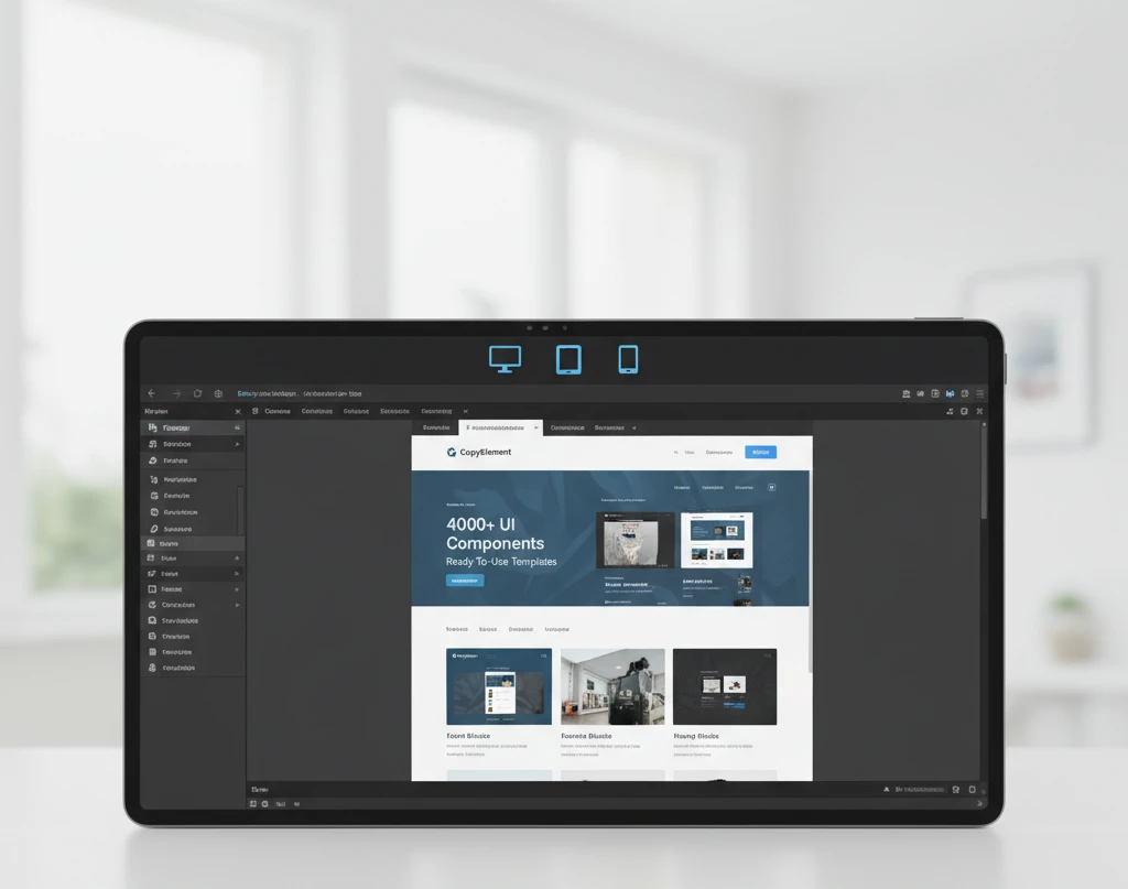
Elementor’s device preview functionality is your virtual testing ground, allowing you to simulate how your website will appear on different screen sizes without needing to open multiple browser tabs or use physical devices constantly. Within the Elementor editor, you’ll find a clear set of icons representing desktop, tablet, and mobile views. Clicking these icons instantly renders your page as it would appear on those respective devices. It’s crucial to understand that these are realistic simulations, not just scaled-down versions. Elementor applies your responsive settings dynamically, showing you precisely how your adjusted margins, padding, font sizes, and element visibility will translate to the end-user’s experience.
Beyond the basic preview, Elementor allows for resizing the preview window manually. By clicking and dragging the edges of the preview pane, you can simulate an almost infinite number of screen widths. This is particularly useful for identifying potential issues on intermediate screen sizes or devices that don’t strictly adhere to standard breakpoints (e.g., some smartwatches or unique tablet orientations). While Elementor’s previews are highly accurate, it’s still recommended to perform real-world testing on actual devices whenever possible, especially for critical projects. Browser developer tools offer an additional layer of testing, but Elementor’s integrated previews offer unparalleled speed and convenience for day-to-day design adjustments. For instance, when designing a landing page, you might use these previews to ensure that your call-to-action button remains prominent and clickable on all devices, a key factor in conversion rates. Leveraging these previews diligently saves time and prevents the embarrassment of launching a site that looks broken on a significant portion of your audience’s devices.
Column & Section Adjustments for Seamless Mobile Layouts
When adapting your design for smaller screens, the way columns stack and content flows becomes paramount. Elementor provides intuitive controls for managing column behavior across different devices. By default, columns within a section will stack vertically on mobile devices, which is generally the desired behavior to ensure readability. However, you can gain more control by adjusting the column order. Within the advanced tab of a column’s settings, you can specify a custom order for how columns appear on tablet and mobile. This is extremely useful if your desktop layout has a specific sequence of information that needs to be reordered for a more logical mobile flow. For example, a product image might appear before its description on desktop, but you might want the description to come first on mobile to capture attention quickly.
Sections themselves also require attention. You can adjust vertical padding and margins specifically for mobile to ensure elements aren’t crammed together. Often, you’ll want to significantly reduce the top and bottom padding of sections on mobile to maximize vertical space and minimize scrolling. Another key adjustment is managing the width of columns. While Elementor typically handles this automatically when stacking, you can manually set column widths for tablet or mobile views if needed, perhaps to ensure a specific element occupies a certain percentage of the screen. For instance, a testimonial block might look best occupying the full width of the screen on mobile, rather than being confined to a narrower column. This thoughtful adjustment of columns and sections ensures that the user experience remains cohesive and intuitive, regardless of the device used to access your site. Effectively using these layout adjustments is crucial for creating efficient and user-friendly designs, and forms a core part of building faster WordPress websites with components.
Typography That Adapts: Ensuring Readability on Every Screen
Typography is more than just selecting fonts; it’s about ensuring your message is accessible and legible across a spectrum of devices. For responsive design, this means employing fluid typography techniques. Instead of fixed font sizes, utilize relative units like vw (viewport width) and em. Elementor provides controls for this, allowing font sizes to scale proportionally with the screen. A common pitfall is to set one size for desktop and another for mobile, neglecting intermediate screen sizes, which can lead to overly large text on smaller tablets or cramped text on larger mobile devices. Prioritize defining typographic hierarchies that remain clear. For instance, headings should always be distinguishable from body text, and this relationship should persist regardless of the viewport. Consider using Elementor’s typography presets and adjusting them for different device views. This ensures consistency while adapting to screen real estate. Remember to test your typography on actual devices, not just in browser emulators, as screen resolutions and rendering can vary. Aim for a comfortable line height and character count per line, as these are critical for readability, especially on smaller screens where space is limited. A good rule of thumb is to keep line lengths between 45-75 characters for optimal reading flow. Utilizing the mobile view within Elementor’s editor is crucial for fine-tuning these details. You can set specific font sizes, line heights, and letter spacing for tablets and mobile phones, overriding desktop settings where necessary. This granular control ensures your content remains easy to digest and engaging for all users.
Decision criteria for choosing responsive typography involve evaluating the brand’s aesthetic, the content’s nature, and the target audience’s typical viewing devices. For a corporate site, a more traditional, highly readable serif font might be appropriate, while a creative portfolio could opt for a bolder, more expressive sans-serif. However, the responsive adaptation remains key. A common mistake is relying solely on browser default scaling, which often results in poor legibility. Instead, actively manage font sizes using Elementor’s dedicated responsive controls. For example, a large h1 heading on desktop might need to scale down significantly for a mobile screen to prevent it from dominating the viewport or causing awkward line breaks. Conversely, body text that feels appropriately sized on desktop might become too small on a mobile device. Test extensively to find the sweet spot. A practical approach is to set your base font size for desktop, then transition to mobile-first adjustments, refining tablet views in between. This iterative process, coupled with the use of relative units, ensures your text adapts gracefully. Consider the impact of font weight and style as well; bolded text or italics can become less impactful or harder to read at smaller sizes. Always perform live testing on various devices. You can learn more about creating layouts that perform across devices by exploring guides on building responsive sites with Elementor, which often touch upon typography as a core element of user experience.
Image Optimization & Responsive Behavior for Faster Load Times
Images are crucial for visual appeal but can significantly impact website performance, especially on mobile devices with limited bandwidth. Image optimization is paramount. This involves compressing images without a noticeable loss in quality and serving appropriately sized images for different screen resolutions. Elementor, while a design tool, integrates with WordPress’s media handling, allowing you to leverage best practices. A major pitfall is uploading unoptimized, high-resolution images directly, forcing browsers to download large files and then scale them down, wasting resources and time. Always use image editing software or plugins to compress images before uploading. Tools like TinyPNG or image optimization plugins for WordPress can significantly reduce file sizes. Beyond compression, consider responsive images. This means delivering different image files based on the user’s device and screen size. While Elementor doesn’t natively handle the complex generation of multiple image sizes like WordPress does with its `srcset` attribute, it allows you to choose which image size to display. For optimal performance, always select the smallest appropriate WordPress-generated image size for smaller screens within your Elementor settings. Another effective technique is lazy loading images, where images outside the viewport are only loaded as the user scrolls down. This significantly improves initial page load times. Elementor offers lazy load options for images, and it’s a feature you should definitely enable.
When deciding which images to use and how to implement them responsively, consider the context of use. A background image on a large desktop monitor might be a complex, high-detail photograph, but on a mobile screen, a simpler, more abstract graphic or a less detailed version of the same image would perform better and be less distracting. Elementor’s background settings allow you to control image display (cover, contain, etc.) and position, which are vital for how an image scales within its container. However, the underlying image file size is the primary performance factor. A common mistake is using the same large image file for all devices. Instead, aim to use WordPress’s built-in image sizes or create custom sizes and select the most appropriate one within Elementor’s image widget settings for each device view. For critical hero images, consider using modern image formats like WebP, which offer superior compression compared to JPEGs and PNGs. While Elementor’s direct WebP support might depend on your WordPress setup, ensuring your media library is configured to serve WebP can yield substantial performance gains. You can further optimize your website’s speed by exploring Elementor performance optimization guides. These resources often delve deeper into image handling and other techniques to ensure your site loads quickly, contributing to a better user experience and improved SEO rankings. Ensuring images load quickly across all devices is a cornerstone of modern web design.
Video & Embed Responsiveness: Avoiding Horizontal Scrollbars
Embedding videos and other external content, such as maps or social media feeds, presents a unique challenge in responsive design: ensuring they scale correctly without breaking the layout or causing undesirable horizontal scrollbars. A common oversight is embedding content with fixed dimensions. When an iframe or object element is given a fixed width, it will overflow its container on smaller screens, leading to that dreaded horizontal scroll. The solution lies in applying CSS techniques to make these embeds fluid. A widely adopted method involves wrapping the embed element (e.g., an iframe) in a container div and then applying specific padding-top percentages to the container, often calculated based on the desired aspect ratio (e.g., 16:9, 4:3). Elementor often simplifies this by providing responsive settings for its video widget and embed widgets, which should be leveraged. Always ensure that when you are configuring these widgets, you are checking their responsive modes and adjusting settings for tablet and mobile views. A pitfall here is assuming the default embed code from platforms like YouTube or Vimeo is responsive; it often is not, necessitating wrapper solutions.
To implement this effectively within Elementor, you might need to use a combination of Elementor’s provided widgets and custom CSS. For example, you could place an HTML widget and manually add the responsive wrapper markup, or if you’re using a video widget, check its settings for aspect ratio or responsive options. A key decision criterion is the aspect ratio of the content you’re embedding. Most videos are 16:9, but older embed codes or different content types might require a 4:3 ratio. Calculating the correct padding-top percentage is essential: for a 16:9 aspect ratio, the padding-top would be (9 / 16) 100% = 56.25%. This percentage is applied to the container’s width, effectively creating a proportional height. Another common mistake is forgetting to test embeds on various devices. A YouTube embed that looks fine on a desktop might overflow on a narrow smartphone screen if not properly contained. Elementor’s advanced responsive controls can be a lifesaver here, allowing you to hide or adjust elements based on screen size, but for embeds, the CSS solution is generally more robust. By ensuring all embeds are fluid, you maintain a clean and professional user interface across all devices, avoiding broken layouts and improving the overall user experience. This is a critical step in creating a truly seamless website.
Navigation Menus: Designing for Mobile-First User Experience
Navigation is the backbone of user experience, and its design must be optimized for mobile first. On smaller screens, traditional desktop navigation menus are impractical. This is where mobile-first menu design principles come into play. Elementor offers various menu widgets, including the Navigator, which can be configured to transform into a mobile-friendly format, such as a hamburger icon that reveals a slide-out or full-screen overlay menu. A significant pitfall is simply shrinking the desktop menu; this often results in unreadable text and tiny clickable areas. Instead, embrace patterns designed for touch interfaces. The hamburger icon is ubiquitous and easily recognizable. When designing your mobile menu, prioritize clarity and ease of access. Key decision criteria include the number of menu items, the desired aesthetic, and the complexity of the navigation hierarchy. For sites with many pages, a multi-level dropdown within the mobile menu might be necessary, but it should be implemented in a way that is easy to navigate without feeling cluttered.
Actionable steps involve configuring Elementor’s menu widget’s responsive settings. Select the appropriate mobile menu toggle icon and define its behavior. Consider the animation for the menu reveal—a smooth slide-in or fade-in is generally preferred over a jarring appearance. Test the click targets for your mobile menu items to ensure they are large enough to be easily tapped with a finger. Another common mistake is neglecting the interaction design of the mobile menu. How does the user close the menu? Is there a clear ‘close’ button or an overlay tap area? Ensure consistency with other mobile apps users are accustomed to. For complex navigation, consider simplifying the mobile menu by prioritizing the most important links and perhaps using a secondary navigation element or a site search for less critical pages. Utilizing pre-designed mobile menu templates or components can significantly speed up this process and ensure a professional look and feel. You can find many such solutions that integrate seamlessly with Elementor, helping you to build faster with ready-made sections, including navigation elements. Ultimately, a well-designed mobile menu enhances usability and prevents user frustration, making your website more accessible and effective for all visitors.
Advanced Techniques: Hiding & Showing Elements by Device
Elementor provides powerful built-in controls to manage the visibility of sections, columns, and widgets across different devices. This feature is crucial for creating a streamlined user experience, ensuring that content is relevant and accessible on desktops, tablets, and mobile phones. By strategically hiding elements, you can prevent visual clutter and improve loading times on smaller screens. For instance, a complex interactive element that works well on a desktop might overwhelm a mobile user; hiding it on smaller viewports and replacing it with a simpler, mobile-friendly alternative is a best practice. To access these controls, select any element, column, or section, then navigate to the ‘Advanced’ tab in the Elementor editor. Within the ‘Responsive’ subsection, you’ll find toggles for hiding elements on Tablet, Mobile, and Desktop views. Decision criteria for hiding should center on user experience and content hierarchy: Is the element essential for this specific device? Does it add value or just take up space? Consider the primary goal of the page on each device type. For example, a full-width image gallery might be perfect for a desktop, but on mobile, it’s often better to display a single, high-impact image or a simplified carousel.
A common pitfall is hiding essential navigation or call-to-action buttons on mobile, making it difficult for users to interact with the site. Always ensure that critical information remains visible and accessible. Another mistake is over-reliance on hiding; sometimes, redesigning the element for a specific device is more effective than simply removing it. For example, instead of hiding a large form on mobile, consider using a multi-step form or a vertically stacked layout for better usability. When implementing, test thoroughly. What looks good in the Elementor editor might behave differently on a live device. Always preview your changes on actual devices or use your browser’s developer tools to simulate different screen sizes. For advanced users, consider custom CSS classes applied via the ‘Advanced’ tab to control visibility more granularly if the built-in options aren’t sufficient, though this requires a deeper understanding of CSS.
Actionable steps include auditing your existing designs for responsiveness. Start with your most important pages and identify elements that might be problematic on smaller screens. Implement the hiding/showing toggles systematically, device by device. For desktop-first designs, carefully review how elements reflow and appear on tablets and mobiles. Conversely, if you design mobile-first, ensure that larger screens accommodate the expanded content without looking sparse. Don’t forget to consider performance; fewer elements loaded on mobile can lead to faster load times. You can further enhance your responsive design strategy by leveraging Elementor’s column stacking order options within the ‘Layout’ tab of column settings to control how columns arrange themselves on smaller screens. This complements hiding elements by ensuring the remaining content flows logically.
Testing & Validation: Ensuring Your Responsive Design Works Flawlessly
While Elementor offers intuitive tools for responsive design, rigorous testing and validation are non-negotiable steps to guarantee a flawless user experience across all devices. Relying solely on the Elementor editor’s preview modes can be misleading, as they often simulate rather than replicate the actual behavior on diverse hardware and operating systems. Therefore, the primary testing method should always involve testing on real devices. This means checking your website on various smartphones (iOS and Android), tablets, and different desktop screen resolutions. Pay close attention to how elements resize, reflow, and interact. Check for touch target sizes on mobile – buttons and links should be large enough to be easily tapped without accidental clicks on adjacent elements.
Browser developer tools are an indispensable companion to real-device testing. Most modern browsers (Chrome, Firefox, Edge, Safari) offer built-in responsive design modes that allow you to simulate various device sizes and network conditions. This is an efficient way to quickly check if your layouts are breaking at common breakpoints. Look for content overlap, distorted images, or navigation that becomes inaccessible. Another critical aspect is performance testing. A beautifully designed responsive site that loads slowly on mobile will likely deter visitors. Tools like Google PageSpeed Insights or GTmetrix can reveal performance bottlenecks. Optimizing images, minifying CSS/JavaScript, and leveraging browser caching are essential post-design steps that directly impact the responsive experience. For a comprehensive guide on optimizing speeds, explore resources on optimizing Elementor website speed.
Beyond visual and performance checks, validate your website’s usability on different devices. Can users easily navigate through your content? Are forms simple to complete? Does your primary call to action stand out on every screen size? User feedback, even from friends or colleagues using different devices, can uncover issues you might have overlooked. Consider conducting a small A/B test on different responsive layouts if conversion rates are a concern. For complex layouts and interactive components, ensure that touch gestures function as expected on mobile and tablet devices. A successful responsive design is one that not only looks good but also functions seamlessly and efficiently, providing an optimal experience regardless of how a user accesses your site, thereby contributing to a positive user journey and potentially improving conversion rates as seen in studies on crafting Elementor landing pages that convert.
Common Responsive Design Mistakes to Avoid in Elementor
One of the most frequent errors in Elementor responsive design is neglecting the mobile viewport entirely. Designers often focus heavily on the desktop view and assume that the responsive adjustments will automatically suffice, leading to elements that are too small, too large, or awkwardly positioned on smaller screens. This includes tiny font sizes that are unreadable or excessively large images that force users to scroll horizontally. Always start with a mobile-first approach or meticulously review the mobile view after designing for larger screens. Ensure that interactive elements like buttons and links have adequate spacing and are easily tappable – a common oversight is having touch targets too close together, leading to frustrating mis-taps.
Another significant pitfall is inconsistent styling across different devices. While some variation is expected and often beneficial (e.g., simplifying a complex desktop menu to a hamburger icon on mobile), major elements should maintain their visual integrity and branding. Using different color schemes, font weights, or drastically altered layouts for the same content on different devices can confuse users and dilute your brand identity. For example, ensuring that your primary brand colors and typography remain consistent helps reinforce brand recognition. Elements that are crucial for understanding the content or taking action must remain accessible. Hiding essential information or calls to action on mobile, as previously discussed, is a critical mistake that directly hinders user engagement and conversion potential. It’s vital to ensure that the core message and user journey are preserved across all breakpoints.
Overuse of the ‘Stretch Section’ feature without careful consideration can also lead to responsive issues. While useful for creating full-height sections, if content within these stretched sections isn’t properly managed with padding and margins across devices, it can result in content being cut off or appearing compressed on smaller screens. Always check the vertical alignment and spacing of content within stretched sections. Furthermore, relying solely on Elementor’s default responsive settings without customization can lead to generic-looking sites. Unique branding often requires more granular control, which can be achieved by adjusting padding, margins, font sizes, and even column ordering specifically for tablet and mobile views. This detailed control is essential for creating a truly professional and user-friendly website. Building faster and more efficiently with Elementor’s ready-made sections and templates can also be part of this process, as long as they are then properly customized for responsiveness; explore options for building faster with Elementor’s ready-made sections to streamline your workflow without sacrificing quality.