
In the ever-evolving world of web development, accessibility is no longer optional; it’s a fundamental requirement. For Elementor developers, this means building websites that are not only visually appealing and functional but also inclusive to users of all abilities. Ignoring accessibility can lead to lost customers, legal issues, and a negative brand image. Let’s delve into the essentials of website accessibility with Elementor.
This comprehensive guide will walk you through the critical aspects of creating accessible websites using Elementor, focusing on practical implementation and adherence to the Web Content Accessibility Guidelines (WCAG). We’ll explore why accessibility matters, how to simplify WCAG for Elementor, ensure keyboard navigation, and optimize images. By the end, you’ll be equipped with actionable steps to build truly inclusive websites.
Why Website Accessibility Matters for Elementor Developers (Beyond Compliance)
The Business Case: Reaching a Wider Audience & Boosting Conversions
Accessibility isn’t just a matter of ticking boxes; it’s a strategic business decision. By making your Elementor websites accessible, you open doors to a significantly larger audience, including individuals with disabilities, elderly users, and those using assistive technologies. Consider this: approximately 15% of the world’s population lives with some form of disability. Ignoring this segment translates to potentially losing a significant portion of your customer base. Moreover, accessible websites often provide a better user experience for everyone, leading to increased engagement and higher conversion rates. For example, clear and concise content benefits all users, not just those with cognitive disabilities. A well-structured website with proper headings and navigation aids everyone in finding information more efficiently.
Ethical Considerations: Ensuring Inclusivity and Equal Access
Beyond the financial incentives, accessibility is an ethical imperative. The internet should be a level playing field where everyone, regardless of their abilities, can access information, participate in online activities, and engage with businesses. By prioritizing accessibility, you are demonstrating a commitment to inclusivity and social responsibility. This can significantly enhance your brand’s reputation and foster a positive relationship with your audience. Consider the message you send when your website is inaccessible. It implies that certain users are less valued, potentially alienating them and damaging your brand’s image. Prioritizing accessibility signals respect and understanding, fostering trust and loyalty.
SEO Benefits: How Accessibility Improves Search Engine Rankings
Accessibility and SEO go hand in hand. Many of the principles that make a website accessible also make it more search engine friendly. For example, using proper heading structures (H1, H2, etc.), providing descriptive alt text for images, and ensuring a logical website structure all contribute to both accessibility and SEO. Search engines like Google prioritize websites that offer a good user experience. Accessible websites are generally easier to crawl and index, leading to improved search engine rankings. Furthermore, a website with faster loading times and a mobile-friendly design (often byproducts of accessibility optimizations) is more likely to rank higher in search results. For additional insights on optimizing your Elementor websites for search engines, refer to guides that explain WordPress SEO and Elementor.
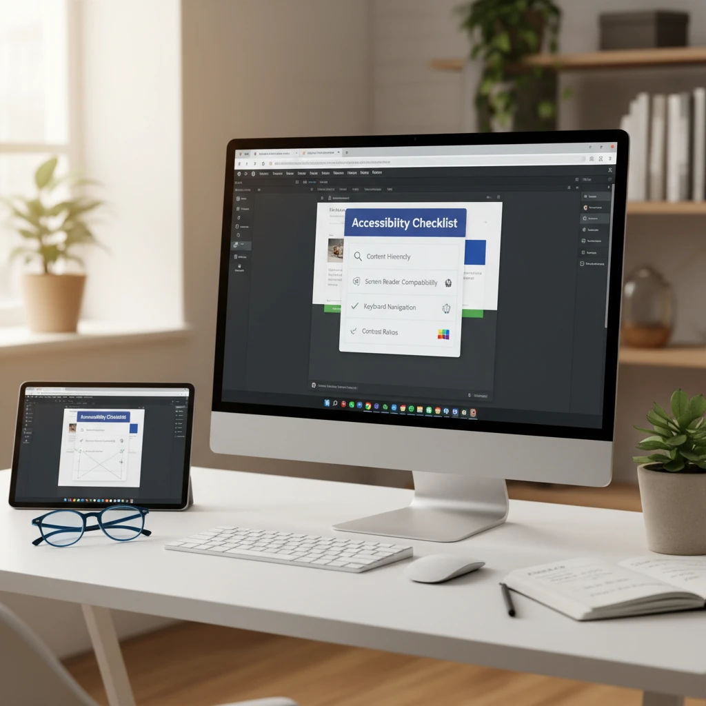
WCAG Guidelines: Your Accessibility Bible (Simplified for Elementor)
Understanding the Four Principles: Perceivable, Operable, Understandable, Robust (POUR)
The Web Content Accessibility Guidelines (WCAG) are the internationally recognized standard for web accessibility. They are based on four core principles, often referred to as POUR: Perceivable (information and user interface components must be presentable to users in ways they can perceive), Operable (user interface components and navigation must be operable), Understandable (information and the operation of the user interface must be understandable), and Robust (content must be robust enough that it can be interpreted reliably by a wide variety of user agents, including assistive technologies). Think of it this way: Perceivable means users can see or hear the content; Operable means users can navigate and interact with the website; Understandable means the content and interface are clear and easy to comprehend; and Robust means the website works well with different browsers and assistive technologies. You can find more detailed information on the W3C’s accessibility principles page.
Common WCAG Success Criteria Applicable to Elementor Websites
Several WCAG success criteria are particularly relevant when building websites with Elementor. These include 1.1.1 Non-text Content (providing alt text for images), 1.3.1 Info and Relationships (using proper heading structures), 1.4.3 Contrast (ensuring sufficient color contrast between text and background), 2.1.1 Keyboard (making all functionality available via keyboard), 2.4.4 Link Purpose (In Context) (making the purpose of each link clear from the link text alone), 3.1.1 Language of Page (specifying the language of the page), and 4.1.2 Name, Role, Value (ensuring that all interactive elements have proper names, roles, and values). For Elementor developers, this translates into carefully selecting widgets, configuring them correctly, and adding appropriate attributes to ensure accessibility. For example, when using the heading widget, always select the correct heading level (H1, H2, etc.) to maintain a logical document structure.
Tools and Resources for Checking WCAG Compliance
Numerous tools and resources are available to help you check the WCAG compliance of your Elementor websites. These include automated testing tools like WAVE (Web Accessibility Evaluation Tool) and Axe DevTools, which can identify common accessibility issues. Browser extensions like the Accessibility Insights browser extension can also be helpful. Manual testing is also crucial. Use a screen reader like NVDA or VoiceOver to experience your website as a visually impaired user would. Additionally, consult the official WCAG documentation and resources provided by organizations like the World Wide Web Consortium (W3C). Remember that automated tools can only catch some issues; manual testing is essential for ensuring a truly accessible website.
Keyboard Navigation: Ensuring Full Operability Without a Mouse
Logical Tab Order: Implementing tabindex Attributes Correctly
Keyboard navigation is a critical aspect of web accessibility. Users who cannot use a mouse rely on the keyboard to navigate and interact with websites. Ensuring a logical tab order is essential for a positive user experience. The tab order should follow the visual flow of the page, typically from left to right and top to bottom. While Elementor generally handles tab order automatically, you may need to adjust the tabindex attribute for custom elements or complex layouts. Avoid using negative tabindex values unless absolutely necessary, as they can remove elements from the natural tab order, potentially confusing users. Instead, use tabindex="0" to include elements in the tab order or tabindex="1" or higher to force an element to be focused earlier. Be cautious when using positive values, as they can disrupt the natural flow. Always test the tab order thoroughly after making changes.
Visible Focus Indicators: Enhancing User Experience
A visible focus indicator is a visual cue that highlights the currently focused element on the page. This is crucial for keyboard users to understand where they are on the page and which element will be activated when they press Enter or Spacebar. The default focus indicator may not always be sufficient, especially if it lacks contrast or is obscured by the website’s design. Use CSS to customize the focus indicator to ensure it is highly visible and distinguishable from the surrounding elements. A common approach is to add a bright outline or a contrasting background color to the focused element. Consider the overall design of your website when choosing a focus indicator style. It should be consistent with the brand and easy to perceive. Remember that a clear and visible focus indicator significantly improves the usability of your website for keyboard users. You can find detailed CSS examples for focus indicators on Mozilla’s CSS focus documentation.
Testing Keyboard Navigation Thoroughly
Testing keyboard navigation is essential to identify and fix any issues that may arise. Disconnect your mouse and try to navigate your entire website using only the keyboard. Pay close attention to the tab order, the visibility of focus indicators, and the operability of all interactive elements. Ensure that you can access all links, buttons, form fields, and other controls using the keyboard. Check that the tab order makes logical sense and follows the visual flow of the page. Verify that the focus indicator is clearly visible on all focused elements. If you encounter any difficulties or inconsistencies, investigate the underlying code and make the necessary adjustments. Repeat the testing process after making changes to ensure that the issues are resolved and that no new problems have been introduced. Thorough testing is the key to delivering a smooth and accessible keyboard navigation experience.
Image Optimization for Accessibility: Alt Text and Beyond
Writing Effective Alt Text: Descriptive, Concise, and Contextual
Alternative text (alt text) is a short description of an image that is displayed when the image cannot be loaded or when a screen reader is used. Writing effective alt text is crucial for making your website accessible to visually impaired users. The alt text should be descriptive, concise, and contextual. It should accurately convey the content and purpose of the image in the context of the surrounding text. Avoid using generic phrases like “image” or “picture.” Instead, describe what the image shows and what information it conveys. Keep the alt text brief, ideally under 125 characters, as some screen readers may cut off longer descriptions. Consider the context of the image and its relevance to the surrounding content. The alt text should provide the necessary information for users to understand the content even if they cannot see the image. It’s an important aspect of designing accessible websites with WordPress.
Decorative Images: Using Null Alt Attributes (alt=””)
Decorative images are images that do not convey any essential information and are used solely for aesthetic purposes. For decorative images, it is best practice to use a null alt attribute (alt=""). This tells screen readers to ignore the image, preventing them from announcing unnecessary or irrelevant information to the user. Omitting the alt attribute altogether is not recommended, as some screen readers may announce the image’s file name, which can be confusing and distracting. When using Elementor, you can easily add a null alt attribute to an image by simply leaving the alt text field blank. However, ensure that you truly intend for the image to be decorative and that it does not contribute to the understanding of the content. If an image provides any valuable information, even if it is primarily decorative, it should have descriptive alt text.
Image Optimization for Screen Readers: File Size and Format Considerations
While alt text is the primary consideration for image accessibility, file size and format also play a role in the user experience, particularly for screen reader users. Large image files can slow down page loading times, which can be frustrating for all users, but especially for those using screen readers who rely on a consistent and responsive experience. Optimize your images by compressing them without sacrificing too much quality. Tools like TinyPNG or ImageOptim can help you reduce file sizes significantly. Choose the appropriate image format based on the type of image. Use JPEG for photographs and PNG for images with sharp lines and text. Consider using modern image formats like WebP, which offer superior compression and quality compared to JPEG and PNG. Ensure that your images are responsive and adapt to different screen sizes to provide a seamless experience for all users. To further enhance your site’s performance, consider strategies for Elementor image optimization.
Color Contrast: Meeting Minimum Contrast Ratios in Elementor Designs
Understanding Contrast Ratio Requirements: WCAG 2.1 AA and AAA
Color contrast is a critical aspect of website accessibility, ensuring that text and interactive elements are easily distinguishable for users with visual impairments. The Web Content Accessibility Guidelines (WCAG) 2.1 sets specific contrast ratio requirements at two levels: AA and AAA. AA requires a contrast ratio of 4.5:1 for normal text and 3:1 for large text (at least 18pt or 14pt bold) and graphical user interface components (like form fields). AAA, the higher standard, requires a contrast ratio of 7:1 for normal text and 4.5:1 for large text and UI components. When choosing colors, consider not just the visual aesthetic but also the mathematical ratio between the foreground and background colors as perceived by the human eye. Failing to meet these requirements can exclude a significant portion of users, including those with low vision or color blindness. Poor contrast can lead to eye strain and make it difficult for users to read or interact with your content. For example, light gray text on a white background will likely fail WCAG standards.
Tools for Checking Color Contrast: Examples and Implementations
Several tools can help you check the color contrast of your Elementor designs. These tools evaluate the contrast ratio between foreground and background colors and indicate whether they meet WCAG AA or AAA standards. Some popular options include the WebAIM Contrast Checker, Accessible Colors, and the Colour Contrast Analyser (CCA), a downloadable desktop application. Many browser developer tools also include color contrast checking features. To implement these tools, simply input the hexadecimal color codes for your foreground and background colors. The tool will then calculate the contrast ratio and provide a pass/fail result based on the WCAG guidelines. In Elementor, you can directly access color pickers for text, backgrounds, buttons, and other elements. Before finalizing your color choices, use a contrast checker to verify compliance. Integrating this step into your workflow will help ensure accessibility is considered from the start. Remember to check the contrast of all text elements, including headings, body text, and link text, as well as any interactive elements like buttons and form fields. Regularly auditing your website’s color contrast is essential, especially after making design changes.
Choosing Accessible Color Palettes: Practical Tips and Resources
Choosing an accessible color palette involves more than just picking visually appealing colors; it requires considering the needs of users with visual impairments. Start by selecting a base color and then using a color palette generator that incorporates accessibility checks. Resources like Coolors, Adobe Color, and Paletton offer tools to create color palettes while providing contrast ratio information. Aim for a palette that includes a range of contrasting colors suitable for text, backgrounds, and interactive elements. Avoid relying solely on color to convey important information, as this excludes colorblind users. Use supplementary indicators like text labels or icons. When designing in Elementor, create global color styles that adhere to WCAG guidelines. This makes it easier to maintain consistent and accessible color contrast across your entire website. Educate your team on the importance of color accessibility and provide them with the tools and resources they need to make informed color choices. Remember that Elementor’s CSS styling options can be used creatively to enhance contrast without compromising design aesthetics.
Semantic HTML: Structuring Content for Accessibility and SEO within Elementor
Using Heading Tags (H1-H6) Correctly: Creating a Logical Hierarchy
Semantic HTML is crucial for both accessibility and SEO, providing structure and meaning to your website content. Heading tags (H1-H6) play a vital role in creating a logical hierarchy, making it easier for users and search engines to understand the organization of your page. An H1 tag should be used only once per page, representing the main title. Subsequent headings (H2-H6) should be used to create a nested structure, with H2 tags representing main sections, H3 tags representing subsections, and so on. Avoid skipping heading levels (e.g., jumping from H2 to H4) as this disrupts the logical flow. In Elementor, you can easily select heading levels for text widgets. Ensure your heading structure accurately reflects the content’s hierarchy. For example, if you have a section about “Website Design Principles,” that would be an H2. Subtopics like “Color Theory” and “Typography” within that section would be H3s. A poor heading structure can confuse screen readers and search engines, hindering accessibility and SEO. Regularly review your heading structure to ensure it is logical and consistent. Proper heading structure also improves readability for all users, making it easier to scan and understand the content.
Implementing ARIA Roles: Enhancing Semantic Meaning for Screen Readers
ARIA (Accessible Rich Internet Applications) roles provide additional semantic information to assistive technologies, such as screen readers. While HTML5 semantic elements cover many common use cases, ARIA roles are useful for enhancing the meaning of custom or complex UI components. For example, if you create a custom navigation menu with JavaScript, you can use the role="navigation" attribute to explicitly identify it as a navigation landmark. Common ARIA roles include role="button", role="alert", role="dialog", and role="tablist". When deciding whether to use an ARIA role, first consider if a native HTML element can achieve the same result. Native elements often have built-in accessibility features that ARIA roles may not fully replicate. Overusing ARIA roles can also create confusion and negatively impact accessibility. In Elementor, you can add ARIA attributes to any widget using the “Attributes” section in the Advanced tab. For example, you might use ARIA to improve the accessibility of Elementor’s dynamic content features when creating custom layouts. Always test your implementation with a screen reader to ensure the ARIA roles are correctly interpreted and provide a meaningful experience for users.
Leveraging HTML5 Semantic Elements: <article>, <nav>, <aside>, etc.
HTML5 introduced several semantic elements that provide clear meaning to different sections of your website, improving both accessibility and SEO. The <article> element represents a self-contained composition in a document, page, application, or site, and that is, in principle, independently distributable or reusable, e.g., in syndication. The <nav> element defines a section of navigation links, while the <aside> element represents content that is tangentially related to the main content of the page. Other important semantic elements include <header>, <footer>, <main>, and <section>. Using these elements correctly provides a clear structure to your content, making it easier for screen readers and search engines to understand the purpose of each section. When building layouts in Elementor, wrap your content within appropriate semantic elements. For example, use the <nav> element to contain your main navigation menu, the <article> element for blog posts, and the <aside> element for sidebars containing related information. Incorrect use of semantic elements can be detrimental to accessibility and SEO, so it’s important to understand their intended purpose. Avoid using <div> elements for everything, as this provides no semantic meaning. Combining HTML5 semantic elements with ARIA roles can further enhance the accessibility of complex layouts. You can find a complete list of HTML elements and their meanings on the Mozilla Developer Network HTML element reference.
Form Accessibility: Creating User-Friendly and Accessible Forms in Elementor
Providing Clear and Descriptive Labels: Using the <label> Tag
Form accessibility is crucial for ensuring that all users, including those with disabilities, can easily fill out and submit forms on your website. Clear and descriptive labels are a fundamental aspect of accessible forms. The <label> tag should be used to associate text labels with form input fields, providing context and instructions to the user. Each input field should have a corresponding <label> tag, and the for attribute of the <label> should match the id attribute of the input field. This association allows screen readers to announce the label when the user focuses on the input field. In Elementor’s form widget, ensure that you enable the “Label” option for each field and provide clear, concise, and descriptive labels. Avoid using placeholders as labels, as they disappear when the user starts typing, making it difficult to remember the required information. If you must use placeholders, ensure that you also provide a persistent label. Failing to provide proper labels can make forms unusable for screen reader users and confusing for all users. Consider using AI-powered content creation to generate descriptive and effective form labels if you are struggling with the wording.
Implementing Error Handling: Clear and Informative Error Messages
Effective error handling is essential for providing a positive user experience and ensuring that users can successfully submit forms. When a user makes an error in a form field (e.g., entering an invalid email address or leaving a required field blank), the form should display a clear and informative error message. These error messages should be easily visible and should provide specific guidance on how to correct the error. In Elementor’s form widget, customize the error messages to be user-friendly and helpful. Avoid generic error messages like “Invalid input.” Instead, provide specific instructions, such as “Please enter a valid email address” or “This field is required.” Use color and icons to visually highlight error messages, but ensure that the color contrast meets WCAG guidelines. Associate error messages with the corresponding input fields using ARIA attributes, such as aria-describedby, so that screen readers announce the error message when the user focuses on the field. Test your form with different types of errors to ensure that the error handling is working correctly and that the error messages are clear and helpful. Poor error handling can frustrate users and prevent them from completing the form.
Accessible Input Types: Using Appropriate HTML5 Input Types
Using the appropriate HTML5 input types is important for both accessibility and usability. HTML5 provides a variety of input types, such as text, email, number, tel, date, and url, which provide semantic meaning and enable browser-specific validation and input features. For example, using the email input type will trigger browser validation to ensure that the user enters a valid email address. In Elementor’s form widget, select the appropriate input type for each field. Using the correct input types not only improves accessibility but also enhances the user experience by providing optimized input methods for different types of data. For example, on mobile devices, the tel input type will display a numeric keyboard, making it easier for users to enter phone numbers. Avoid using the text input type for all fields, as this provides no semantic meaning and disables browser-specific features. When using custom input fields, ensure that you provide appropriate ARIA attributes to convey the input type to assistive technologies. Using accessible input types can significantly improve the usability and accessibility of your forms, making them easier for all users to complete.
Video and Audio Accessibility: Captions, Transcripts, and Audio Descriptions
Adding Captions and Subtitles to Videos: Tools and Services
Video and audio content must be accessible to individuals with hearing and visual impairments. Adding captions and subtitles to videos is crucial for making video content accessible to deaf and hard-of-hearing users. Captions are synchronized text that displays the dialogue and other relevant audio information, such as sound effects. Subtitles, on the other hand, are primarily intended for viewers who do not understand the language spoken in the video. Several tools and services are available for creating captions and subtitles, including YouTube’s automatic captioning feature, which is a good starting point but often requires editing for accuracy. Other options include professional captioning services like Rev and Otter.ai, which provide more accurate and reliable results. When creating captions, ensure that they are synchronized with the audio, accurately reflect the dialogue, and are easy to read. Consider adding speaker identification and descriptions of important sound effects. In Elementor, you can easily embed videos from YouTube or Vimeo, and these platforms allow you to upload your own caption files. Failing to provide captions and subtitles excludes a significant portion of users from accessing your video content. Consider using the image optimization techniques discussed elsewhere on this blog to ensure faster loading of your video content, which improves the overall experience. Remember to review and edit automatically generated captions for accuracy.
Providing Transcripts for Audio Content: Best Practices
Providing transcripts for audio content is essential for making audio content accessible to deaf and hard-of-hearing users. A transcript is a text version of the audio content, including spoken words, sound effects, and other relevant audio information. Transcripts allow users to read the content instead of listening to it. When creating transcripts, ensure that they are accurate, complete, and easy to read. Include speaker identification, descriptions of sound effects, and any other information that is necessary to understand the content. You can create transcripts manually or use transcription services like Otter.ai or Descript, which provide automated transcription with varying degrees of accuracy. After creating the transcript, make it easily accessible to users by providing a link to the transcript near the audio player. In Elementor, you can add a text widget below the audio player and paste the transcript into the widget. Alternatively, you can create a separate page for the transcript and link to it from the audio player. Failing to provide transcripts excludes deaf and hard-of-hearing users from accessing your audio content. Always review and edit automatically generated transcripts for accuracy.
Audio Descriptions: Making Visual Content Accessible to Blind Users
Audio descriptions are narrative tracks that describe important visual elements in videos, making them accessible to blind and visually impaired users. Audio descriptions narrate what is happening on the screen, including actions, gestures, scene changes, and other visual information that is not conveyed through dialogue or sound effects. Creating audio descriptions requires careful planning and execution. The descriptions should be clear, concise, and informative, and should not interfere with the dialogue or other audio elements. Professional audio description services are available, and some video editing software includes features for adding audio descriptions. When creating audio descriptions, consider the target audience and the purpose of the video. Provide enough detail to convey the essential visual information without being overly verbose. In Elementor, when embedding videos with audio descriptions, ensure that the video player supports audio description tracks and that users can easily enable or disable the audio descriptions. For example, if you have produced an AI-generated mockup using Elementor, ensure the presentation video is fully accessible. Failing to provide audio descriptions excludes blind and visually impaired users from fully experiencing your video content. Test your videos with audio descriptions to ensure that they are effective and provide a meaningful experience for users. For more resources on implementing audio descriptions, consider exploring the American Council of the Blind’s Audio Description Project.
Dynamic Content and ARIA Live Regions: Announcing Updates to Screen Readers
Understanding ARIA Live Regions: alert, assertive, polite
ARIA (Accessible Rich Internet Applications) live regions are crucial for informing screen reader users about dynamic content changes without requiring them to manually refresh the page. These regions provide a way to announce updates, such as form validation errors, chat messages, or progress updates. The aria-live attribute, along with related attributes like aria-atomic and aria-relevant, controls how these updates are communicated. The three primary values for aria-live are polite, assertive, and alert.
- polite: This is the least disruptive setting. Screen readers will announce the update when they are idle. Ideal for non-critical updates, like new comments or social media feed updates. Decision criteria: use for content changes that don’t require immediate attention. Pitfalls: users might not notice the updates promptly if they are engaged with other content.
- assertive: This setting interrupts the screen reader’s current activity to announce the update immediately. Use sparingly for important updates that require immediate user action, such as critical error messages. Decision criteria: use for urgent updates that prevent the user from proceeding. Pitfalls: overuse can be extremely disruptive and annoying for users. Example: A form error preventing submission, requiring immediate correction.
- alert: While technically not an
aria-livevalue (it’s a role), it functions similarly to assertive but implies an important, often time-sensitive message. It is often implicitly assertive. Decision criteria: use for critical alerts that necessitate immediate acknowledgement. Pitfalls: Similar to assertive, misuse leads to a poor user experience.
Implementing ARIA Live Regions in Elementor: Practical Examples
Implementing ARIA live regions in Elementor requires custom code, as Elementor’s built-in features do not directly offer ARIA live region settings for every widget. You can leverage Elementor’s HTML widget or custom JavaScript to add the necessary ARIA attributes. Consider a scenario where you have a contact form. Upon successful submission, a “Thank You” message appears dynamically. To make this accessible, wrap the message in a div with aria-live="polite". Example:
<div aria-live="polite">Thank you for your submission!</div>For error messages, use aria-live="assertive" to immediately inform the user. Ensure the content within the live region is semantically meaningful. For instance, if you are updating a progress bar, include both the visual update and the accessible text update within the live region. Be mindful of updates that happen too frequently, as excessive announcements can overwhelm the user. Instead, group related updates into a single announcement when possible.
Testing ARIA Live Regions with Screen Readers
Testing ARIA live regions is crucial to ensure they function as intended. Use popular screen readers like NVDA, JAWS, or VoiceOver. Navigate your website and trigger the dynamic content updates that should be announced. Verify that the screen reader announces the updates in a timely and appropriate manner. For example, a “polite” update should not interrupt the screen reader mid-sentence, while an “assertive” update should be announced promptly. Also, test on different browsers and operating systems, as screen reader behavior can vary. If you encounter issues, examine the ARIA attributes and JavaScript code for errors. Ensure the content within the live region is accurately reflecting the changes happening on the page.
Alternatives to Elementor for Accessibility-Focused Website Development (And When to Choose Them)
While Elementor offers a degree of flexibility, creating truly accessible websites often requires more control than it readily provides. In some scenarios, alternative approaches might be more suitable, especially when accessibility is a top priority. These alternatives range from WordPress’s native block editor to completely custom solutions.
Gutenberg (WordPress Block Editor): Native Accessibility Features
Gutenberg, the WordPress block editor, offers improved native accessibility compared to older versions of WordPress. Its block-based structure encourages semantic HTML, which is crucial for screen reader compatibility. Each block can be configured with accessibility considerations in mind. However, Gutenberg’s accessibility is still dependent on the theme and plugins used. A poorly coded theme can negate Gutenberg’s built-in accessibility features. Decision criteria: Consider Gutenberg for simpler websites or when you want to leverage native WordPress features. Pitfalls: Requires careful theme selection and plugin choices to maintain accessibility. It is also important to note that depending on the complexity of the desired design, advanced designs might be limited compared to page builders.
Dedicated Accessibility-Focused Themes: Examples and Considerations
Several WordPress themes are designed with accessibility as a primary focus. These themes often adhere strictly to WCAG guidelines and provide semantic HTML, proper ARIA attributes, and keyboard navigation support. Examples include themes specifically labelled as “accessibility-ready” in the WordPress theme directory. When selecting an accessibility-focused theme, carefully review its documentation and test it with accessibility testing tools to ensure it meets your needs. Decision criteria: Choose an accessibility-focused theme when you want a solid foundation for accessibility without extensive customization. Pitfalls: Customization options might be limited compared to more generic themes. You might also need to vet the theme developers to confirm their commitment to accessibility updates. Look for themes with active maintenance and support.
Headless WordPress with React/Vue: Maximum Control Over Accessibility
For maximum control over accessibility, consider using a headless WordPress setup with a front-end framework like React or Vue. In this approach, WordPress serves as a content management system (CMS), while the front-end is built using a JavaScript framework. This allows you to create completely custom, accessible components and implement ARIA attributes and accessibility best practices from the ground up. Headless WordPress offers ultimate flexibility but requires significant development expertise. Decision criteria: Opt for headless WordPress when you need pixel-perfect control over accessibility and are comfortable with JavaScript development. Pitfalls: Requires advanced technical skills and a longer development time compared to using themes or page builders. However, leveraging an AI-powered content creation workflow can improve your content development speed.
Testing Your Elementor Website for Accessibility: A Step-by-Step Guide for 2026
Thorough accessibility testing is essential to ensure your Elementor website is usable by everyone, including people with disabilities. Testing involves a combination of automated tools, manual checks, and user feedback. This multi-faceted approach helps identify a wide range of accessibility issues, from obvious errors to subtle usability problems.
Using Automated Accessibility Testing Tools: WAVE, Lighthouse, Axe
Automated accessibility testing tools can quickly scan your website for common accessibility errors. Popular tools include WAVE, Lighthouse (integrated into Chrome DevTools), and Axe. These tools check for issues such as missing alt text, insufficient color contrast, and improper heading structure. While these tools are valuable for identifying potential problems, they cannot detect all accessibility issues. They should be used as a starting point, not the sole method of testing. Always manually review the results and investigate each reported issue. Decision criteria: Use automated tools for initial scans and quick checks. Pitfalls: Do not rely solely on automated tools, as they cannot detect all accessibility issues. Remember to interpret the results critically and manually verify the findings.
Manual Accessibility Testing: Emulating Users with Disabilities
Manual accessibility testing involves navigating your website as if you were a user with a disability. This can include using only the keyboard to navigate, simulating color blindness, or using a screen reader. Keyboard navigation testing ensures that all interactive elements can be reached and operated using the keyboard alone. Color contrast testing verifies that text and other visual elements have sufficient contrast for users with low vision. Screen reader testing involves using a screen reader to navigate your website and ensuring that content is read out in a logical and understandable manner. Decision criteria: Perform manual testing to identify issues that automated tools cannot detect, such as usability problems and content clarity. Pitfalls: Requires time and effort, but is essential for identifying subtle accessibility issues. This also demands a certain level of expertise in understanding how people with disabilities use assistive technologies. The Deque University offers comprehensive training resources for manual accessibility testing.
User Testing with People with Disabilities: Gathering Real-World Feedback
The most effective way to ensure your website is accessible is to involve people with disabilities in the testing process. This provides invaluable feedback on how real users experience your website. Recruit participants with a variety of disabilities, including visual, auditory, motor, and cognitive impairments. Observe how they use your website and ask for their feedback on specific features and content. User testing can reveal unexpected accessibility issues and help you prioritize improvements. Decision criteria: Conduct user testing to gather real-world feedback and identify usability problems that automated and manual testing might miss. Pitfalls: Requires careful planning and recruitment of participants. Be prepared to compensate participants for their time and effort. Consider conducting usability tests with users who are actively using your site to generate content. This is especially relevant if you are using Elementor dynamic content features.
Maintaining Accessibility: Ongoing Monitoring and Updates for Your Elementor Site
Accessibility is not a one-time fix; it’s an ongoing process. Websites evolve over time, with new content, features, and design changes. To ensure your Elementor website remains accessible,
Saurabh Kumar
I’m Saurabh Kumar, a product-focused founder and SEO practitioner passionate about building practical AI tools for modern growth teams. I work at the intersection of SEO, automation, and web development, helping businesses scale content, traffic, and workflows using AI-driven systems. Through SEO45 AI and CopyElement, I share real-world experiments, learnings, and frameworks from hands-on product building and client work.