Website navigation often feels like a secondary consideration, but for users and search engines alike, it’s a foundational element of a successful online presence. Especially when building with Elementor, a clear, intuitive navigation system is crucial for guiding visitors through your content and ultimately, achieving your website’s goals. By thoughtfully structuring your site’s architecture and designing an accessible, user-friendly navigation menu, you can dramatically improve user experience and boost conversions.
This article dives deep into the best UI/UX practices for designing effective navigation on Elementor websites. We’ll explore how to plan your website’s information architecture, craft a compelling header, and avoid common pitfalls in dropdown menu design, all while keeping user experience and conversion rates top of mind.
Why Navigation is Crucial for Elementor Websites (and Conversions)
Navigation is more than just a list of links; it’s the roadmap that guides users through your website. A well-designed navigation system enables visitors to easily find what they’re looking for, encouraging them to explore more content, engage with your offerings, and ultimately convert into customers. Failing to prioritize navigation can lead to frustration, high bounce rates, and missed opportunities.
Impact of Poor Navigation on Bounce Rate and User Engagement
Poor navigation is a surefire way to drive visitors away. When users can’t quickly and easily find the information they need, they’re likely to abandon your site in favor of a competitor. This results in a higher bounce rate – the percentage of visitors who leave your site after viewing only one page – and reduced user engagement, meaning less time spent on your site and fewer interactions with your content. For instance, imagine a visitor landing on a CopyElement page, struggling to find specific templates, and leaving within seconds. A clear navigation ensures they quickly find relevant Elementor UI Kits, increasing the likelihood they’ll explore other offerings.
Navigation as a Key Element of Website Usability and Accessibility
Usability and accessibility are paramount in web design, and navigation plays a central role in both. A usable navigation system is intuitive, predictable, and easy to understand, allowing users of all technical skill levels to navigate your site effortlessly. Accessibility considerations, such as providing alternative text for navigation images and ensuring keyboard navigation, are crucial for users with disabilities. By adhering to accessibility guidelines, such as those outlined in this article on accessible WordPress design, you can create a more inclusive and user-friendly experience for everyone. The Web Content Accessibility Guidelines (WCAG) are the gold standard for achieving this.
How Clear Navigation Directly Influences Conversion Rates
Clear and strategic navigation can significantly impact your website’s conversion rates. By guiding visitors towards key conversion points, such as product pages, contact forms, or subscription sign-ups, you can increase the likelihood of them taking the desired action. For example, prominently featuring a call-to-action button in your header or footer can encourage visitors to sign up for a free trial or request a demo. Optimizing your navigation for conversions involves understanding your target audience’s needs and designing a user flow that seamlessly guides them towards your desired outcome. If a visitor needs to easily find pricing information, make sure that page is accessible from the primary navigation. Prioritizing clarity in labeling and placement improves usability and increases potential for conversion.
Planning Your Elementor Navigation: User Journey and Information Architecture
Before diving into the visual design of your Elementor navigation, it’s essential to carefully plan your website’s information architecture (IA) and map out the user journey. IA refers to the organization and structure of your website’s content, while the user journey describes the path a visitor takes through your site to achieve a specific goal. By understanding your target audience’s needs and creating a well-defined site map, you can ensure that your navigation system is intuitive, efficient, and effective.
Understanding Your Target Audience’s Navigation Needs
To create an effective navigation system, you must first understand your target audience’s needs and expectations. Consider their level of technical expertise, their goals for visiting your website, and the types of information they’re likely to be seeking. For instance, CopyElement’s target audience includes WordPress developers, web designers, and marketing professionals. Their navigation should cater to their specific needs, such as easy access to template categories, pricing information, and documentation. Conduct user research, analyze website analytics, and gather feedback to gain insights into your audience’s preferences and pain points. Understanding user behavior is critical to crafting effective navigational cues.
Creating a Site Map to Define Clear Website Structure
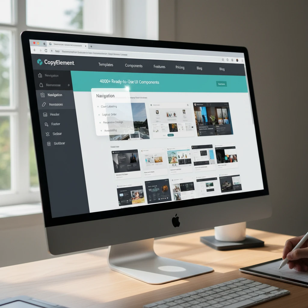
A site map is a visual representation of your website’s structure, showing the relationship between different pages and sections. Creating a site map is a crucial step in planning your navigation, as it helps you to organize your content logically and ensure that all important pages are easily accessible. Start by identifying your website’s main categories and subcategories, then map out the hierarchy of pages within each section. Consider using a mind mapping tool or a simple spreadsheet to create your site map. For CopyElement, a site map would include categories such as “Templates,” “Components,” “Pricing,” “Blog,” and “Support,” with subcategories for different types of Elementor templates and components.
Prioritizing Key Pages and User Flows within the Navigation
Not all pages on your website are created equal. Some pages, such as your homepage, product pages, and contact form, are more important than others in terms of achieving your business goals. Prioritize these key pages in your navigation by making them easily accessible from the main menu and other prominent locations on your site. Similarly, identify the most common user flows – the paths visitors take to complete specific tasks – and optimize your navigation to facilitate these flows. For example, if a common user flow is to browse templates and then view pricing, ensure that the “Pricing” page is easily accessible from the template gallery. By strategically prioritizing key pages and user flows, you can guide visitors towards your desired outcomes and improve your website’s conversion rates.
Designing a User-Friendly Header in Elementor: Key Elements and Best Practices
The header is one of the most important elements of your website’s design, as it’s the first thing visitors see and serves as the primary navigation hub. A well-designed header should be visually appealing, easy to navigate, and consistent across all pages of your site. In Elementor, you can create custom headers using the theme builder, allowing you to control every aspect of the header’s design and functionality.
Logo Placement, Branding, and Consistency
Your logo is a crucial element of your brand identity, and it should be prominently displayed in the header of your website. Typically, the logo is placed in the upper left-hand corner of the header, as this is where users naturally look for it. Ensure that your logo is high-resolution and visually appealing, and that it links back to your homepage. Maintain consistency in branding by using the same colors, fonts, and imagery in your header as you do throughout your website. Consistency builds trust and reinforces your brand identity. For CopyElement, the logo should link to the homepage and should use the same branding found within existing CopyElement templates.
Clear and Concise Navigation Menu Options
Your navigation menu should be clear, concise, and easy to understand. Use descriptive labels for your menu items, avoiding jargon or overly technical terms. Limit the number of menu items to avoid overwhelming visitors, and group related pages together under logical categories. Consider using dropdown menus to organize subcategories, but be careful not to create overly complex or nested dropdowns. For example, a CopyElement navigation menu might include options such as “Templates,” “Components,” “Pricing,” “Blog,” and “Support.” Prioritize ease of understanding by making sure each option is clearly defined. Ensure your design adheres to the principles of excellent UI/UX.
Integrating Search Functionality for Easy Content Discovery
A search function is an invaluable tool for helping visitors find specific content on your website. Integrate a search bar into your header, making it easily accessible from any page on your site. Use a clear and intuitive design for the search bar, and provide helpful suggestions as users type. Optimize your website’s search functionality by indexing your content properly and using relevant keywords. For a site like CopyElement with thousands of components and templates, a robust search function is essential for allowing users to quickly find what they need, even with a clear primary navigation. The search bar should be prominent and easy to use. Consider leveraging structured data to improve search result visibility.
Call-to-Action Buttons in the Header: Best Practices for Placement and Design
Call-to-action (CTA) buttons are an effective way to encourage visitors to take a desired action, such as signing up for a free trial, requesting a demo, or making a purchase. Place your CTA buttons strategically in your header, making them visually prominent and easy to click. Use clear and compelling language for your CTA buttons, and choose colors that contrast with the rest of your header. For CopyElement, a CTA button in the header could encourage users to “Start a Free Trial” or “Browse Templates.” The placement should be strategic, drawing attention without disrupting the overall navigation experience.
Dropdown Menus in Elementor: Avoiding Common UI/UX Pitfalls
Dropdown menus can be a useful way to organize a large amount of content within your Elementor navigation. However, they can also be a source of frustration if not designed carefully. Common pitfalls include overly complex menus, difficult-to-use interactions, and poor mobile responsiveness. By following best practices for UI/UX design, you can create dropdown menus that are both functional and user-friendly.
Keeping Dropdown Menus Simple and Focused
The key to effective dropdown menus is simplicity. Avoid creating overly complex or nested dropdowns, as these can be difficult for users to navigate. Limit the number of options in each dropdown menu, and group related pages together under logical categories. Use clear and concise labels for your menu items, and avoid jargon or overly technical terms. Aim for a maximum of two levels of dropdowns (a main menu item with a dropdown, and then a dropdown within that dropdown) to prevent users from getting lost. For example, a “Templates” dropdown on CopyElement could have categories for “Landing Pages,” “Blog Pages,” and “Portfolio Pages,” but avoid further nesting beyond that to maintain a clear and focused user experience.
Mobile Responsiveness Considerations for Dropdown Menus
Mobile responsiveness is crucial for any website design, and dropdown menus are no exception. Ensure that your dropdown menus are easy to use on touch devices, with sufficiently large touch targets and clear visual cues. Consider using a different navigation pattern for mobile devices, such as a hamburger menu, to provide a more streamlined and user-friendly experience. Test your dropdown menus on a variety of mobile devices to ensure that they work properly and are easy to navigate. In Elementor, you can use the responsive settings to customize the appearance and behavior of your dropdown menus on different screen sizes. Prioritizing mobile usability ensures a positive experience for all users, regardless of their device.
Testing Dropdown Menu Usability on Different Devices
Thorough testing is essential to ensure that your dropdown menus are user-friendly and function properly on all devices. Test your dropdown menus on a variety of desktop browsers, as well as on different mobile devices and tablets. Pay attention to the user experience, looking for any areas where users might get confused or frustrated. Gather feedback from users and make adjustments to your design based on their input. Tools like Google Analytics can help you track user behavior and identify areas where your dropdown menus might be causing problems. Regularly testing and iterating on your design is key to creating dropdown menus that are both functional and user-friendly.
Mobile-First Navigation Design in Elementor: Optimizing for Smaller Screens
With the majority of web traffic originating from mobile devices, a mobile-first approach to navigation is paramount. In Elementor, this means designing your navigation primarily for smaller screens and then progressively enhancing it for larger displays. Neglecting mobile navigation can lead to a frustrating user experience, resulting in higher bounce rates and lower conversion rates. Decision criteria for mobile navigation should include ease of use, scannability, and accessibility. Pitfalls to avoid are cluttered menus, tiny touch targets, and slow loading times. Remember that a user should be able to accomplish their primary task, such as finding a product or contact information, within a few taps.
Implementing a Hamburger Menu for Compact Mobile Navigation
The hamburger menu (three horizontal lines) is a widely recognized icon for concealing navigation options on mobile. In Elementor, you can easily implement a hamburger menu using the Nav Menu widget. When implementing, ensure the menu is visually distinct and easily tappable. Consider using a contrasting background color or a subtle animation on hover or tap to provide visual feedback. Be mindful of placement; commonly, it resides in the top-left or top-right corner. The expanded menu should be easy to scan, with clear typography and sufficient spacing between links. Avoid nested menus within the hamburger menu on mobile, as they can be difficult to navigate on smaller touchscreens.
Prioritizing Essential Navigation Links on Mobile
Due to the limited screen space on mobile devices, it’s crucial to prioritize the most essential navigation links. Start by identifying the key user tasks on your website. What are visitors most likely looking for? These should be your top-priority navigation items. Reduce the number of visible links to only those that are absolutely necessary. A good rule of thumb is to keep it under five. Use analytics data to understand user behavior and identify the most frequently accessed pages. You can then strategically place those links in the most prominent positions within the mobile menu. Consider using descriptive link text that clearly communicates the destination page. For instance, instead of “Services,” use “Our Services” or “View Our Services.”
Ensuring Touch-Friendly Navigation Elements for Mobile Users
Touch targets should be large enough to be easily tapped without accidentally selecting adjacent links. Apple recommends a minimum touch target size of 44 x 44 pixels. Use Elementor’s padding and margin settings to increase the spacing around navigation links. Avoid placing links too close together. Use clear and legible typography. Avoid using fonts that are too small or difficult to read on smaller screens. Test your navigation on different mobile devices to ensure it is easy to use and accessible to all users. Use Elementor’s responsive mode to fine-tune the design for different screen sizes. Tools like browser developer tools can emulate different mobile devices for testing.
Leveraging Elementor’s Sticky Header Functionality for Enhanced Usability
A sticky header, also known as a fixed header, remains visible at the top of the screen as users scroll down the page. This provides continuous access to the navigation menu, search bar, and other essential elements. Elementor offers a built-in sticky header functionality, allowing you to implement this feature without coding. Implementing a sticky header can improve website usability and user engagement, but it’s crucial to implement it correctly to avoid potential drawbacks. The decision to use a sticky header should be based on the length of your pages and the importance of persistent navigation access. Ask yourself, does my site design prioritize quick content discovery and navigation over maximizing screen real estate at all times?
Benefits of a Sticky Header for User Experience
A sticky header provides several benefits for user experience. First, it ensures that the navigation menu is always within reach, reducing the need for users to scroll back to the top of the page. This is especially helpful on long pages with a lot of content. Second, it can improve brand visibility by keeping your logo and branding elements constantly visible. Third, it can provide quick access to search functionality, allowing users to easily find what they’re looking for. Finally, it can improve conversion rates by making calls to action more accessible. For example, if you’re selling a product, a sticky header can keep the “Add to Cart” button visible at all times.
Customizing the Sticky Header Appearance in Elementor
Elementor’s sticky header functionality allows you to customize the appearance of the header when it becomes sticky. This includes changing the background color, text color, logo size, and other styling options. Consider using a slightly different background color for the sticky header to visually distinguish it from the regular header. This can help users understand that the header is fixed and always accessible. You can also adjust the padding and margin to create a more compact version of the header when it’s sticky. This can help save screen space and prevent the sticky header from covering too much content. Finally, ensure that the sticky header is still legible and easy to use, even when it’s in its compact state. Perhaps the logo shrinks slightly, or some elements are hidden.
Potential Drawbacks of Sticky Headers and How to Address Them
While sticky headers offer several benefits, they can also have potential drawbacks. One common issue is that they can take up valuable screen space, especially on smaller devices. To mitigate this, consider using a smaller, more compact version of the header when it’s sticky. Another potential issue is that they can interfere with the reading experience if they’re too large or distracting. Make sure your sticky header design is clean, simple, and unobtrusive. Consider making the header partially transparent so that it’s less intrusive. Additionally, test your sticky header on different devices and screen sizes to ensure that it works well across all platforms. If the user is on mobile, consider the possibility of a “smart” sticky header that disappears during scrolling but reappears with a slight upward flick. This is achievable with custom code but goes beyond the basic Elementor UI.
Breadcrumbs Navigation in Elementor: Helping Users Understand Their Location
Breadcrumbs are a secondary navigation system that shows a user’s location within a website’s hierarchy. They typically appear as a horizontal list of links, with each link representing a higher-level page in the site structure. Implementing breadcrumbs can improve website usability and SEO. Breadcrumbs are especially useful for websites with complex hierarchies or deep content structures. Consider implementing breadcrumbs if your website has more than three levels of navigation. For a practical example, consider an e-commerce site. A user navigates from “Home > Clothing > Men’s > Shirts > Casual Shirts.” The breadcrumb trail clearly visualizes their path.
Implementing Breadcrumbs for Improved Website Navigation
Elementor does not have a dedicated breadcrumbs widget, so you’ll need to use a third-party plugin or code snippet to implement breadcrumbs. Several popular WordPress plugins offer breadcrumbs functionality, such as Yoast SEO (which also helps implement WordPress SEO), Rank Math, and Breadcrumb NavXT. Once you’ve installed and activated a breadcrumbs plugin, you can typically configure it to display breadcrumbs on specific pages or post types. Ensure that the breadcrumbs are placed in a prominent location, such as above the main content area. Avoid placing them in the footer or sidebar, where they may be easily overlooked.
Customizing Breadcrumb Appearance and Styling
Most breadcrumbs plugins allow you to customize the appearance and styling of the breadcrumbs to match your website’s design. This includes changing the font, color, separator, and other styling options. Use a font and color scheme that is consistent with your website’s overall design. Choose a separator that is visually distinct but not too distracting. Common separators include forward slashes (/) and greater-than signs (>). Consider using a different color or font weight to highlight the current page in the breadcrumb trail. This helps users understand their current location within the site structure. Ensure that the breadcrumbs are responsive and adapt to different screen sizes. A mobile-friendly breadcrumb design is crucial for providing a good user experience on smaller devices. Consider reducing the font size or hiding some of the breadcrumb levels on mobile.
When and Where to Use Breadcrumbs Effectively
Breadcrumbs are most effective on websites with complex hierarchies or deep content structures. They’re particularly useful for e-commerce sites, online magazines, and documentation websites. Avoid using breadcrumbs on simple websites with only a few pages. Breadcrumbs are typically placed above the main content area, below the header. They can also be placed in the sidebar, but this is less common. Ensure that the breadcrumbs are visible on all relevant pages and post types. Avoid hiding them on certain pages, as this can confuse users. Consider using breadcrumbs in conjunction with other navigation elements, such as the main menu and footer navigation, to provide a comprehensive navigation experience.
Footer Navigation in Elementor: Providing Secondary Navigation Options
The website footer is a valuable area often overlooked for navigation. While it shouldn’t replace primary navigation, it serves as a secondary hub for essential links and information. In Elementor, designing an effective footer involves carefully selecting the content and arranging it in a user-friendly manner. Decision criteria should involve answering common user needs and addressing legal requirements. Common pitfalls include cluttered designs, outdated information, and neglecting mobile responsiveness. A well-designed footer can improve user experience and contribute to SEO. It can be thought of as a “catch-all” for useful links that don’t neatly fit in the primary navigation.
Important Links to Include in the Footer Navigation
Several important links should be included in the footer navigation. These typically include links to the “About Us” page, “Contact Us” page, “FAQ” page, and “Terms of Service” and “Privacy Policy” pages. The “About Us” page provides information about your company or organization. The “Contact Us” page provides contact information, such as your email address, phone number, and physical address. The “FAQ” page answers frequently asked questions about your products or services. The “Terms of Service” and “Privacy Policy” pages are legal documents that outline the terms and conditions of using your website and how you collect and use user data. Including these links in the footer helps users find this information quickly and easily.
Contact Information, Legal Pages, and Social Media Integration
Beyond the standard links, the footer should also include other important information. This includes your company’s physical address (if applicable), phone number, and email address. Providing this information makes it easier for users to contact you and builds trust. You should also include links to your social media profiles, such as Facebook, Twitter, and LinkedIn. Social media integration can help users connect with you on social media and stay up-to-date on your latest news and updates. Ensure that all legal pages, such as the “Terms of Service,” “Privacy Policy,” and “Disclaimer,” are easily accessible from the footer. These pages are essential for protecting your business and ensuring compliance with legal requirements. Make sure your Elementor website follows essential security measures, and that your legal pages accurately reflect your data handling practices.
Footer Design Considerations for User Experience and SEO
When designing your website footer, consider user experience and SEO. Keep the design clean and simple, with clear typography and sufficient spacing. Avoid cluttering the footer with too much information. Use a font and color scheme that is consistent with your website’s overall design. Ensure that the footer is responsive and adapts to different screen sizes. A mobile-friendly footer design is crucial for providing a good user experience on smaller devices. Use descriptive link text that clearly communicates the destination page. This can help improve SEO by providing search engines with relevant keywords. For example, instead of “Contact,” use “Contact Us Today.” Consider including a copyright notice in the footer to protect your intellectual property.
Accessibility Considerations for Elementor Website Navigation
Creating accessible navigation is paramount for ensuring that all users, regardless of their abilities, can easily navigate your Elementor website. Ignoring accessibility can lead to a poor user experience and potentially exclude a significant portion of your audience. Prioritize inclusivity by focusing on keyboard navigation, ARIA attributes, and color contrast.
Ensuring Keyboard Navigation for Users with Disabilities
Keyboard navigation is critical for users who cannot use a mouse, including individuals with motor impairments or those who rely on assistive technologies. Elementor’s default settings might not always guarantee a seamless keyboard experience. Test your navigation thoroughly using the tab key to ensure that each interactive element receives focus in a logical order. Common pitfalls include elements that are focusable but not visually indicated, or a confusing tab order that makes navigation unpredictable. Here’s how to test:
- Tab Order Audit: Manually tab through every link, button, and form element to verify the order matches the visual layout.
- Skip Navigation Links: Implement “skip to content” links to allow users to bypass repetitive navigation elements.
- Focus States: Style the focus state (using CSS) to clearly highlight which element is currently selected. A subtle outline is often insufficient; consider a more prominent change in background color or a bold border.
Using ARIA Attributes to Enhance Navigation Accessibility
ARIA (Accessible Rich Internet Applications) attributes provide additional semantic information to assistive technologies, improving the accessibility of your navigation. Use ARIA roles and attributes to define the purpose and state of navigation elements. For example, use role="navigation" to explicitly identify your navigation menu, and aria-label to provide a descriptive label for screen readers. Consider these implementations:
- Descriptive Labels: Use
aria-labelto clarify the purpose of icon-only navigation elements (e.g.,<a href="" aria-label="Search"><i class="fa fa-search"></i></a>). - Menu Structure: Properly structure your navigation with semantic HTML5 elements like
<nav>,<ul>, and<li>, and enhance them with ARIA roles where necessary. - Dynamic Content: If your navigation includes dynamic elements (e.g., dropdown menus that appear on hover), use ARIA attributes like
aria-expandedandaria-controlsto communicate their state and relationship to assistive technologies.
For further information on ARIA implementation, consult the Mozilla Developer Network’s ARIA documentation.
Color Contrast and Readability Considerations for Navigation Elements
Ensure sufficient color contrast between text and background colors in your navigation to meet WCAG (Web Content Accessibility Guidelines) standards. Low contrast can make it difficult for users with visual impairments to read the navigation links. Aim for a contrast ratio of at least 4.5:1 for normal text and 3:1 for large text. You can use online contrast checkers to verify your color choices. For example, avoid using light gray text on a white background. Additionally, prioritize readability by choosing clear and legible fonts, and avoid overly complex or decorative typefaces. Consider these points:
- Contrast Checkers: Utilize tools like WebAIM’s Contrast Checker to assess the contrast ratio of your navigation elements.
- Font Size and Spacing: Ensure that your font size is large enough and that there is adequate spacing between navigation links to improve readability.
- Hover States: Pay special attention to the color contrast of hover and focus states, as these are crucial for providing visual feedback to users.
Testing and Iterating on Your Elementor Website Navigation: A/B Testing and User Feedback
Effective navigation is not a one-time setup; it requires continuous testing and iteration based on user behavior and feedback. Implement A/B testing to compare different navigation designs, and actively solicit user feedback to identify areas for improvement. Analyzing user interactions allows you to refine your navigation and create a more intuitive experience.
Using Heatmaps and Analytics to Track Navigation Behavior
Heatmaps and analytics tools provide valuable insights into how users interact with your website navigation. Heatmaps visualize where users click, move their mouse, and scroll on your pages, revealing which navigation elements are most frequently used and which are ignored. Analytics platforms, such as Google Analytics, offer data on page views, bounce rates, and navigation paths, allowing you to understand how users move through your site. Consider these metrics:
- Click Maps: Identify frequently clicked navigation links and areas where users expect to find information.
- Scroll Maps: Understand how far users scroll on pages with navigation menus, revealing if important links are below the fold.
- Navigation Paths: Analyze the most common paths users take through your site to identify areas where navigation can be streamlined.
For example, if a heatmap shows that users frequently click on a specific section in a mega menu but ignore other sections, you might consider prioritizing that section or making it more prominent. Combining this data with bounce rate analysis can indicate whether users are leaving pages because they cannot find what they are looking for, suggesting a need for improved navigation clarity. Heatmaps provide visual data, while analytics offers numerical insights, giving a comprehensive view of user behavior.
Gathering User Feedback on Navigation Usability
Direct user feedback is essential for understanding the qualitative aspects of your navigation. While analytics reveal what users are doing, feedback explains why. Conduct user testing sessions, send out surveys, and solicit feedback through contact forms to gather insights on usability, clarity, and overall satisfaction. Consider these methods:
- User Testing: Observe users as they navigate your website, asking them to complete specific tasks and providing verbal feedback on their experience.
- Surveys: Use online survey tools to collect feedback on navigation usability, asking questions about clarity, ease of use, and overall satisfaction.
- Feedback Forms: Include a contact form on your website where users can submit feedback on any aspect of their experience, including navigation.
Example: After launching a redesigned navigation, a company sent out a survey asking users to rate the ease of finding specific information. 30% of respondents indicated difficulty finding product specifications, leading the company to reorganize the product information within the navigation. This resulted in a 15% decrease in bounce rate on product pages.
Iterating on Your Navigation Design Based on Data and Feedback
Use the data and feedback you collect to iterate on your navigation design. Prioritize changes that address the most common pain points and align with user behavior. A/B test different versions of your navigation to determine which performs best, and continuously monitor the results to ensure ongoing improvement. Examples of iterations include:
- Reorganizing Menu Items: Based on heatmap data, move frequently clicked links to more prominent positions in the menu.
- Simplifying Menu Labels: Use clearer and more concise labels to improve navigation clarity.
- Adding Search Functionality: If users are struggling to find specific information, add a search bar to your navigation.
Remember that iteration is an ongoing process. As your website evolves and user needs change, you should continuously test and refine your navigation to ensure that it remains effective. Make sure that website security is still a focus with any new updates.
Advanced Elementor Navigation Techniques: Mega Menus and Dynamic Navigation
Elevate your Elementor website’s navigation with advanced techniques like mega menus and dynamic navigation. Mega menus provide enhanced visual organization, while dynamic navigation adapts to user roles. However, implementing these features requires careful planning to ensure usability and performance.
When to Use Mega Menus and How to Design Them Effectively
Mega menus are best suited for websites with a large number of pages or complex product categories. They allow you to display a comprehensive overview of your site’s content in a visually appealing format. When designing a mega menu, consider the following:
- Organization: Structure your mega menu logically, using clear headings and subheadings to group related content.
- Visual Hierarchy: Use visual cues, such as font size, color, and icons, to create a clear visual hierarchy and guide users to the most important information.
- Responsive Design: Ensure that your mega menu is fully responsive and works well on all devices, including mobile phones and tablets.
Avoid overwhelming users with too much information. Keep the design clean and uncluttered, and focus on providing a clear and intuitive browsing experience. Consider a hypothetical example: an e-commerce site selling electronics could use a mega menu to showcase different product categories (e.g., “Laptops,” “Smartphones,” “Accessories”), each with subcategories and featured products. Including images can significantly improve engagement.
Considerations for Implementing Dynamic Navigation Based on User Roles
Dynamic navigation adapts the menu structure based on the user’s role or login status. This is useful for websites with different types of users, such as members, administrators, or customers. When implementing dynamic navigation, consider the following:
- User Roles: Define clear user roles and permissions to determine which menu items should be displayed to each user.
- Authentication: Implement a secure authentication system to verify user identities and roles.
- Performance: Optimize your code to ensure that dynamic navigation does not slow down your website’s performance.
For example, a membership website might display different menu items to logged-in members versus anonymous visitors. Logged-in members might see links to their profile, account settings, and member-only content, while anonymous visitors might see links to registration and login pages. Be aware of WordPress SEO when implementing advanced navigations features.
Measuring Navigation Performance: Key Metrics and KPIs
Understanding how users interact with your navigation requires careful tracking and analysis of key metrics. By monitoring bounce rate, time on page, pages per session, and navigation flow using tools like Google Analytics, you can gain insights into the effectiveness of your navigation and identify areas for improvement.
Tracking Bounce Rate, Time on Page, and Pages per Session
These three metrics provide a high-level overview of user engagement on your website. A high bounce rate on key landing pages might indicate that users are not finding what they are looking for, suggesting a navigation issue. Low time on page could mean that content isn’t engaging, or again, that users can’t easily navigate to related information. Pages per session reflects how deeply users explore your site; a low number might suggest poor navigation prevents users from discovering other relevant content. Here’s how they work together:
- Bounce Rate: The percentage of visitors who leave your website after viewing only one page. A high bounce rate (over 70%) may indicate navigation issues.
- Time on Page: The average amount of time users spend on a particular page. Low time on page could mean that users are not finding the information they need or that the navigation is confusing.
- Pages per Session: The average number of pages a user visits during a single session. A low number of pages per session may indicate that the navigation is not effective at guiding users to other relevant content.
Using Google Analytics to Analyze Navigation Flow
Google Analytics offers powerful tools for analyzing navigation flow, allowing you to visualize how users move through your website. The “Behavior Flow” report shows the paths users take from one page to another, revealing common entry and exit points. The “Navigation Summary” report provides insights into how users navigate to a specific page, showing the previous and next pages they visited. Analyzing these reports can help you identify navigation bottlenecks and optimize the user experience. For example, if you notice that a large number of users are dropping off after visiting a particular page, you might consider adding more prominent links to related content or improving the page’s navigation structure. It’s also important to keep in mind Elementor speed secrets, to not impact your performance.
Setting Benchmarks and Monitoring Navigation Improvement Over Time
Establish baseline metrics for your key navigation KPIs and track changes over time. This allows you to measure the impact of your navigation improvements and identify areas where further optimization is needed. Set realistic benchmarks based on your industry and website goals. For example, if your initial bounce rate is 80%, aim to reduce it to 60% within three months. Regularly monitor your metrics and make adjustments to your navigation strategy as needed. A/B testing different navigation designs and tracking the results in Google Analytics can help you identify the most effective changes. Remember that this is an ongoing process; continuously monitoring and optimizing your navigation is crucial for maintaining a positive user experience and achieving your business goals. Learn more about setting up goals in Google Analytics to better measure navigation effectiveness.
By carefully considering accessibility
Saurabh Kumar
I’m Saurabh Kumar, a product-focused founder and SEO practitioner passionate about building practical AI tools for modern growth teams. I work at the intersection of SEO, automation, and web development, helping businesses scale content, traffic, and workflows using AI-driven systems. Through SEO45 AI and CopyElement, I share real-world experiments, learnings, and frameworks from hands-on product building and client work.